Framing Art Prints Without Spending a Fortune
Framing is the bit nobody warns you about. You buy a print for £25, feel pleased with yourself, then realise the frame to put it in costs three times that if you wander into the wrong shop. There's a lot of nonsense in the framing world — bespoke quotes that make your eyes water, gallery-grade glass you don't need, mounts cut to a millimetre for a print that's going above the loo.
Most of the time, you can do this for under twenty quid a print and have it look properly considered. Here's how I'd think about it.
Stick to standard sizes and the frames get cheap
The single biggest money-saving move is buying prints in standard sizes — A4, A3, A2, A1, or the squarer 30×40cm and 50×70cm sizes that the Scandinavian shops favour. The moment a print is 11×17 inches or some odd custom dimension, you're in bespoke-framing territory and the price doubles overnight.
A3 (297×420mm) and A2 (420×594mm) are my two favourites for the wall behind a sofa or above a sideboard. A3 is big enough to actually look like art rather than a postcard, and small enough that you can hang two or three together without it feeling like a gallery wall committee meeting. A2 carries a room on its own.
For frame sources, IKEA's RIBBA is the obvious starting point and there's no shame in it. The black, white and oak versions in A3 and A2 are genuinely fine — solid backing, a decent (if basic) mount included, and the glass is real glass on the larger sizes. The KNOPPÄNG range is even cheaper if you don't need the mount.
Habitat has a slightly nicer finish on their wooden frames, particularly the oak ones, and you can sometimes catch them on sale through Argos. John Lewis is usually overpriced for what you get, but their clearance section is worth a scroll.
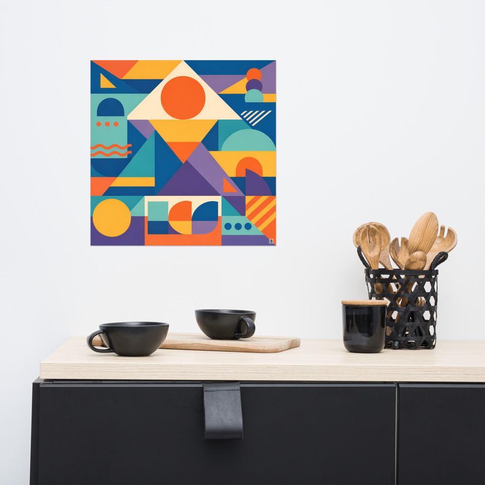
Then there's eBay and charity shops, which is where it gets interesting. Vintage frames — especially the chunky 1970s teak ones and slim brass-edged 80s frames — are everywhere for a fiver if you're patient. Measure the *aperture* (the hole), not the outer frame, because the listings often muddle the two. A vintage frame around a modern geometric print is one of my favourite combinations; something like Crescent Court in a warm teak frame from 1974 looks like it's always lived there.
A quick warning on second-hand: the glass on old frames is often scratched, and the backing board can be warped or full of acidic cardboard that'll yellow your print over time. Budget for replacing the backing with fresh acid-free card from Hobbycraft or eBay, and inspect the glass in daylight before you commit.
Mount or no mount
A mount (or mat, if you've been reading American sites) is the bevelled border of card that sits between the print and the frame. It does two things: it gives the print breathing room so it doesn't feel cramped, and it keeps the paper from touching the glass, which matters more than people realise — paper pressed against glass for years will eventually stick, especially in a humid room.
My general rule: bigger frame than the print, with a mount, almost always looks better than a frame cut exactly to the print size. An A3 print in an A2 frame with a white mount feels intentional and gallery-ish. An A3 print in an A3 frame feels like a poster.
That said, mountless framing has its place. Bold graphic prints with strong borders of their own — Memphis-style work, that sort of thing — often look better edge-to-edge. If you've got something like Arcade Terrace where the composition already has its own internal margins, a mount can feel redundant.
If you do want a mount but the frame didn't come with one, or came with one in the wrong colour, eBay sellers will cut you a custom mount for about £5-8. Specify off-white rather than bright white — bright white tends to fight with the paper colour of most art prints, which are usually a touch warm.
Glass versus perspex
This one's mostly about where the frame's going and who's near it.
Real glass looks better. It's clearer, it doesn't scratch from a wipe of a duster, and it feels more substantial. The downsides are weight (a big A1 with real glass is a proper lump on a plasterboard wall) and the obvious shatter risk. If you're framing something above a cot, above a bed, or anywhere a child or a clumsy adult might knock it, glass is a bad idea.
Perspex (acrylic) is lighter, safer, and won't smash if your wall fixings give up at 2am. It scratches if you look at it funny, though, and it attracts dust through static in a way that glass doesn't. For a kitchen or bathroom, where steam and grease are in play, perspex actually wins because it's easier to clean without streaking.
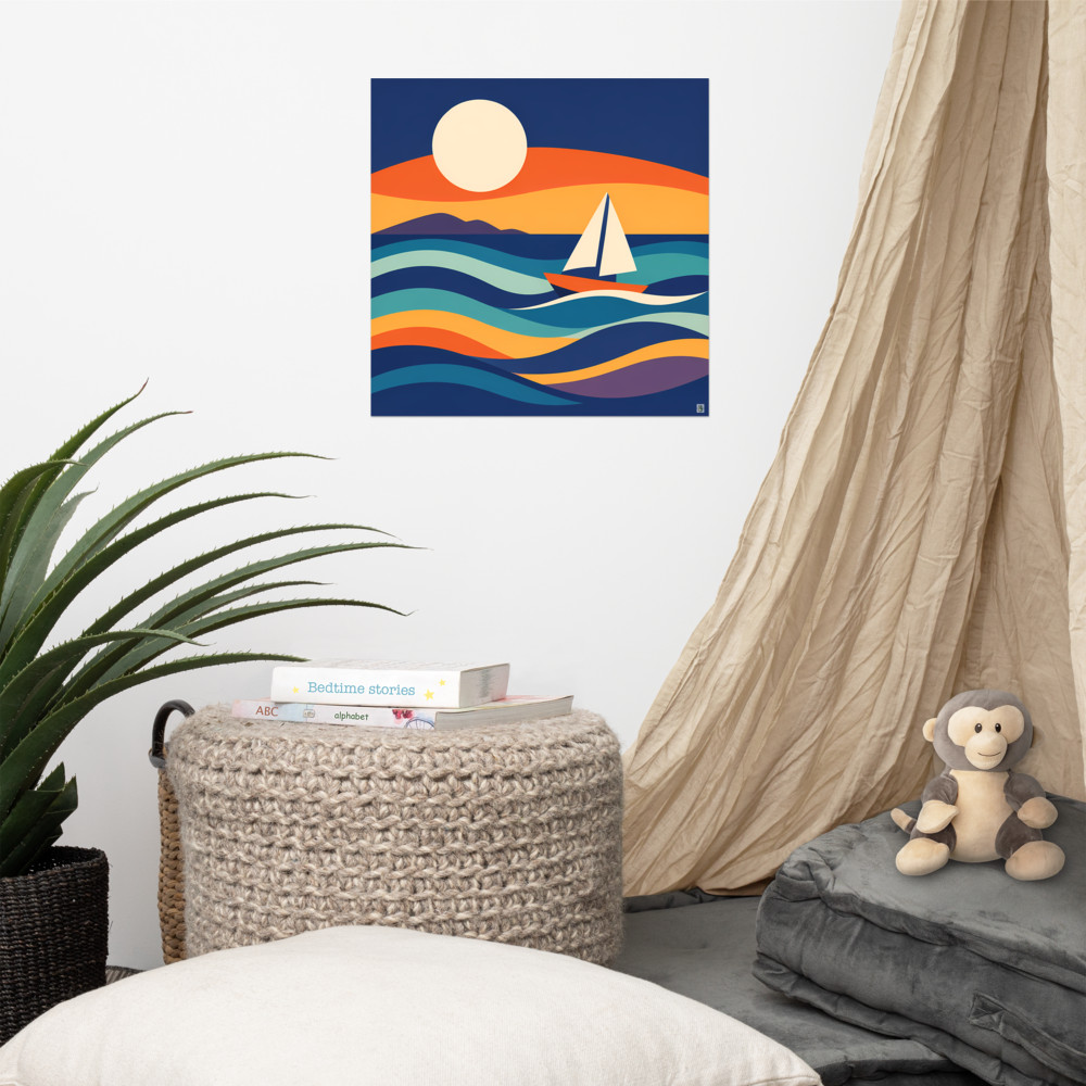
There's also non-reflective glass, which is worth it for one specific situation: a print on a wall directly opposite a window. Otherwise it slightly mutes the colours and you can skip it. UV-protective glass is genuine if a print is in direct sun all day — sunlight will fade inks faster than anything else — but for most rooms it's overkill. Hanging botanical work like Midsummer Rise on a north-facing wall? Standard glass is absolutely fine. Same print in a south-facing conservatory? Spend the extra.
A few small things that make a big difference
Clean the inside of the glass before you assemble. There's nothing more annoying than spotting a hair behind the glass a week after you've hung the frame.
Use the little metal tabs on the back of the frame, not tape, to hold the backing in. Tape ages badly and you'll want to swap the print out eventually.
Hang frames lower than you think. The middle of the print should sit around 145-150cm from the floor — gallery height — not up near the picture rail. People hang things too high almost universally, and it makes rooms feel taller in a bad way, like everything's floating away from the furniture.
Related articles

Mentioned in this article