InkSmithery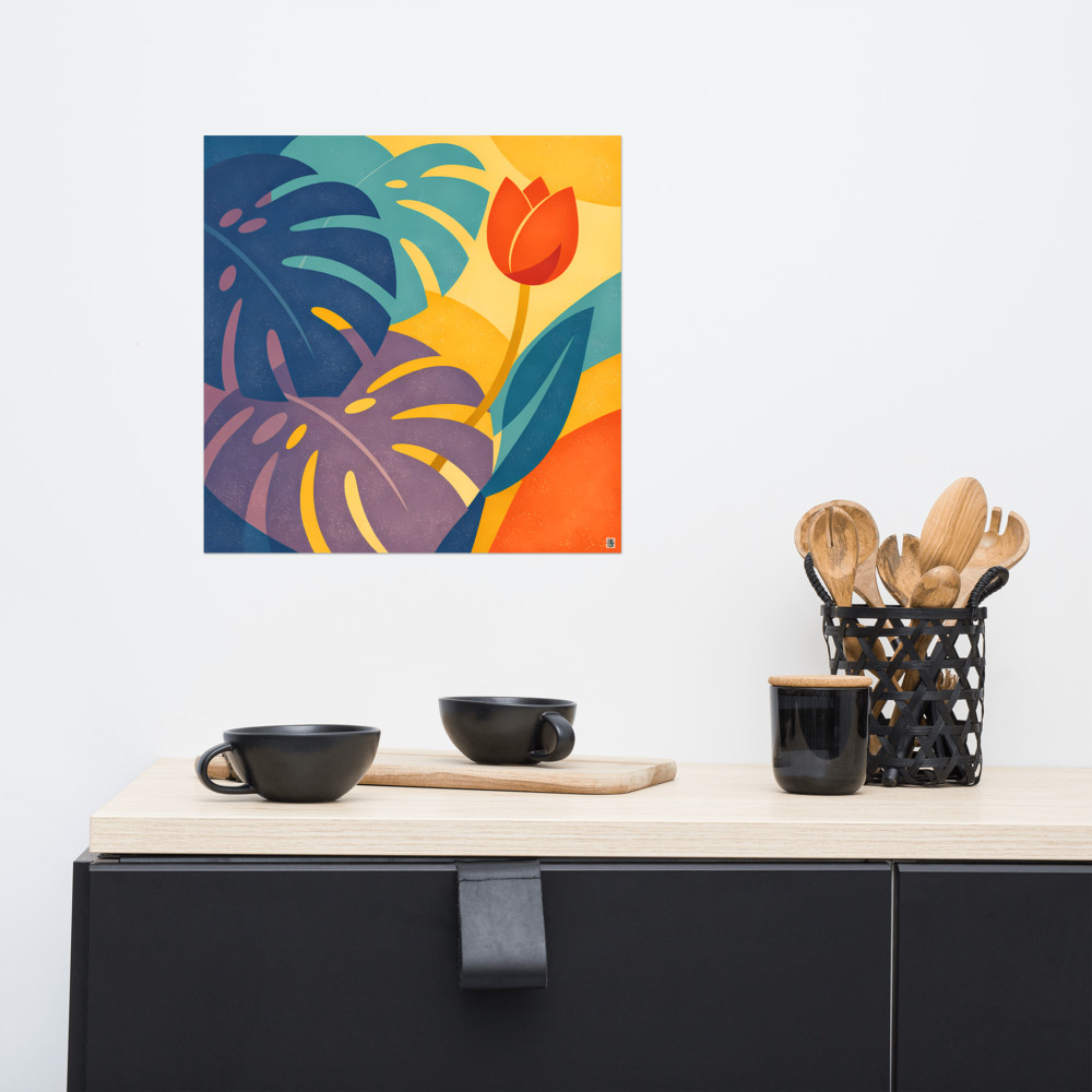
Buying Kids' Room Art That Won't Get Binned at 14
There's a specific look that kids' room art tends to fall into. Cartoon animals wearing waistcoats. A watercolour giraffe with a balloon. The word DREAM in a font that looks like it was drawn with a marker pen. None of it is offensive, exactly. But it does have a shelf life of about six years, and by the time your child is old enough to have opinions about anything, it's coming down.
So the question I keep getting asked — usually by parents doing up a nursery or a bedroom for a five-year-old — is whether it's possible to buy art that reads as being for a child, but doesn't have to be replaced when they hit double digits. I think it is. It just means resisting a few of the obvious choices at the start.
The problem with themed art
Most art marketed at kids is themed. Jungle. Space. Under the sea. Woodland. The theme is doing the heavy lifting, and the artwork itself is often quite flat — a picture of a lion, a picture of a rocket, a picture of a fox. The child recognises the thing, and that's most of the appeal.
The issue is that recognition wears off. A seven-year-old is not thrilled by a picture of a fox on the wall in the way a three-year-old was. And by twelve, the fox is embarrassing. The art hasn't done anything wrong, it's just been outgrown, because it was never asking to be looked at in any deeper way.
Art that lasts tends to work the other way round. The subject is less obvious. There's something to notice on a second look. A child might love it because the colours are bright or because there's a moon in it, and a teenager might keep it because it actually looks quite good above the desk. Same picture, different reasons.
What actually works
In my experience, the pieces that survive the jump from child's room to teenager's room usually share a few things.
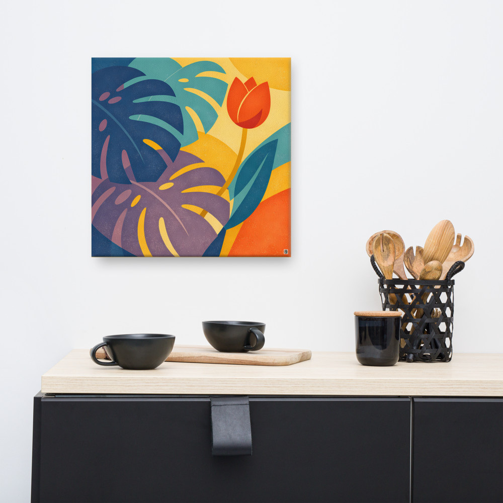
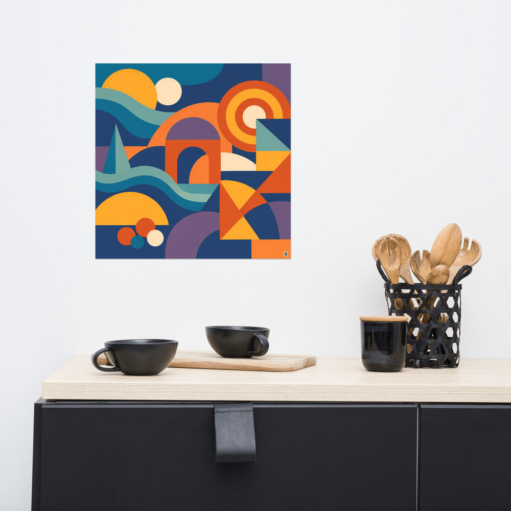
They have real colour, not pastel wash. Kids respond to saturated colour far more than the muted nursery palette suggests — that dusty sage and blush pink thing is largely for the parents. A print with proper blues, greens, warm oranges will hold a child's attention longer and won't feel babyish later. Something like Glasshouse Noon, with its bold leaf shapes and unapologetic colour, reads as cheerful to a small child and as a decent piece of design to an older one. Nothing about it is specifically "for kids", which is the point.
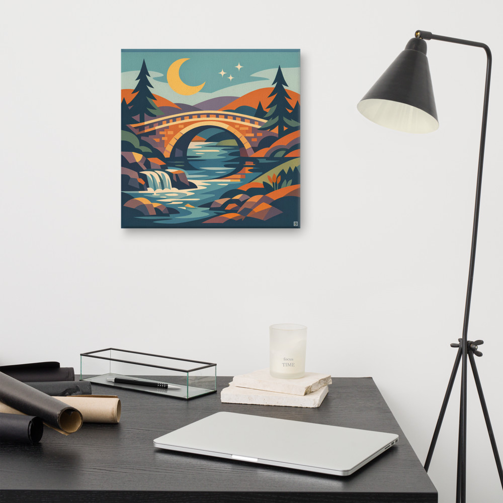
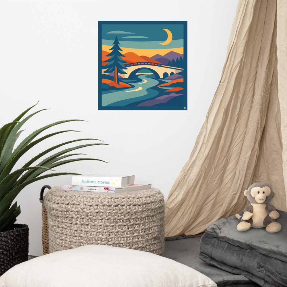
They have a subject a child can latch onto, but it's not the whole point of the picture. A moon. A bridge. A house in the distance. Kids love a scene they can build a story around, and a landscape gives them more room to do that than a single cartoon character does. Mosswater Crossing is a good example — there's a bridge, a river, a forest, a moon, and a four-year-old will happily tell you what's happening in it. A fourteen-year-old will just see a nice geometric landscape.
They're graphic rather than illustrative. Illustration ages faster than graphic design does, and cartoon illustration ages fastest of all. Anything with a strong shape-based, mid-century, or geometric feel tends to hold up because it's working with the same visual vocabulary as a lot of grown-up art. The child doesn't clock it as "kids' art" — they just clock it as their picture.
Things to actively avoid
A few things that seem like a good idea in the shop and then age badly:
- Anything with the child's name on it. It's sweet for about eighteen months and then it's a permanent commitment to that exact bedroom.
- Character licences. Bluey, Paw Patrol, whatever comes next. These are for stickers and duvet covers, not for framed prints on the wall.
- Motivational text. "Be brave, little one" is not something a nine-year-old wants to look at while doing homework.
- Anything overly gendered. Pink princess castles and blue trucks both date fast, and they also lock the room into an identity the child may not want by the time they're seven.
The test I use is: would I be embarrassed to have this in my own hallway? Not because kids' art has to be sophisticated, but because if the answer is a clear no, there's usually a reason, and it's often that the piece is doing something a bit obvious.
Buying for the room they'll grow into
One useful shift is to stop thinking of it as "art for a child" and start thinking of it as "art for a room that a child happens to sleep in". The room is going to change over the next ten years. The bed will get bigger, the toys will go, a desk will appear. The art can either be replaced at every stage, or it can be chosen once and left to earn its keep.
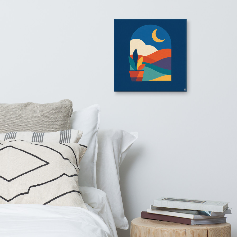
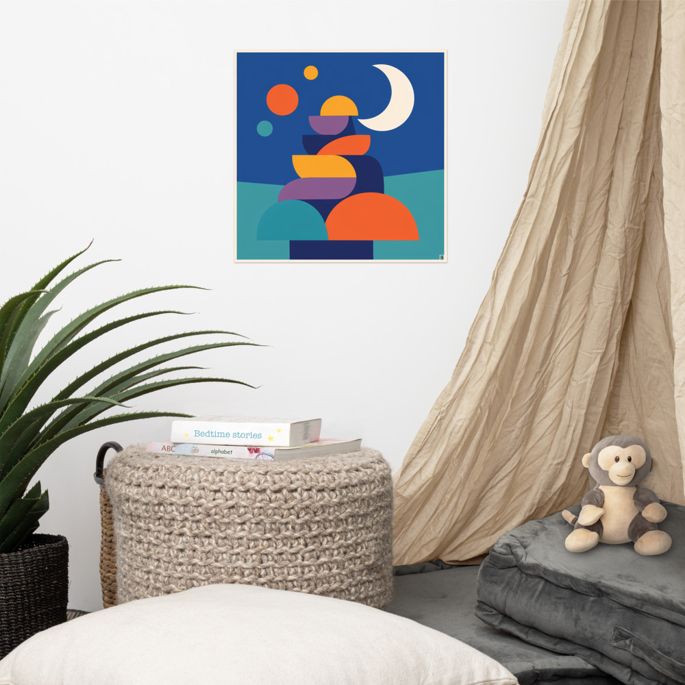
This is where slightly more atmospheric pieces work well. Distant Vale, with its arched window and moonlit landscape, is the kind of thing that suits a nightlight-lit toddler's room and a fifteen-year-old's revision cave with equal ease. It's calming without being twee, and there's enough going on to keep it interesting.
If you're buying for a nursery and want something you can genuinely leave up, go a size bigger than feels right and hang it lower than you would in a living room — around 120cm from floor to centre works well while they're small, and it'll still look intentional when they're taller. Canvas tends to survive kids' rooms better than glass, for obvious reasons.
The best compliment a piece of kids' art can get, honestly, is a teenager not noticing it's there. That means it's fitted in. It's part of the room rather than a label on it. And that's a much better outcome than another cartoon fox in a box under the bed.
Related articles
Mentioned in this article