The Wall Behind You On Video Calls: A Better Approach
There's a moment, usually about three seconds into a call, when you notice the wall behind the other person. Not consciously. You just clock it. Beige paint, a leaning houseplant, the corner of a radiator. And then you stop thinking about it, because your brain has filed them as a real person in a real space.
The wall behind *you* is doing the same job, whether you've thought about it or not. Most people haven't. They've either gone full blank wall (reads as hotel room) or panic-hung one big print directly behind their head (reads as corporate headshot, slightly off-centre). There's a better way, and it doesn't require redecorating.
Why one piece almost never works
A single piece of art, centred behind you, is the default move and it's the weakest one. The problem is that the camera flattens everything. What looks balanced in person — one print, a bit of breathing room, you sitting in front of it — becomes a strange portrait composition on screen, where the art appears to be sprouting out of your head or floating awkwardly to one side depending on how you've shifted in your chair.
Two pieces almost always reads better. The reason is depth and rhythm. Your eye has somewhere to travel. The composition doesn't depend on you sitting in exactly the right spot, because the wall already has its own internal balance regardless of where your head is. You can lean, you can gesture, you can get up to grab a notebook, and the backdrop holds together.
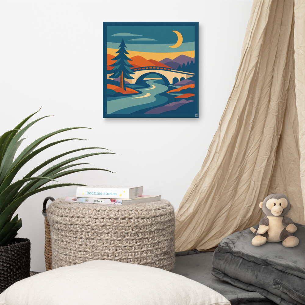
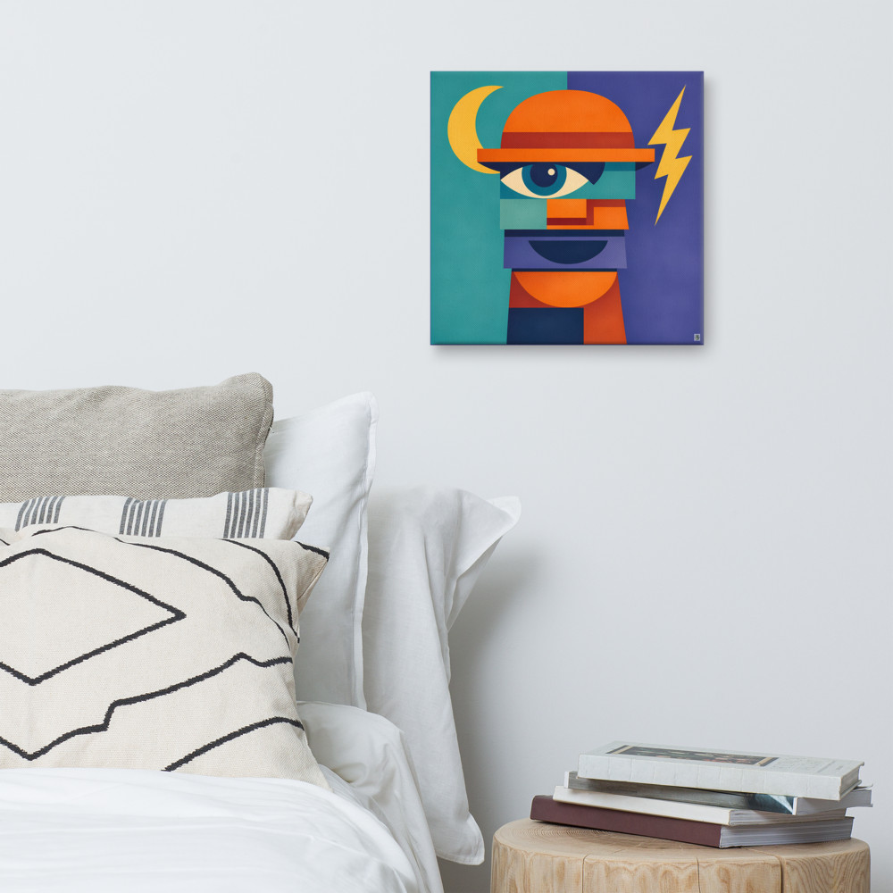
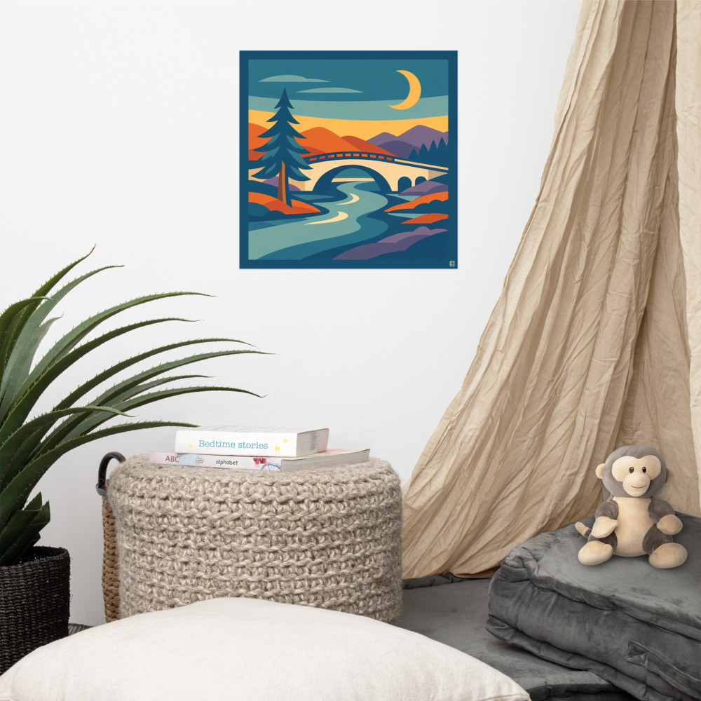
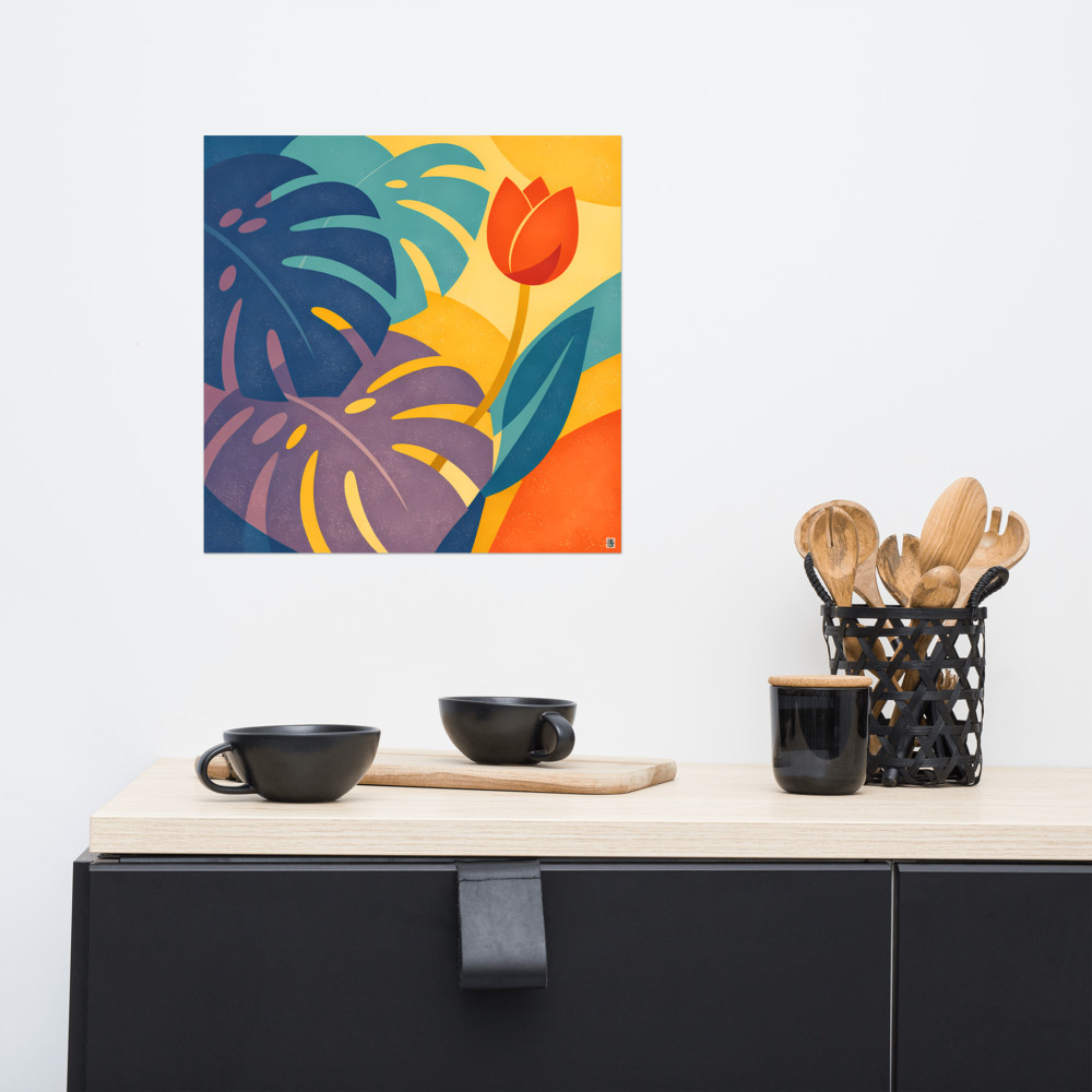
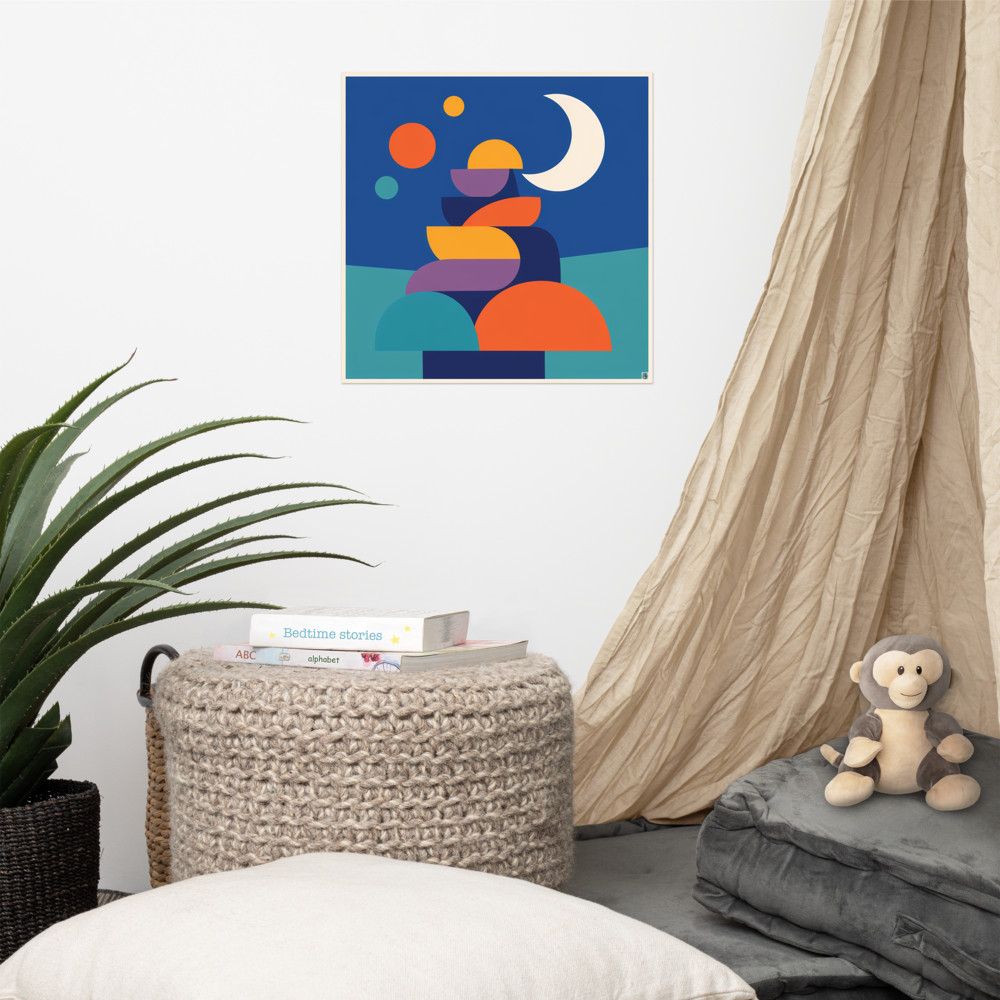
The two pieces don't need to match. In fact, they're more interesting if they don't. What you want is a shared sensibility — similar palette, or similar weight, or a visual conversation of some kind. A moody landscape next to a geometric portrait can work beautifully if both lean into the same mood. Something like Quiet Crossing paired with Night Signal shares a moonlit, slightly mystical register without being matchy.
The frame-light triangle
Here's the thing nobody mentions. On a video call, there are three points that matter: the frame around your face on screen, the light source on your face, and the visual weight of whatever's on the wall. If those three things are fighting each other, the call feels off, and nobody can quite tell you why.
The simplest version of this: if your main light is coming from your left (a window, a lamp, whatever), the heavier or darker piece of art should sit on the right side of the wall behind you. This counterweights the brightness on your face. If both your light and your strongest piece of art are on the same side, the whole composition tips. Your face ends up looking like it's sliding off the screen.
Height matters too, and this is where most people get it wrong. The instinct is to hang art at standard gallery height — roughly 145cm to the centre of the piece — which is great when you're standing in a living room. It's terrible on a webcam, because your camera is sitting at desk height and pointing slightly up. From that angle, gallery-height art appears way above your head, almost touching the ceiling.
For a video call wall, I'd hang things lower than feels natural. The top edge of the art should sit roughly level with the top of your head when you're seated. That way the camera catches the pieces properly framing your shoulders, not floating off into the void.
Why books on the shelf is the lazy choice
Every commentator, podcaster and middle-management LinkedIn influencer has the same backdrop now. A shelf. Some books, spines mostly facing out. A plant. Maybe a small framed thing leaning, never hung. It's become visual shorthand for "I am a thoughtful person on a call."
The problem is it's so common it's invisible. It tells the viewer nothing about you. Worse, shelves on camera are fiddly — books cast little shadows that read as clutter, the plant always looks like it needs watering, and you have to keep re-styling the thing every few weeks or it starts to look stale.
A wall with two considered prints does the opposite. It's settled. It doesn't need maintenance. It says you made a decision about what you wanted behind you, rather than defaulting to the standard set dressing.
There's also something to be said for choosing art with a bit of stillness to it. Busy, high-contrast, highly detailed prints compete with your face on a small screen. The viewer's eye doesn't know where to land. Pieces with a calmer composition and a limited palette — something like Moonlit Grove, which is mostly negative space and a few clean shapes — sit behind you without shouting. They register, they add character, and then they get out of the way.
A few practical things
If you can, test the wall before you commit to hanging anything. Prop the prints up on a chair or lean them against the wall roughly where you'd hang them, then jump on a call with yourself (most apps let you do this) and actually look at the result on screen. What works in the room often doesn't work on camera, and vice versa. It's worth ten minutes of faffing.
Watch out for glare. Glass-fronted frames pick up window light and overhead bulbs in ways you won't notice until you're mid-meeting and realise there's a bright rectangle hovering behind your shoulder. Canvas or unglazed prints sidestep this entirely, which is one of the quiet reasons they work so well as a video call backdrop.
And finally — don't overthink it past a point. The goal isn't a perfect set. It's a wall that looks like it belongs to a person with taste and a life, photographed by accident. Two pieces, hung at the right height, with the light falling sensibly. That's most of the job done.
Related articles

Mentioned in this article