Bedroom Art That Helps You Sleep Without Being Boring
There's a particular kind of bedroom I keep seeing on Pinterest where everything is beige. Beige walls, beige bed, beige art that's mostly a beige rectangle with a slightly darker beige line on it. It's restful in the way a waiting room is restful — your eyes have nowhere to go and nothing to do, so you stop looking. I don't think that's actually what you want above your bed.
The goal of bedroom art, if it has one, is to give your brain somewhere soft to land. Not somewhere thrilling. Not somewhere it has to work. Just somewhere it can rest its gaze on the way out of consciousness, and somewhere pleasant to find when it wakes up. That's a more interesting brief than "make it neutral and inoffensive," and it opens up a lot more options than the beige rectangle implies.
Why high-energy palettes fight you at bedtime
There's a reason restaurants use red and fast food chains use red-and-yellow and casinos use everything-at-once. Saturated warm colours, particularly red, are stimulating. They register quickly, they hold attention, and they nudge your nervous system in a direction that is excellent for selling burgers and terrible for falling asleep. Electric blue and high-chroma teal do something similar from the cool end — they read as bright signage, screens, alertness.
I'm not saying you can't have any red in a bedroom. A rust-coloured cushion is fine. A small accent in a print is fine. But a large piece of art above the bed in a saturated primary colour is asking your eyes to keep checking on it, and your eyes will oblige. Softer, dustier, more complex colours — muted ochres, sage, putty, the kind of dusky pink that looks like it's already half-asleep — let your gaze settle instead of bounce.
The trick is that muted doesn't have to mean dull. A print can be low in saturation and still rich in tone, with depth and warmth and things going on. That's the bit the all-beige bedrooms miss. You can have something to look at without it shouting.
Scene-based art versus faces and figures
This is the bit I feel quite strongly about, for what it's worth. Figurative art — portraits, single dramatic figures, anything with a face that looks back at you — is a strange choice for the wall opposite your bed. Faces are the thing human brains are most wired to process. We're absurdly good at noticing them, reading them, wondering what they're thinking. Put a face on your bedroom wall and some quiet part of you is doing low-level social processing every time you glance up.
Scene-based art doesn't do that. A landscape, an abstract evocation of a place, a still life of a vase and some leaves — these give the eye somewhere to wander without giving the brain a person to read. You can look at a quiet scene and think about nothing in particular. Try doing that with a portrait staring back at you.
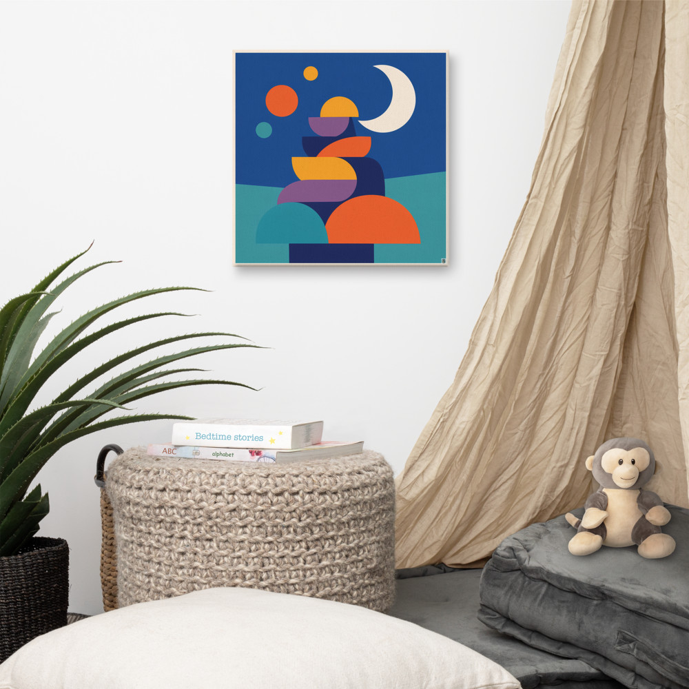
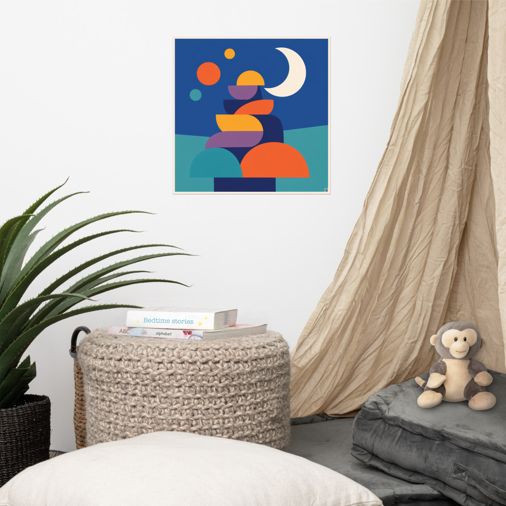
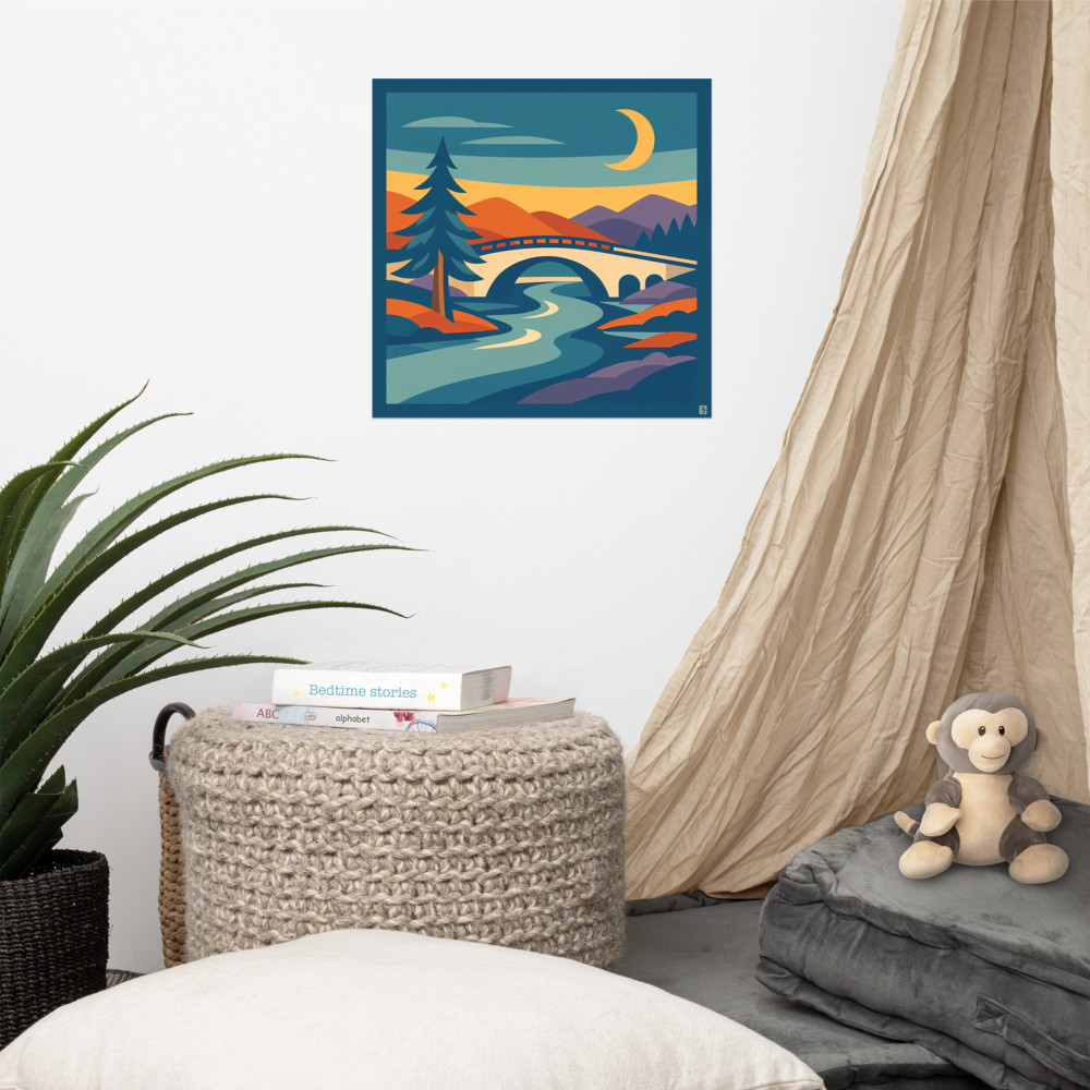
Something like Moonlit Quay is a good example of what I mean — it's a scene, but a stylised, geometric one, so it's not asking you to study it in detail. You get the feeling of a quiet harbour at night, the moon, the stacked shapes, and that's enough. Your eye knows what it's looking at within a second and then it can relax. That "reads quickly, rewards slowly" quality is what I'd look for in any bedroom piece.
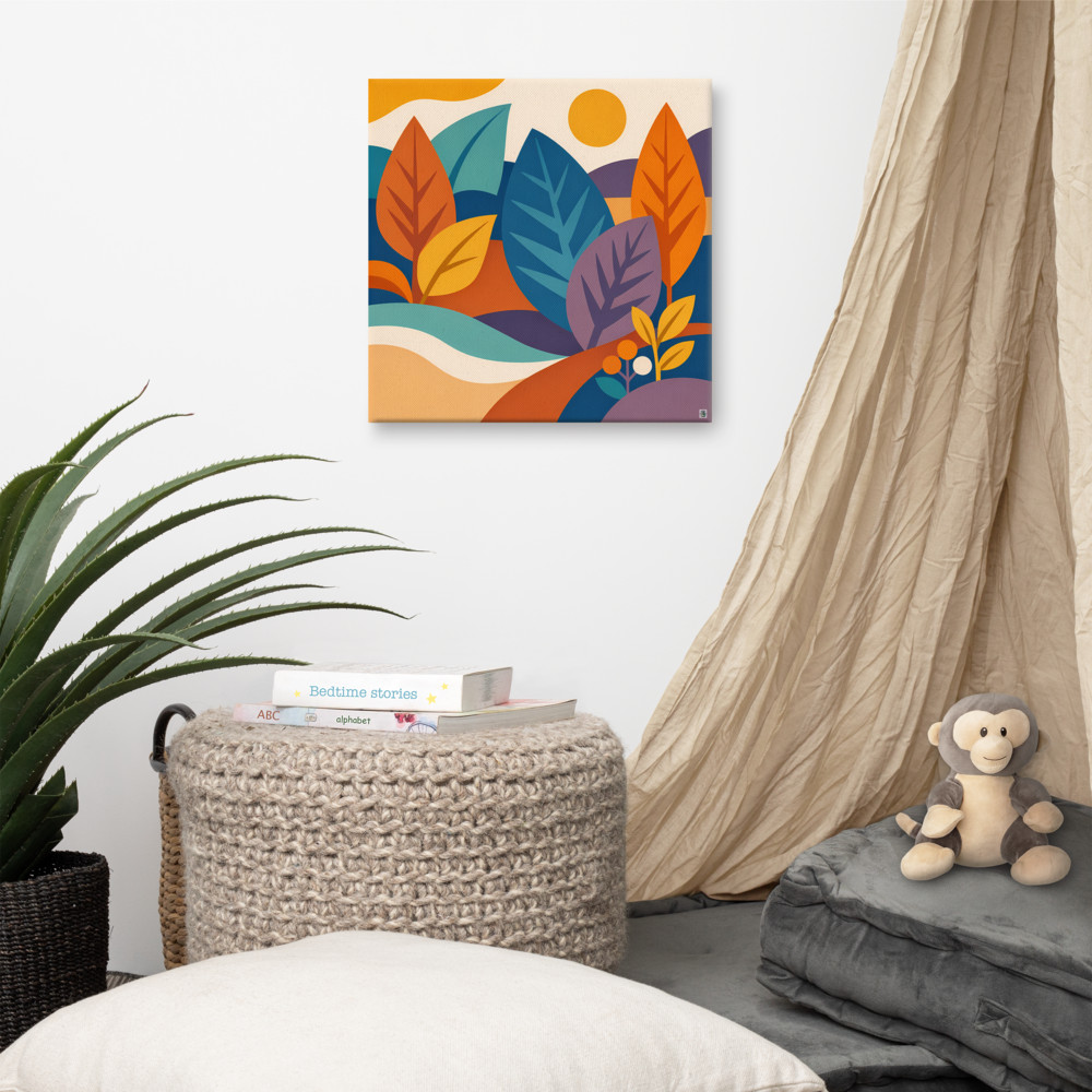
The same logic works for daytime-feeling scenes if your bedroom gets good morning light and you'd rather wake up to something warmer. A piece like Sunlit Copse leans into soft, gentle hills and botanical shapes — still a scene, still low-effort to look at, but it gives the room a different mood when the curtains open.
A few practical things about hanging it
Scale matters more in a bedroom than people realise. Above a double or king bed, a single small print looks marooned. Either go reasonably large (something around 60cm or wider for the main piece), or do a pair, or do a small grouping where the pieces clearly belong together. A lone A4 print floating above a 150cm headboard is going to look like it's drifted in from another room.
Height is the other thing. The standard advice is centre at around 145–150cm from the floor, which works for most rooms — but above a bed, you're often hanging in relation to the headboard, not the floor. A gap of roughly 15–25cm between the top of the headboard and the bottom of the frame tends to look right. Closer and it feels cramped, further and the art looks like it doesn't know the bed is there.
Avoid glass directly above where your head goes, by the way. Canvas, or framed prints hung on the side walls rather than over the pillow, are safer. It's the sort of thing you don't think about until you do think about it, and then you can't unthink it.
On bedside walls and quieter corners
The wall above the bed gets all the attention, but the wall you actually see most often from inside the bed is the opposite one — the wall with the wardrobe or the door. That's the view you have when you're lying there in the morning not quite ready to get up. It's worth giving it something worth looking at.
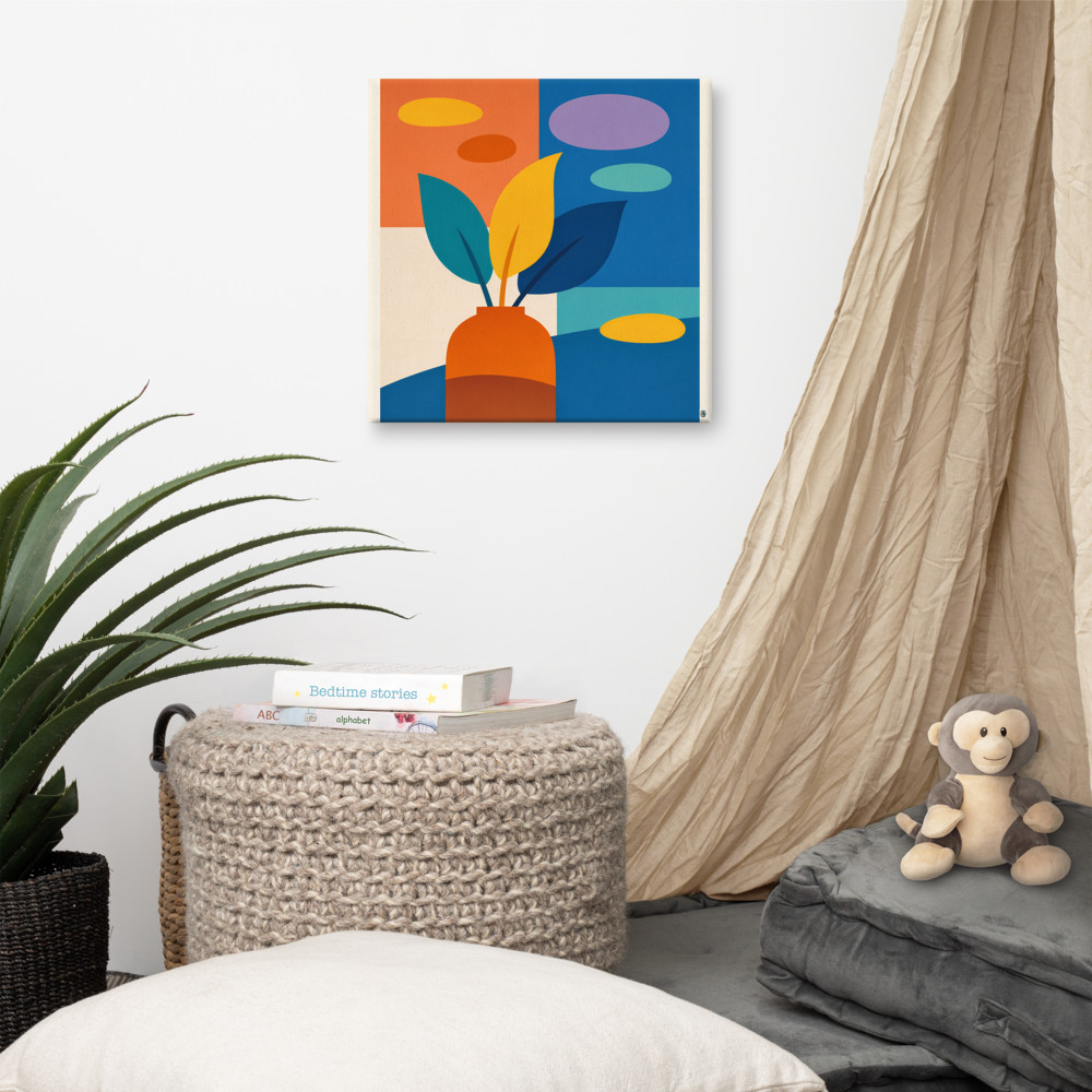
This is where a still-life-ish piece earns its place. Courtyard Pause is the kind of thing I mean — a vase, some leaves, blocks of muted colour, nothing happening but everything settled. It's a scene in the loose sense: an arrangement, a moment, a small composed world. Easy to look at for a long time without getting bored or wound up.
If I had to summarise the whole thing in one sentence, it'd be this: pick art that your eyes can rest on, not art that performs for you. Restful bedroom art isn't the absence of personality. It's just personality that knows what time it is.
Related articles
Mentioned in this article