InkSmithery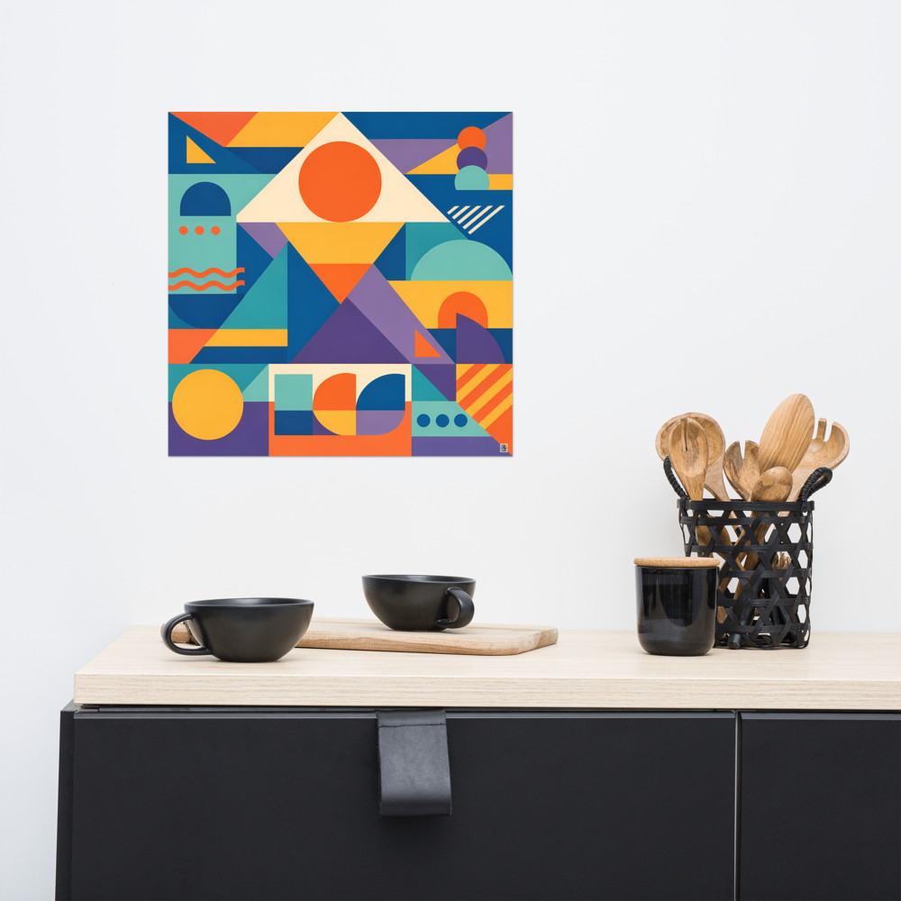
Art Above a Headboard: Sizing, Proportion and Safety
The wall above a bed is one of those spots that looks straightforward until you actually stand in front of it holding a picture hook. Too small and the art floats like a postage stamp. Too tall and the room starts to feel weirdly compressed, like the ceiling has crept down while you weren't watching. And then there's the not-small matter of a heavy frame hanging directly over someone's head for eight hours a night.
So here's what I've worked out over the years, and what I'd actually tell a friend who was about to hang something above their bed.
Getting the width right
The general rule of thumb — and it is genuinely useful, not just decorator-speak — is that art above a bed should span roughly two-thirds to three-quarters of the width of the bed (or the headboard, if yours is wider than the mattress). A standard UK double is 135cm wide, so you're looking at a piece, or arrangement, somewhere between about 90cm and 100cm across. A king at 150cm wants something closer to 100–115cm. A super king starts to need really quite a substantial piece, or a considered arrangement of two or three prints, to hold the wall.
Go narrower than about half the bed width and the whole composition looks apologetic. The bed dominates, the art hovers, and your eye can't work out what it's meant to be looking at. Go wider than the bed and it starts to feel off-balance in the other direction, unless the bed is quite obviously tucked into an alcove where the art can breathe past it.
If you're hanging a diptych or triptych, measure the total width including the gaps between frames — usually 5–8cm looks right — and treat that combined width as your figure.
Why tall-and-narrow rarely works here
This is the bit people get wrong most often, in my experience. A tall portrait-orientation piece above a bed does something odd to the room: it visually pulls the ceiling down and pushes the bed further into the floor. The eye reads the vertical mass of the headboard, then the vertical mass of the art on top, and the whole stack starts to feel like it's compressing the space between mattress and ceiling.
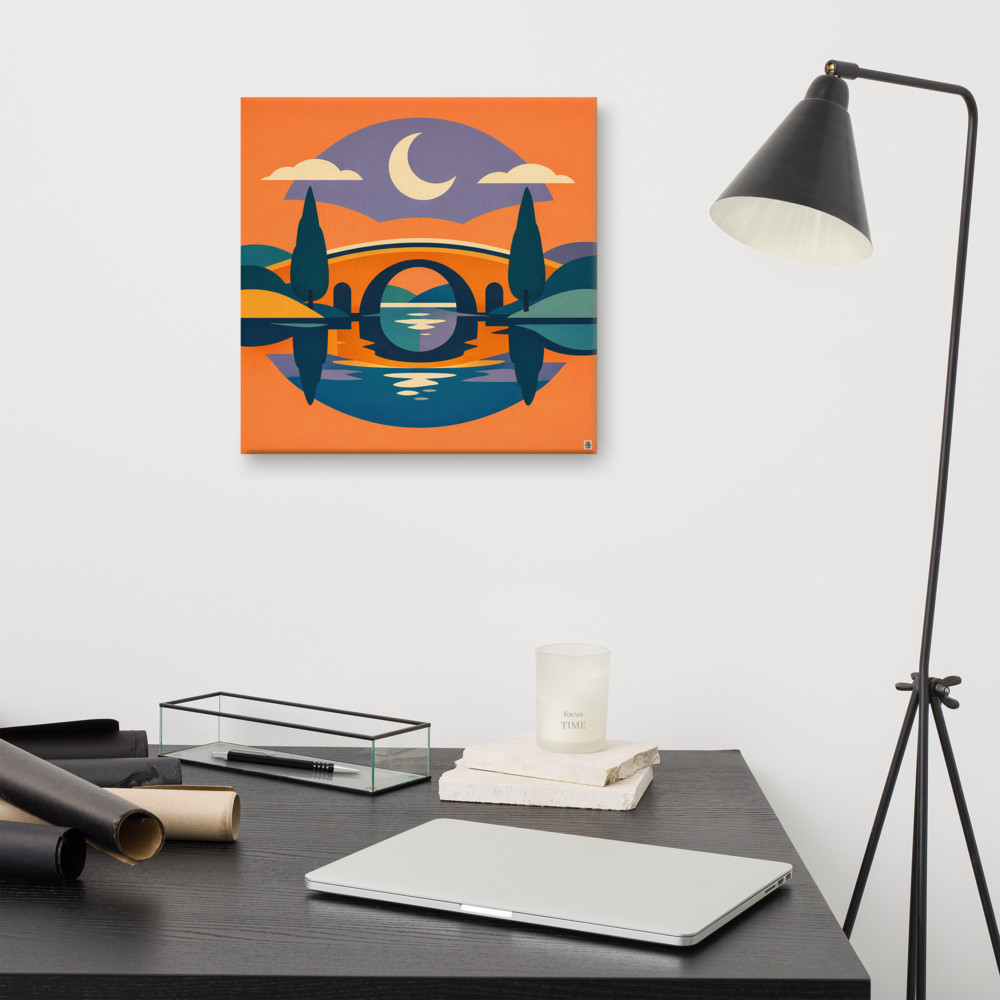
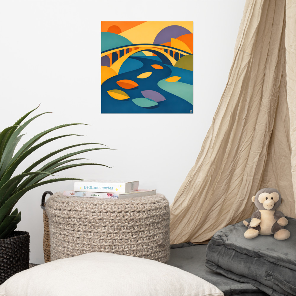
Horizontal or square works far better above a bed because it echoes the horizontal line of the headboard and the mattress. It settles the composition down instead of stacking it up. Something like Canal Dusk — a wide landscape format — sits over a headboard the way it's meant to, with the horizon line doing the same job as the top edge of the bed frame. Your eye travels across, not up-and-down-and-up.
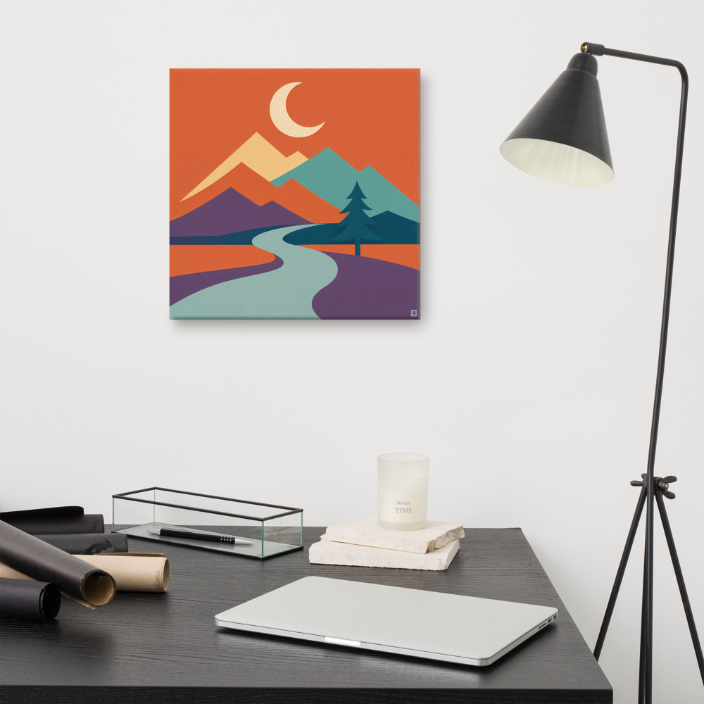
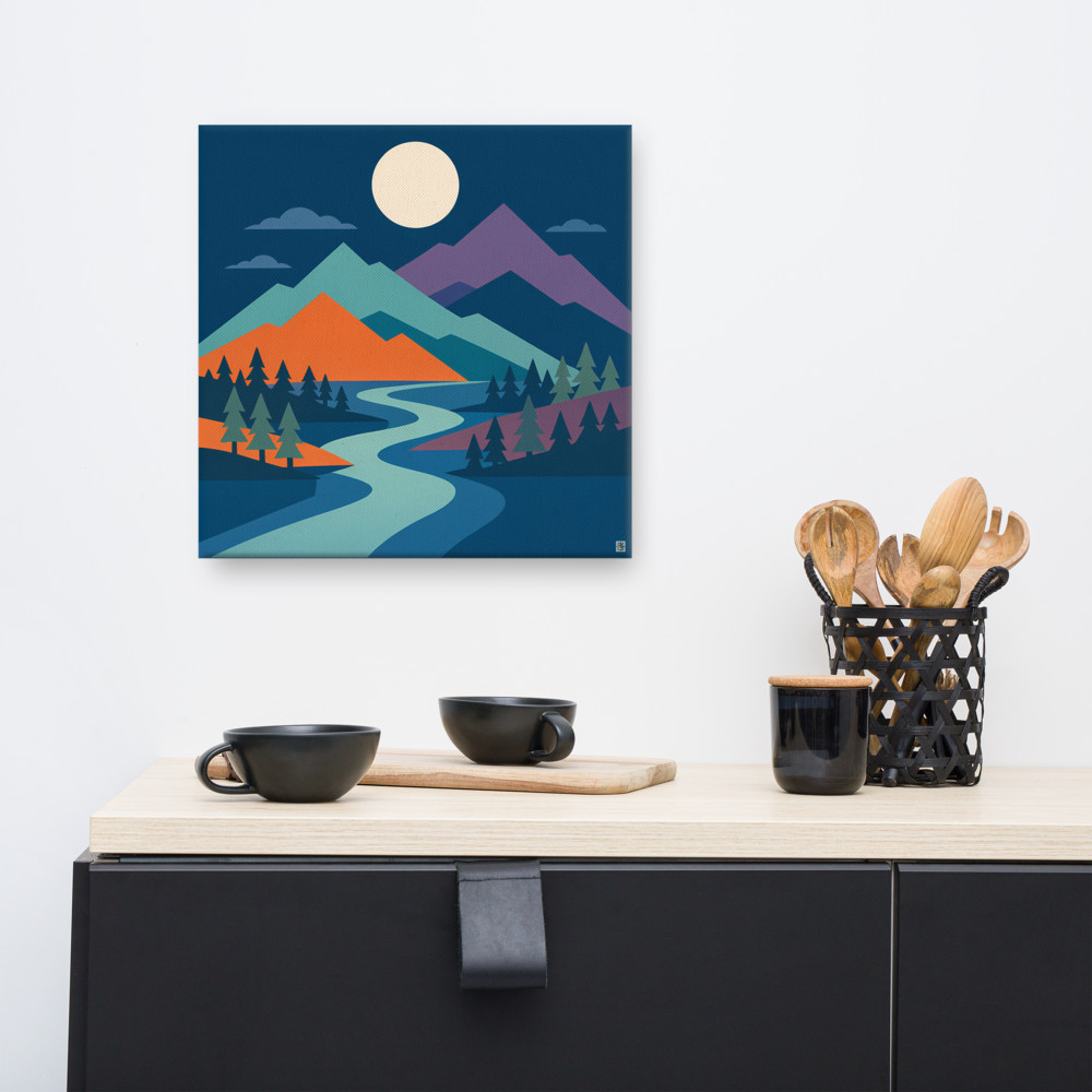
If you genuinely love a portrait piece and want it above the bed anyway, the workaround is to hang it lower than you'd instinctively want to — so it sits closer to the headboard and doesn't reach for the ceiling. Or pair two portrait prints side by side, which turns the overall shape back into something wider than it is tall. A pair of Moonlit Pass prints, for instance, would give you height without the compression, because the combined footprint is now landscape-ish overall.
The gap between headboard and art
Aim for roughly 15–25cm between the top of the headboard and the bottom of the frame. Any tighter and it looks like the two are fighting for the same square of wall. Any looser and the art starts to feel disconnected from the bed entirely, floating up near the ceiling with no relationship to what's beneath it.
One thing worth checking: sit on the bed and look at the wall opposite. Then imagine someone else sitting on the bed. That's the sightline the art will actually live in most of the time — from below, at an angle. Hanging things slightly lower than a gallery would suggest often looks better in a bedroom for exactly this reason.
The safety bit, which I'd rather you didn't skip
Hanging something heavy over a sleeping person is one of those things nobody really wants to think about, but you should think about it once and then not have to worry again.
A few practical things I'd sort out before hanging:
- Use fixings rated well above the weight of the piece. If your canvas or framed print weighs 4kg, don't use a hook rated for 5kg — go to 10kg or more. The rating is a maximum, not a target.
- Find the stud, or use proper plasterboard fixings (spring toggles or metal self-drilling anchors), not the little plastic wall plugs that came free with a shelf you bought in 2014.
- Two hooks are almost always better than one. They spread the load and stop the frame tilting over time.
- For anything glazed, seriously consider whether you want glass above your head at all. Acrylic glazing is lighter, doesn't shatter, and honestly looks nearly identical once it's on the wall. Canvas prints avoid the question entirely, which is partly why they're such a sensible choice for above a bed.
- Check the fixing every year or so. Plasterboard can loosen, especially in older houses where the walls have seen a few decades of central heating cycles.
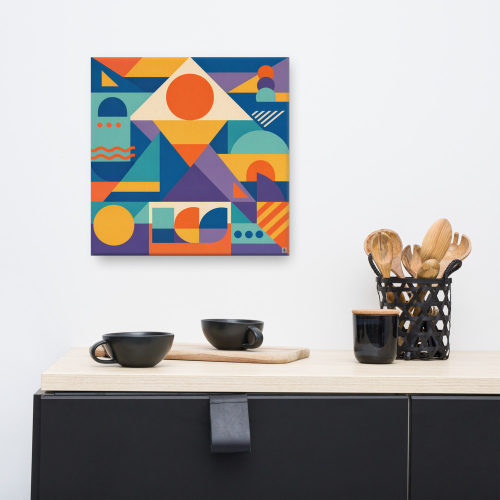
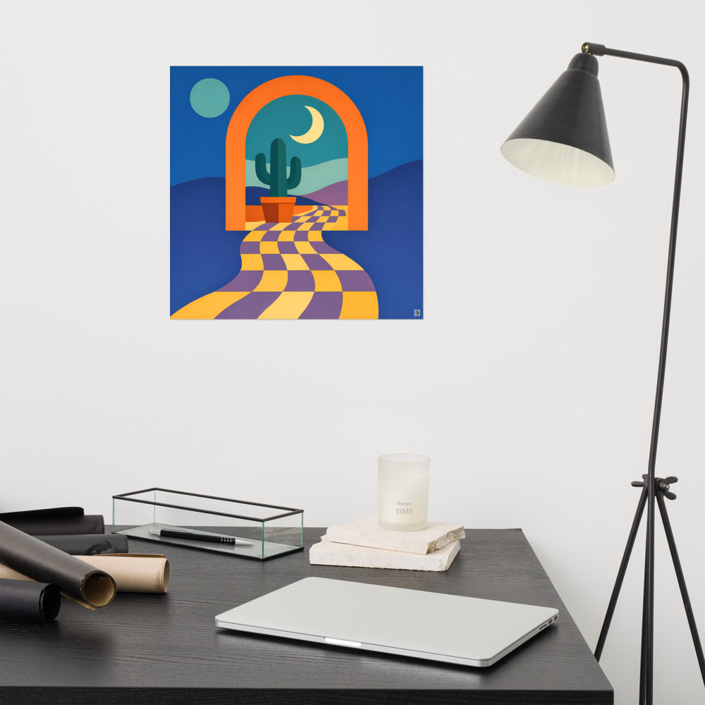
A canvas piece like Arcade Terrace is genuinely one of the easier things to hang safely above a bed — no glass, relatively light for its size, and the depth of the stretcher bars gives you a solid edge to attach D-rings or a wire to.
A few practical starting points
If you're stuck on where to begin: measure your bed, multiply the width by 0.67 and by 0.75, and shop within that range. Favour landscape or square over portrait. Leave 15–25cm above the headboard. Use two fixings, rated generously, into something solid.
The rest is really just about what you actually want to look at every morning and every night, which is a much more personal question than any sizing rule can answer.
Related articles
Mentioned in this article