InkSmithery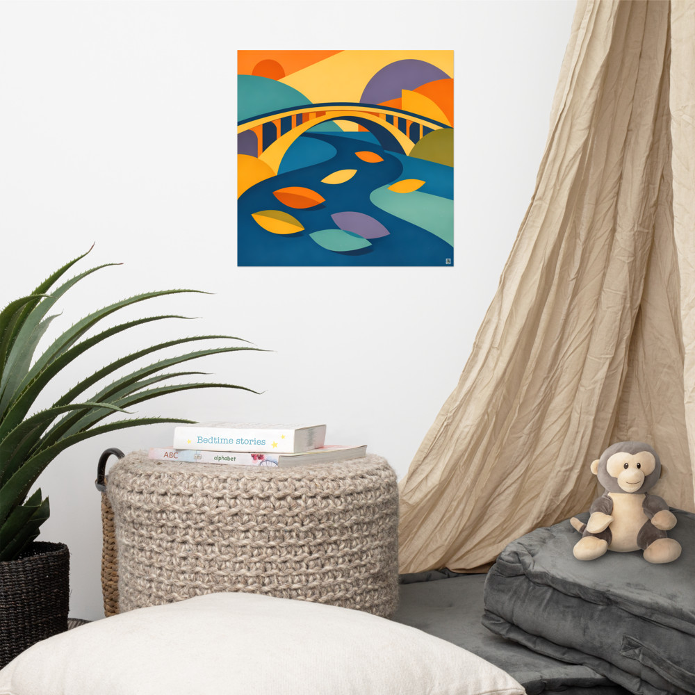
What actually works on a narrow hallway wall (and what doesn't)
Narrow hallways are the trickiest bit of any home to decorate, and I say that as someone who has stared at my own for far too long. You can't step back to appreciate anything. The light is usually rubbish. And whatever you hang, someone's shoulder is going to brush past it on a Tuesday morning when they're running late.
The temptation is to buy one big statement piece to fill the space and be done with it. I'd resist that urge. A large single canvas in a narrow corridor almost never lands the way you hope — you can't get far enough away from it to read the whole image, so your eye just skips across a slab of colour on the way to somewhere else. It ends up feeling less like art and more like a rug hung sideways.
What works instead is thinking about hallways the way a gallery does: as a walk-through, not a viewpoint. You move past art in a hallway. That changes everything about what you should hang there.
Vertical, or a series, or ideally both
Hallways reward two shapes: tall vertical pieces, and small-to-medium pieces hung in a run.
Vertical works because it echoes the geometry of the space itself — you've got a tall, narrow slice of wall, so a tall, narrow image sits inside it without fighting anything. A portrait-orientation print at around 30x40cm or 40x60cm, hung with its centre roughly at eye level (call it 145–150cm from the floor), does far more for a corridor than something twice the size in landscape.
But the thing hallways are genuinely brilliant for is series work. Three or four related pieces spaced along the wall give you something to notice as you walk — a small unfolding, rather than a single monument. This is where hallways beat living rooms, honestly. In a lounge you tend to sit and take in one focal wall. In a hallway your eye moves, so the art can move with you.
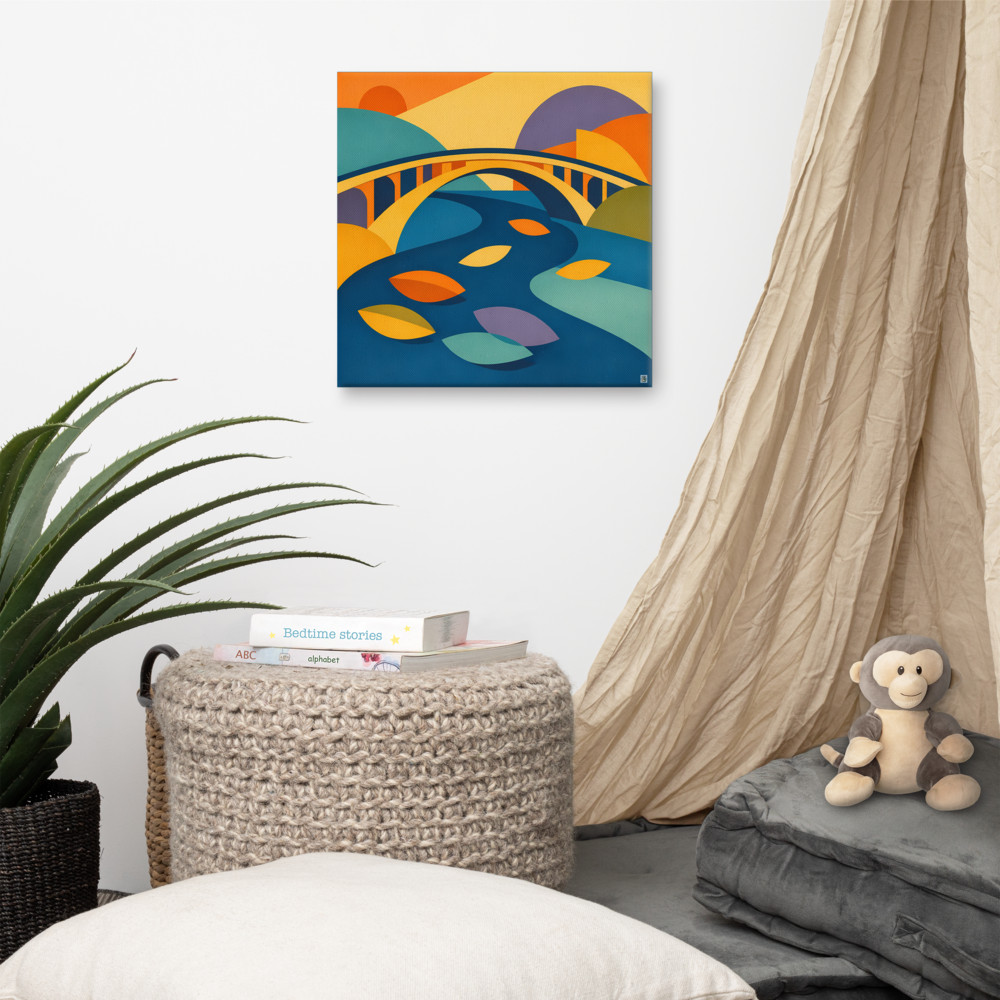
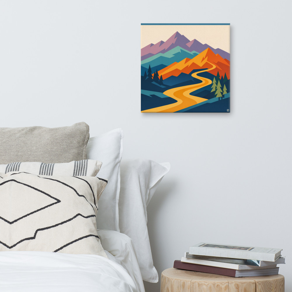
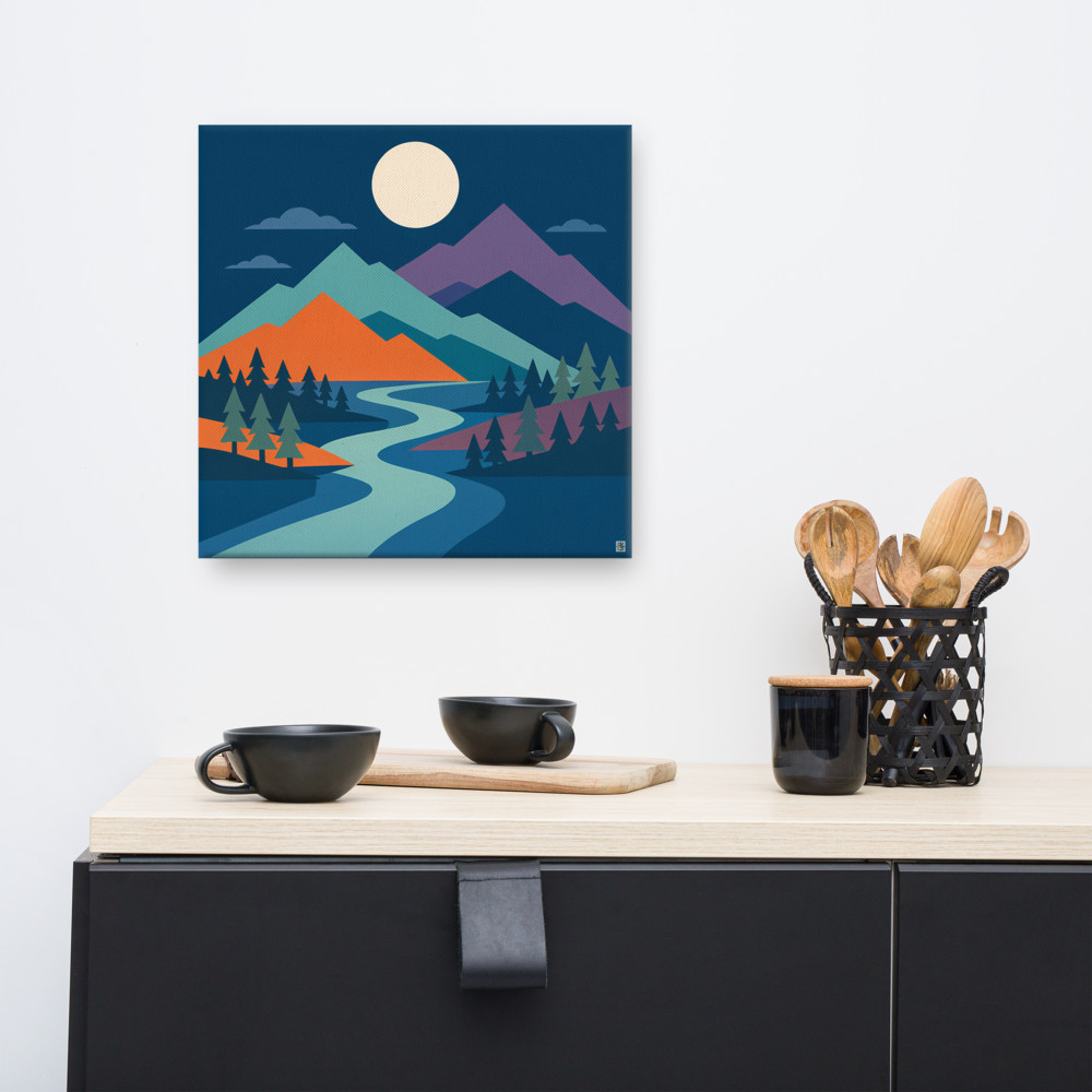
A series doesn't have to mean matching prints. It means pieces that share a language. Same palette, same era of style, same artist, same framing. Three landscape-flavoured geometrics — something like Riverbend Rise alongside Dawn Pass — will feel like a proper collection even though the images aren't identical, because the visual vocabulary is consistent. That's the trick.
Spacing-wise, I'd leave roughly 8–15cm between frames if you're hanging them close as a set, or space them a good arm's length apart if you want each one to feel like its own moment as someone walks by. Both approaches work. Just pick one and commit — the awkward middle distance (say, 40cm apart) tends to look accidental.
The lighting problem nobody warns you about
Most hallways are lit by a single ceiling pendant or downlight, often quite warm, often not very bright, and almost always in the wrong place for the art. You'll hang something you love, step back, and realise half of it is in shadow while the other half has a glare hotspot on the glass.
A few things help. First, if your prints are behind glass or acrylic, pay attention to where the overhead light hits — sometimes moving a frame 20cm to the left is the difference between seeing the image and seeing a reflection of the light fitting. Second, warm bulbs (2700K-ish) flatter warm-toned art but can murder anything cool or blue. If your prints lean toward teal, sage or slate, a slightly cooler bulb (3000K) reads truer.
If you're willing to spend a bit, small battery-powered picture lights that stick to the top of the frame are surprisingly good now. No wiring, USB rechargeable, and they let you actually see the piece. For a hallway with no natural light this is probably the single biggest upgrade you can make — bigger than the art itself, arguably.
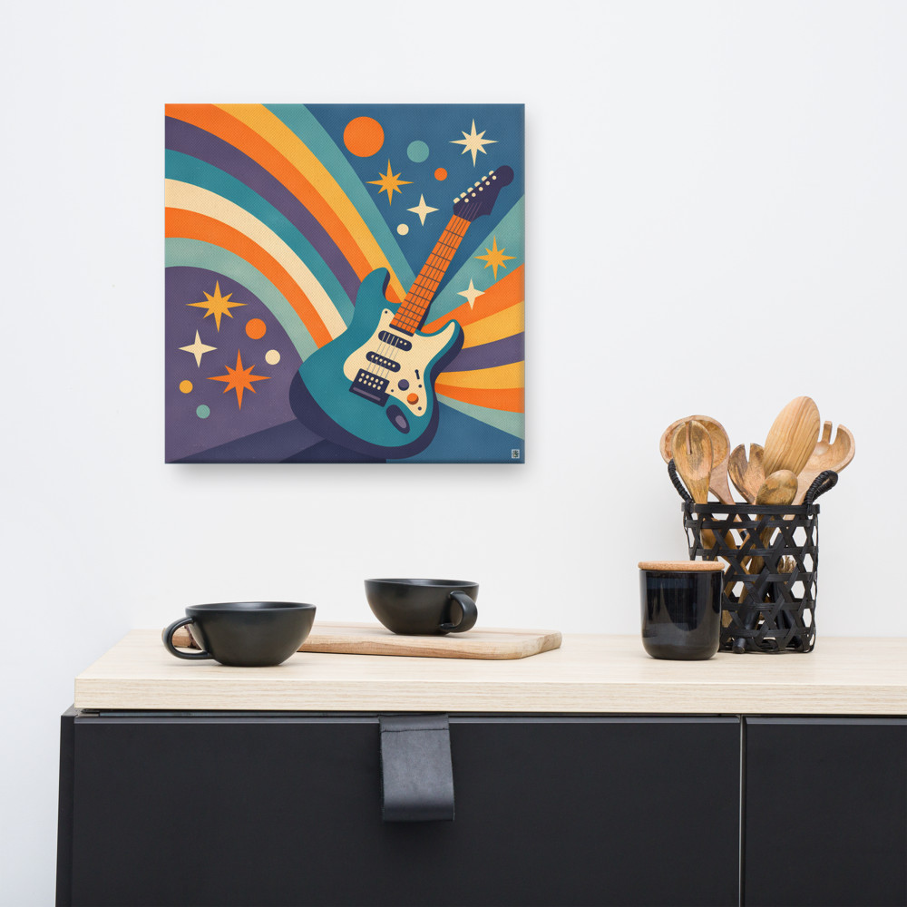
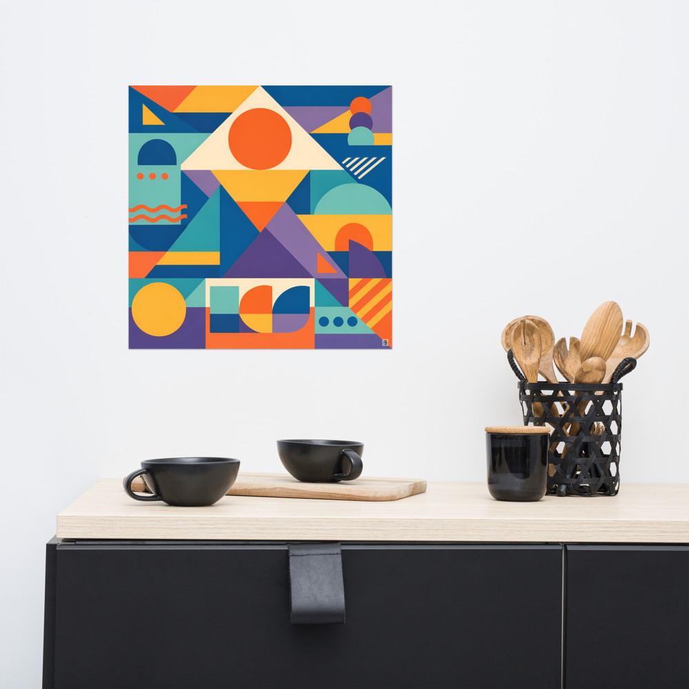
And on colour: darker prints tend to disappear into dim hallways, which is a shame if you've picked something with lovely detail. Lighter backgrounds, or pieces with strong graphic shapes that read from a distance, tend to survive low light better. Something bold and rhythmic like Chord Vale will still make itself known in a gloomy corridor, whereas a moody, subtle piece might vanish.
A few practical bits
Measure the actual usable wall before you buy anything. Radiators, thermostats, light switches, alarm panels and coat hooks eat into narrow hallway walls in ways you don't clock until you're holding a frame up and swearing.
Hang lower than you think, especially if the hallway is often walked rather than stood in. Gallery convention is centre-of-piece at 145–150cm, but if your ceilings are low or the hallway is really tight, going a touch lower stops everything feeling top-heavy.
If you're going for a run of three or more, mock it up on the floor first. Lay the frames out, shuffle them around, take a photo on your phone from above. It's much easier to spot when something feels off when you're looking at a picture of the arrangement rather than the arrangement itself.
And — this one's just personal taste — I'd avoid hanging anything you actually love in a hallway that gets a lot of steam from a nearby bathroom. Prints behind glass are usually fine, but unframed canvases in a humid, poorly ventilated corridor will start to look sad within a year or two. Save those for drier walls.
The short version: think tall, think in threes, and treat the walk itself as part of the experience. A hallway isn't a smaller living room. It's its own kind of space, and once you stop trying to force a big-single-piece solution into it, the options open up considerably.
Related articles
Mentioned in this article