Why One Big Print Beats Three Small Ones in a Small Room
There's a stubborn bit of interiors advice that goes something like: small room, small art. It sounds sensible. It's also, in my experience, wrong most of the time.
If you've ever hung three neat little 20x25cm prints above a sofa in a box bedroom and stepped back thinking *that should have worked*, you've bumped into the same problem I did for years. The wall looks busier, not bigger. The room feels more cluttered, not more considered. And you can't quite work out why, because on paper you did everything right — you filled the space, you balanced the composition, you even measured.
The reason it doesn't work is that our eyes count things. When there are three separate objects on a wall, the brain registers three objects, three frames, three edges, three stopping points. When there's one, it registers one. In a small room, where the wall itself isn't that big to begin with, every extra visual break chops the space into smaller pieces. So the wall — and by extension the room — reads as more fragmented than it actually is.
One larger piece does the opposite. It gives the eye somewhere to land and then rest. The wall behind it becomes a supporting surface rather than a competing one. The room feels calmer, and calmer almost always reads as bigger.
The maths nobody tells you
Here's the counter-intuitive bit. Three prints at 30x40cm each, spaced with a sensible 5cm gap, occupy a footprint of roughly 100cm wide by 40cm tall on the wall. That's 4,000 square centimetres of *rectangle*, but only about 3,600 sq cm of actual art, with the rest being gaps and negative space between frames.
Swap that for a single 70x100cm piece and you're at 7,000 sq cm of art. Nearly double. And yet — this is the part people don't quite believe until they try it — the single piece often *feels* less imposing in the room than the trio did. Because it's one shape. One decision. The eye reads it in a single glance and moves on to the rest of the space.
The trio, meanwhile, keeps asking to be looked at. Each frame is a small demand. Multiply that by three and you've turned a wall into a to-do list.
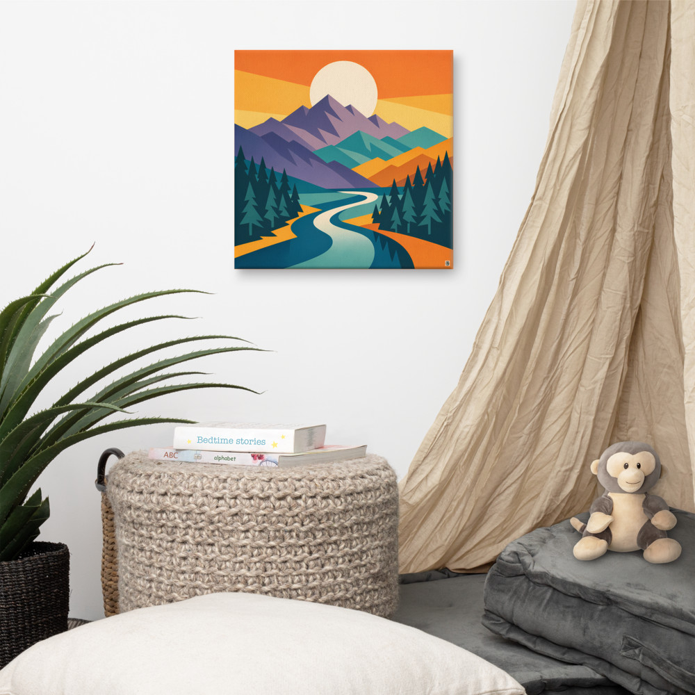
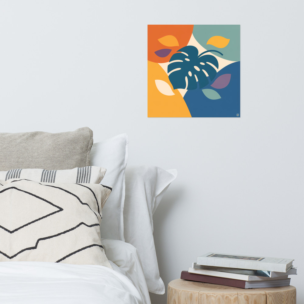
This is why designers working with small flats so often reach for a single oversized piece above the bed, or one landscape-orientation canvas over a two-seater. Something like Quiet Pass at a proper size — 60cm or bigger on the long edge — will do more for a narrow bedroom than any gallery wall arrangement of the same total budget.
What "large" actually means in a small room
People hear "oversized art small space" and picture something silly — a two-metre canvas in a studio flat. That's not what I mean. Large is relative to the wall, not the room.
The rough guide I use: the piece should occupy about two-thirds of the width of whatever furniture sits below it. Sofa is 180cm? Aim for art around 120cm wide. Bed headboard is 140cm? Something around 90-100cm. If there's no furniture below and it's just a bare wall, then two-thirds of the wall's usable width (leaving sensible margins on either side) is a good starting point.
Height matters too, but less than most people think. The centre of the piece wants to sit somewhere around 145-150cm from the floor — that's average eye level for a standing adult in the UK. In a room where you're mostly sitting, drop it a bit lower. Above a sofa, the bottom edge should hover 15-25cm above the back cushions, not float halfway to the ceiling.
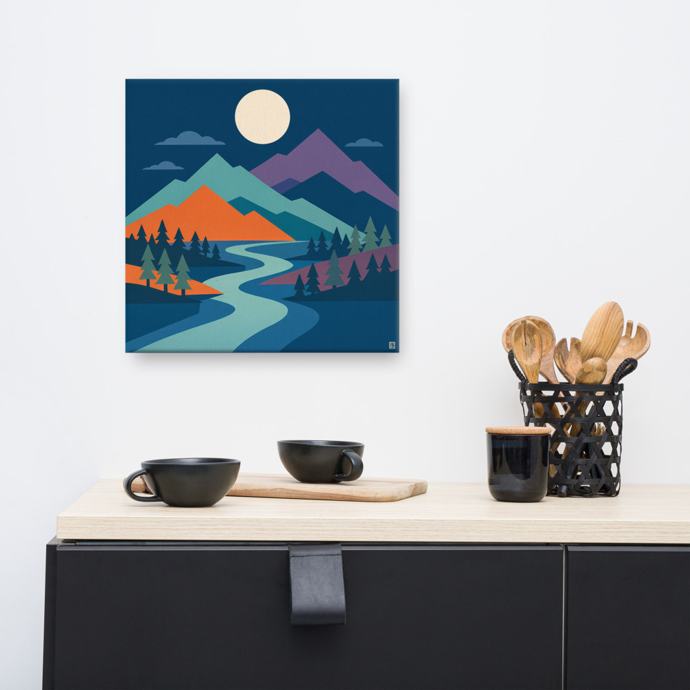
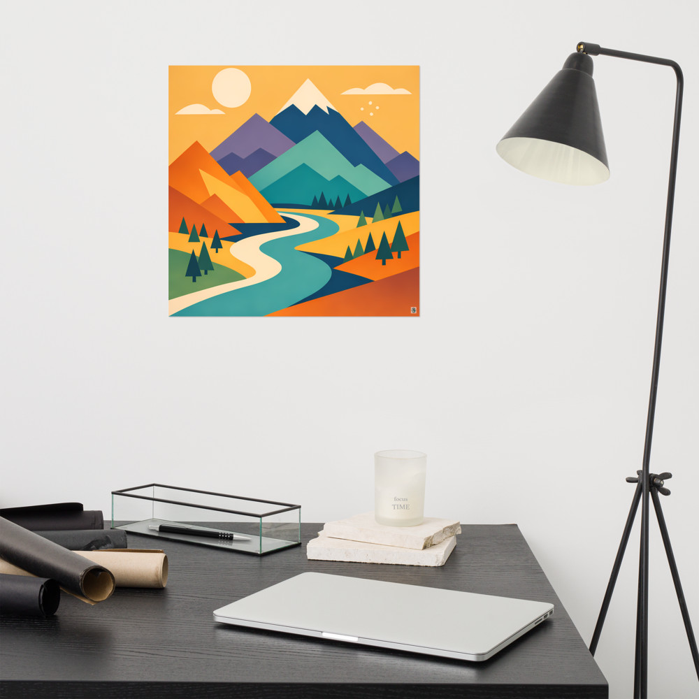
Subject matters more in small rooms than in large ones, because you can't get far enough away to blur the details. Something with depth in the composition — a landscape with receding layers, or a horizon line — will add perceived distance to the wall it's on. A Sunward Vale or similar layered scene essentially borrows depth from the artwork and lends it to the room. Whereas a flat, high-contrast graphic (which I love in bigger spaces) tends to sit *on* the wall rather than push through it.
When three small pieces do actually work
I don't want to pretend gallery walls have no place. They do. They just don't do the job people expect them to do in small rooms.
A cluster of smaller prints works when:
- The wall is already very large and you're trying to break it down into something more intimate.
- The pieces genuinely belong together as a series — same artist, same palette, same subject — so the eye reads them as one composition rather than three separate objects.
- The room is otherwise very minimal and the wall is the focal point on purpose.
What *doesn't* work is three unrelated prints hung together because you couldn't decide which one to buy. That's the version I see most often, and it's the version that makes rooms feel smaller.
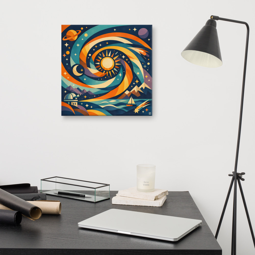
If you want the collected feel without the fragmentation, one option is a single piece with enough going on inside it to reward a longer look — something like Night Passage, where the composition itself has multiple focal points but is contained within one frame. You get the richness without the visual bookkeeping.
A test that costs nothing
Before you commit, cut some newspaper or brown paper to the size of the piece you're considering. Tape it to the wall. Live with it for a couple of days.
Do the same with the outlines of three smaller pieces in the same total area. Walk into the room from the doorway. Sit on the sofa or the bed. Do the boring things — get dressed, make the bed, watch telly — with each version taped up.
You'll know within about 48 hours which one lets the room breathe. It's almost always the single large shape. And once you've seen it, you can't really unsee it.
Related articles
Mentioned in this article