InkSmithery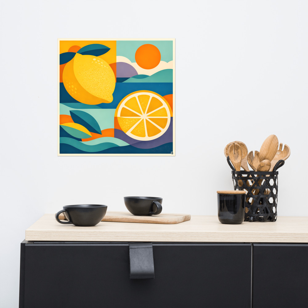
Art and Plants: Why Botanical Prints Fight Real Foliage
There's a Pinterest board somewhere in your head — probably mine too — where a big leafy monstera sits next to a framed print of, say, a botanical illustration of ferns. It looks lovely on screen. Then you try it at home and something's off. The wall feels busy. The plant looks smaller than it did yesterday. You can't quite tell where the leaves stop and the art starts.
This is one of those styling problems that nobody warns you about, because on paper it sounds like a no-brainer. Plants are green and alive. Botanical art is about plants. Surely they belong together. And sometimes they do — but far less often than the mood boards suggest.
The problem with matching botanicals to botanicals
When you put a real fiddle leaf fig next to a print of tropical foliage, both things are competing for the same job. They're both saying "look at these interesting leaves." Your eye doesn't know where to settle. Instead of the plant framing the art or the art framing the plant, they cancel each other out — a bit like wearing a floral shirt with floral trousers in a similar scale. Technically it matches. Visually it's noise.
The scale issue is the sneaky one. A real plant has depth, movement, changing shadows through the day, new leaves unfurling. A botanical print is flat and fixed. Put them side by side and the print starts to look like a slightly sad photocopy of the thing already living on your sideboard. The plant wins, always, but it wins ugly — it makes the art feel redundant rather than complementary.
And then there's colour. Most botanical illustrations lean into greens, soft earthy browns, muted terracottas. Which is exactly what your plant is already bringing to the wall behind it, along with whatever terracotta pot you've popped it in. You end up with a corner that's all one temperature. Cosy in theory. In practice, a bit murky.
Let the plant be the botanical
The shift that usually fixes this is treating the plant as the botanical element in the room, and letting the art do something completely different. Abstract shapes, geometric prints, bold colour blocks, retro sun-and-moon motifs — anything that gives your eye a break from organic leaf shapes.
Think of it like this: the plant is providing the softness, the irregularity, the alive-ness. The art can then bring structure, graphic contrast, or a shot of unexpected colour. The two stop competing and start doing different jobs in the same corner.
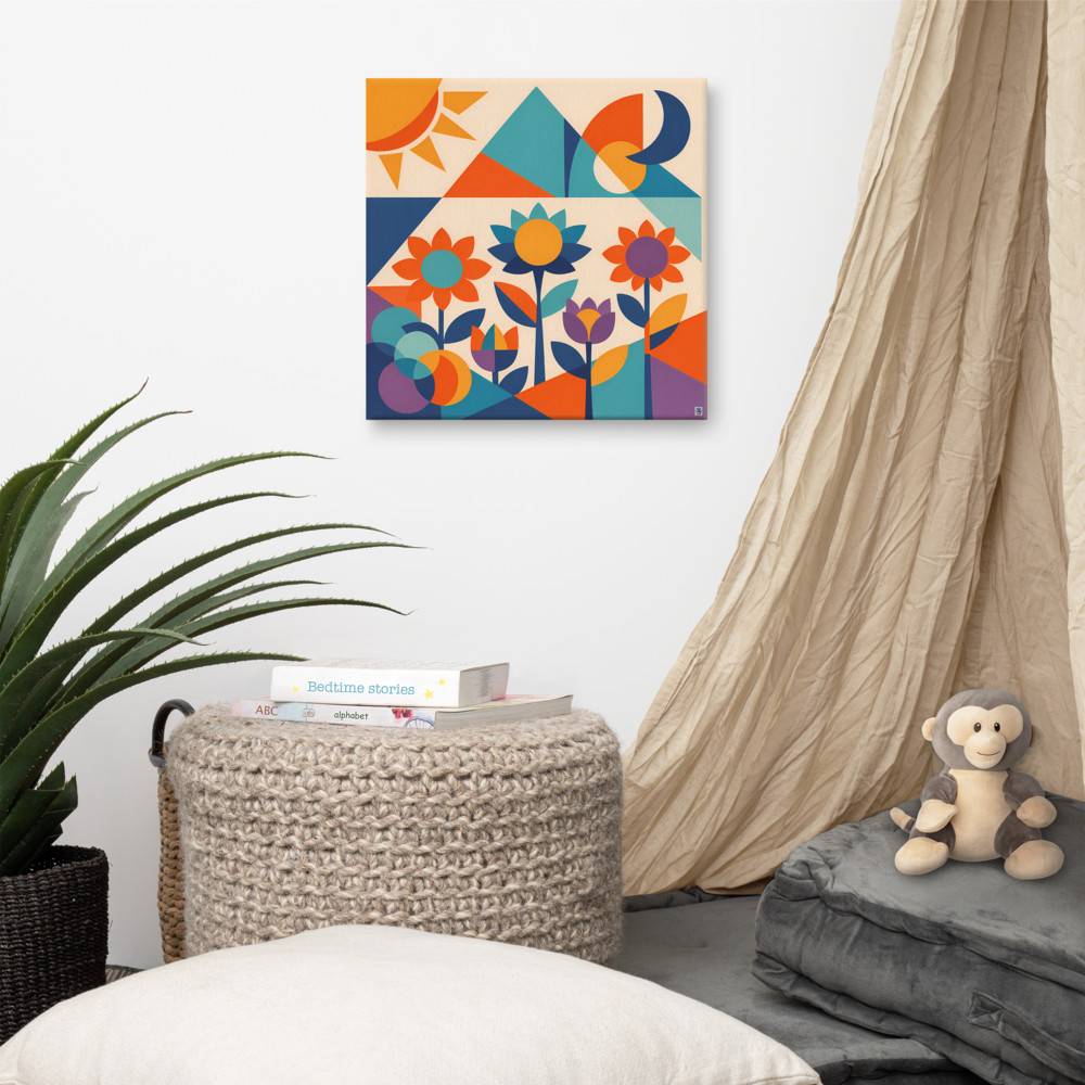
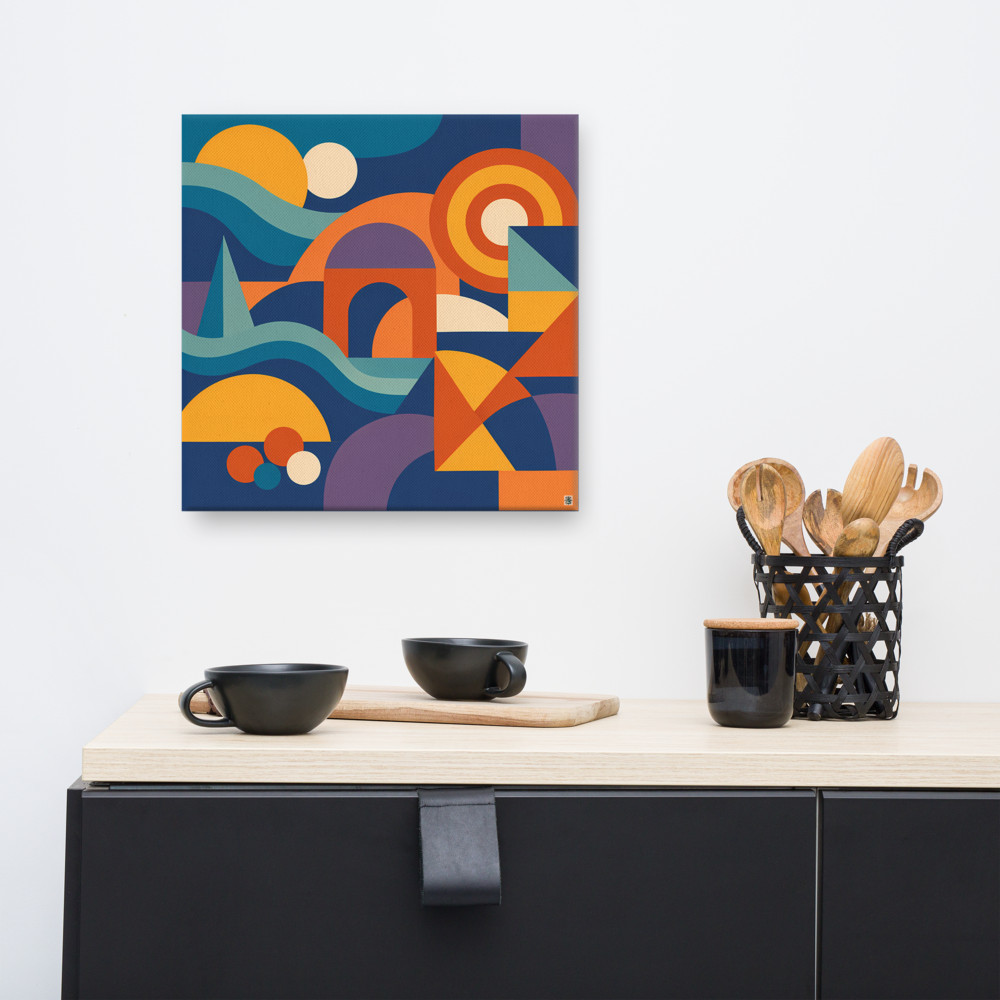
A geometric piece like Dawn Meadow is a nice example of this middle ground — it references flowers and a garden, but through hard-edged shapes and flat colour, so it doesn't try to out-botanical your actual pothos. The reference is there, the visual language isn't. Your monstera can do its thing without feeling doubled-up.
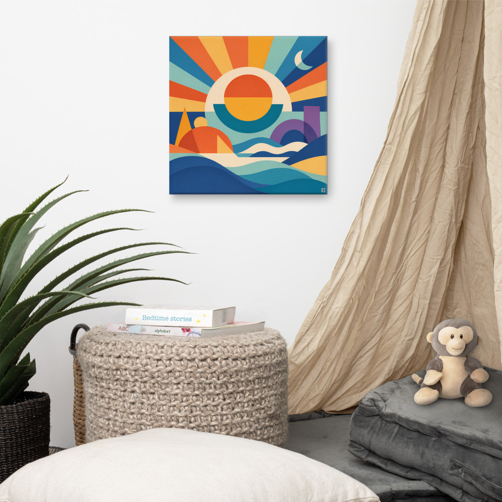
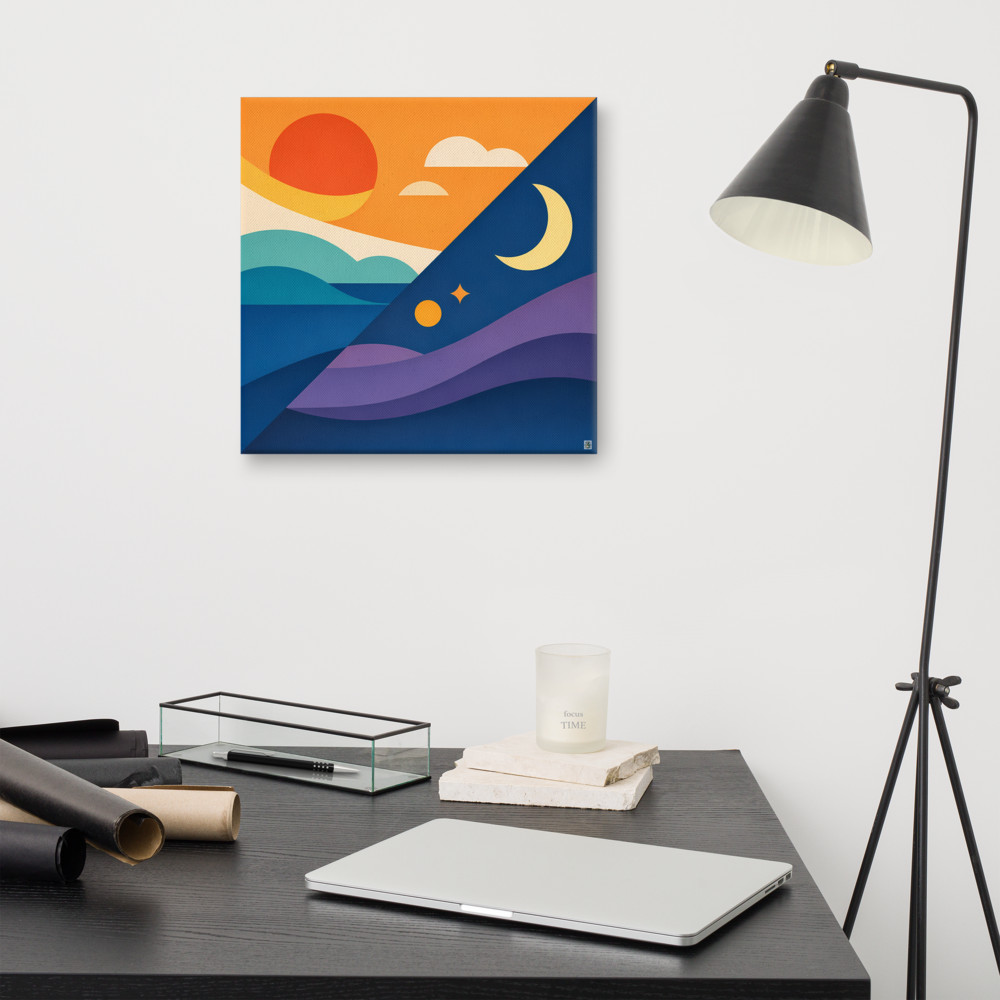
Or go further and pick something with no plant reference at all. A Sunward Tide landscape gives a warm horizon and some retro geometry, which reads as calm and settled next to trailing leaves rather than fighting them. Same for anything with strong horizontal lines or a limited flat palette — the contrast with organic plant shapes is what makes the arrangement work.
When botanical art does work with plants
I don't want to be too absolute about this. Botanical art with real plants can work — you just need one of two things to be true.
Either the art is stylised enough that it's not really trying to depict a plant (line drawings, single-colour silhouettes, that kind of thing), or the plant is small and secondary — a little trailing ivy on a shelf, not the main event. The trouble comes when both the plant and the print are trying to be the focal point at once.
The other exception is scale mismatch on purpose. A tiny detailed botanical print above a huge sculptural plant can work, because there's no question about hierarchy. The plant is the room; the art is a small footnote. It's when they're roughly equal in visual weight that things go sideways.
A few practical moves
If you're styling a plant corner from scratch, I'd probably start with the plant and choose art last. Live with the plant in the space for a week or two, notice which colours it's pulling out of the room, notice where the light falls on its leaves. Then pick art that either contrasts with those greens or introduces a colour the plant can't provide — warm yellows, deep blues, terracotta oranges.
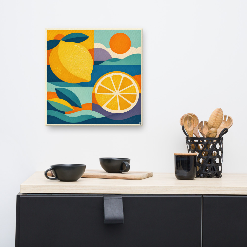
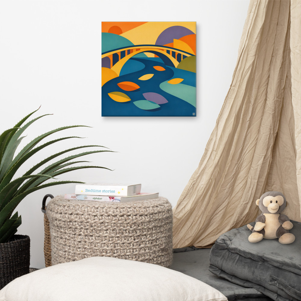
Fruit prints are an underrated option here. Something like Market Glow brings warm citrus yellows and oranges that sit brilliantly against green foliage without repeating it. Same principle — the reference is loosely natural, but the colour and style pull in a different direction.
A few other things that usually help:
- Leave breathing room. Plants need space around them to read as sculpture. If the art is crowding the leaves, move one of them.
- Watch the sightlines. If you sit on the sofa and the plant partly covers the print, that's fine — but decide whether you want the art seen fully or peeking through leaves. Both work, they just need to be a choice.
- Consider the pot. A terracotta pot with an earthy botanical print is the colour murkiness trap. A white or dark pot gives the art more room to speak.
The underlying idea, if there is one, is that a good corner has a bit of tension in it. Something soft against something structured. Something alive against something graphic. When every element is quietly agreeing with every other element, the whole thing goes flat — even when each piece is nice on its own.
So trust the plant to do the botanical bit. It's better at it than any print could be.
Related articles
Mentioned in this article