Mid-Century Modern vs Memphis: Two Movements, One Big Mix-Up
Every few months someone messages me a photo of a print and asks if it's mid-century modern. Half the time it isn't — it's Memphis, or something Memphis-adjacent, and the confusion is completely understandable. Both movements use bold shapes, both have been everywhere on Pinterest for years, and both get lumped under the vague umbrella of "retro". But they come from different decades, different philosophies, and honestly, different moods. One was trying to bring calm rationality into post-war homes. The other was trying to set fire to good taste on purpose.
It's worth knowing the difference, partly because it helps you describe what you actually like (useful when you're searching for art or furniture), and partly because the two can clash spectacularly if you mix them without meaning to.
The era and the thinking behind each
Mid-century modern runs roughly from the mid-1940s through to the late 1960s. Its roots are in Bauhaus and Scandinavian design, and the whole point was function, honesty in materials, and a kind of optimistic restraint. Think Eames, Saarinen, Noguchi. Plywood that looks like plywood. Teak that looks like teak. Tapered legs because they're structurally efficient, not because they're cute (though they are). The colour palettes lean warm and earthy — mustard, olive, burnt orange, walnut brown, soft teal — with plenty of cream and off-white doing the heavy lifting in the background.
The philosophy was democratic, in a sense. Good design for ordinary homes. Clean lines, low-slung furniture, indoor-outdoor flow, big windows. Nothing shouts. Everything's been considered.
Memphis is the rebellious teenager that arrived in 1981, founded in Milan by Ettore Sottsass and a group of designers who'd quite frankly had enough of mid-century earnestness. By the early 80s, modernism had calcified into something predictable, and Memphis was the reaction — squiggles, polka dots, mismatched laminates, geometric shapes that didn't match anything else in the room. Pink next to green next to black-and-white stripes. Furniture that looked like it had been drawn by a child with strong opinions.
It was deliberately provocative. The group basically said: who decided beige is sophisticated? Why does a bookshelf have to look like a bookshelf? Karl Lagerfeld famously furnished an entire Monte Carlo apartment with Memphis pieces. Most critics hated it. The movement only lasted until about 1987 as a formal group, but its visual language has had several revivals since, and we're arguably in one now.
How to tell them apart at a glance
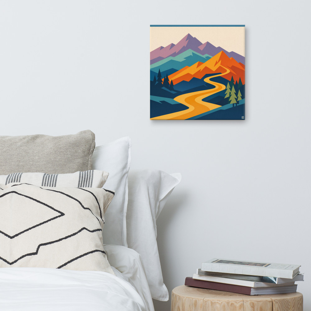
Mid-century modern feels grown-up. The shapes are organic — boomerangs, atomic starbursts, abstracted leaves, gentle curves. There's usually a sense of horizon or landscape, even in abstract work. Colours sit in a coherent family. If you saw something like Dawn Pass on a wall, with its layered mountain shapes and that warm ochre river running through, you'd correctly read it as mid-century-leaning. It's stylised, but it's still describing the world.
Memphis doesn't describe the world. Memphis describes itself. Squiggle lines that go nowhere. Triangles floating next to circles for no narrative reason. Black-and-white grids interrupted by a single hot pink blob. The palette is loud and the combinations are deliberately wrong-on-paper: terracotta with electric blue, lemon yellow with lavender. If a print makes you feel like you're inside an arcade in 1985, that's Memphis.
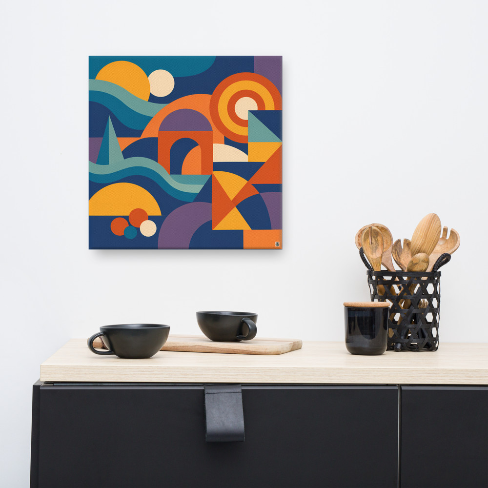
There's a middle ground, though, and this is where the confusion lives. A lot of contemporary work borrows the geometric vocabulary of Memphis but tones the colours down toward the mid-century palette. Something like Harbour Mirage, with those wavy stacked forms in navy and orange, is doing exactly that — the shapes have a playful Memphis quality, but the colours are restrained enough that it'd sit happily in a more grown-up room. That hybrid look is probably what most people actually mean when they say "retro" today.
Putting them in a room
Mid-century modern wants company that matches its register. Teak sideboards. Wool rugs in muted geometrics. Houseplants — lots of them. Lighting that's sculptural but warm. A walnut frame around your print. You can layer it heavily because everything is speaking the same quiet language.
Memphis is harder to live with, and I say that as someone who genuinely likes it. A fully Memphis room is exhausting after about a week. The smarter move is to use it as a single, deliberate accent — one chair, one print, one rug — against an otherwise calm background. White walls, simple furniture, then bam: one piece doing all the talking.
Where people go wrong is treating them as interchangeable retro styles and mixing them at equal volume. A genuine mid-century sideboard with a full Memphis print above it can work, but only if you commit. The print has to be the loudest thing in the room and the sideboard has to play straight man. If you've got competing patterns elsewhere — a busy rug, patterned curtains, a gallery wall — the whole thing collapses into visual noise.
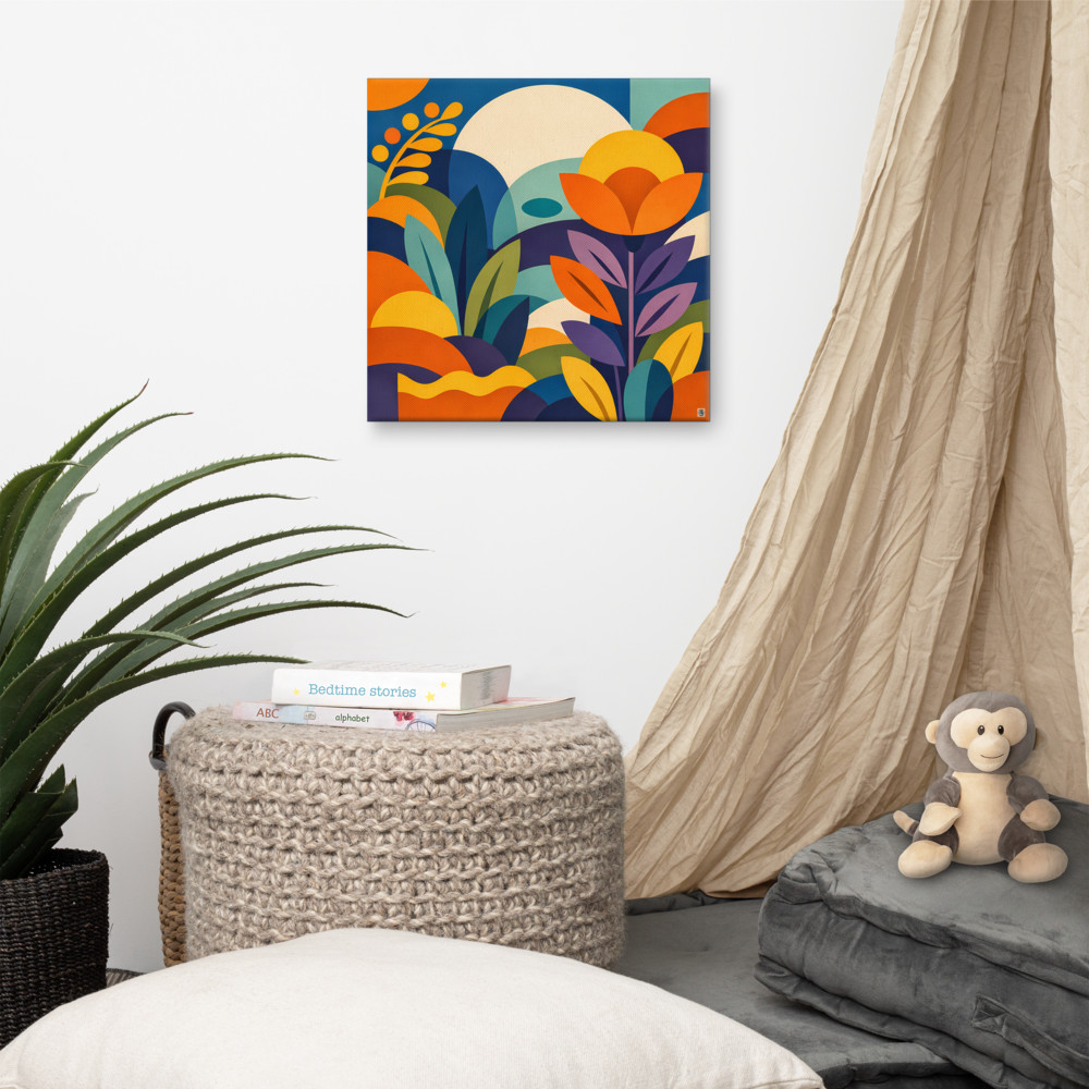
A softer, more botanical piece like Canopy Rise is a good example of how to get the boldness without the chaos. The shapes are confident, the palette is doing something interesting, but it's not fighting the rest of the room for attention. That's usually the sweet spot for people who like the energy of Memphis but want to actually relax in their living room.
The honest summary, if you want one: mid-century modern is a coherent design philosophy with about twenty-five years of history and a clear set of principles. Memphis is a six-year explosion of post-modern mischief that's been quietly influencing graphic design ever since. They're both worth knowing about. They're just not the same thing, and once you can see the difference, you can't unsee it.
Related articles

Mentioned in this article