InkSmithery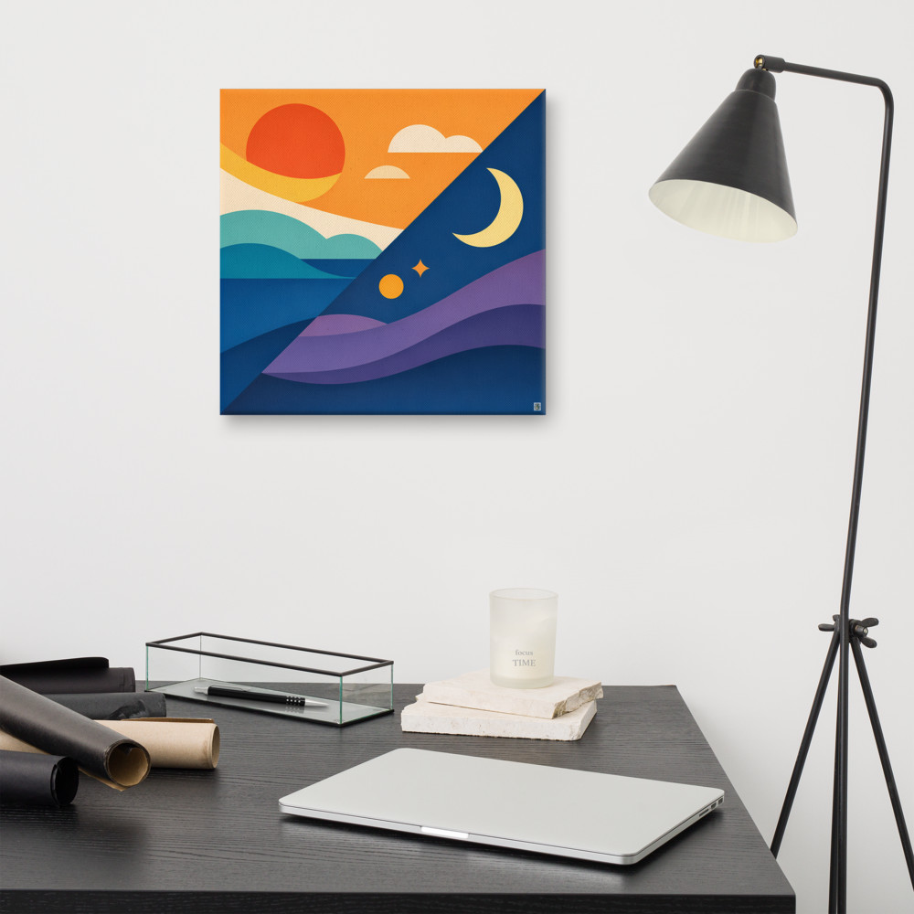
What Actually Makes Something Retro (Not Just Vintage)
There's a specific kind of frustration that comes from searching "retro print" online and getting back a wall of beige photographs with a sepia filter slapped on top. That's not retro. That's just an old-looking photo. And the two things get muddled constantly, which is a shame because once you can see the difference, you can't unsee it.
So here's the useful distinction, at least the way I think about it. Vintage is anything genuinely old, or made to look genuinely old — worn edges, faded tones, the visual language of "this has been around". Retro is different. Retro is deliberately borrowing the design language of a specific past era and using it now, on purpose. A retro piece isn't pretending to be from 1972. It's using the shapes, colours and confidence of 1972 in a way that only really works because we're looking back at it.
That matters because when someone says they want a "retro" print and ends up with a dusty vintage-style botanical illustration, they're often disappointed and can't quite say why. The answer is usually that the piece has no era. It's just... old-feeling. Retro has an era. You can point at it.
The shapes give it away first
Every decade had its own geometric vocabulary, and this is honestly the fastest way to date a design before you even get to the colours.
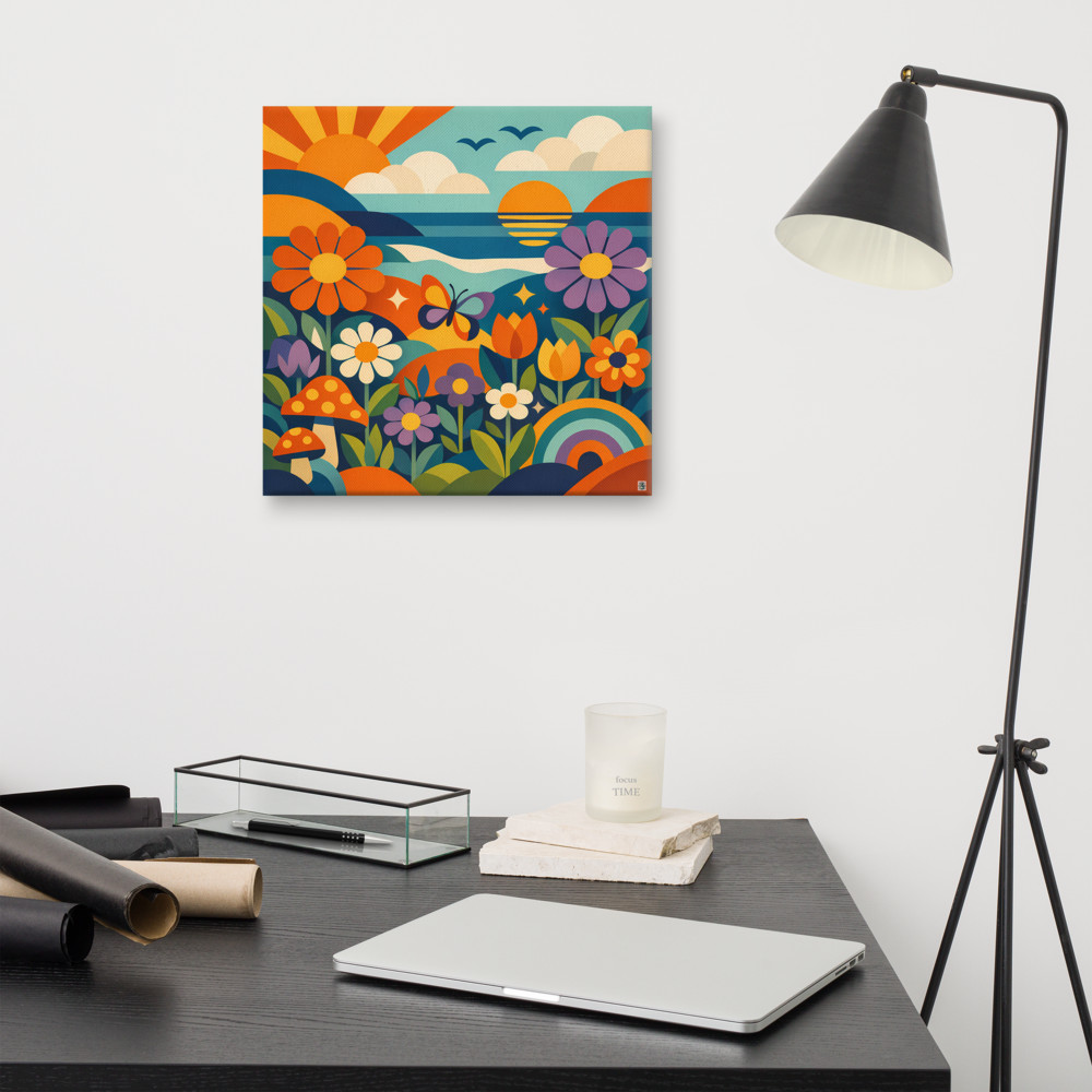
The 60s leaned into clean, optimistic geometry — think mod circles, bold stripes, hard-edged shapes borrowed from Bauhaus but made playful. Everything felt like it was about to launch into space. By the time you get to the 70s, those shapes had softened and got a bit stoned. Curves everywhere. Suns with rays. Rainbows. Rounded lettering that looked like it was melting slightly. Daisies with fat, friendly petals. Nothing sharp, nothing anxious. A design like Meadow Drift is unmistakably 70s not because someone wrote "1974" on it, but because of that specific combination of loose florals, rainbow arcs and a sun that looks pleased with itself.
The 80s reversed course entirely. Sharp angles came back with a vengeance. Grids, triangles, zigzags, that Memphis-style scatter of confetti shapes on a flat background. If the 70s were a beanbag, the 80s were a glass coffee table with a chrome frame. And the 90s went two directions at once — either even more chaotic and neon, or a strange, minimal, Y2K chrome-and-bubble aesthetic that we're now watching come back around.
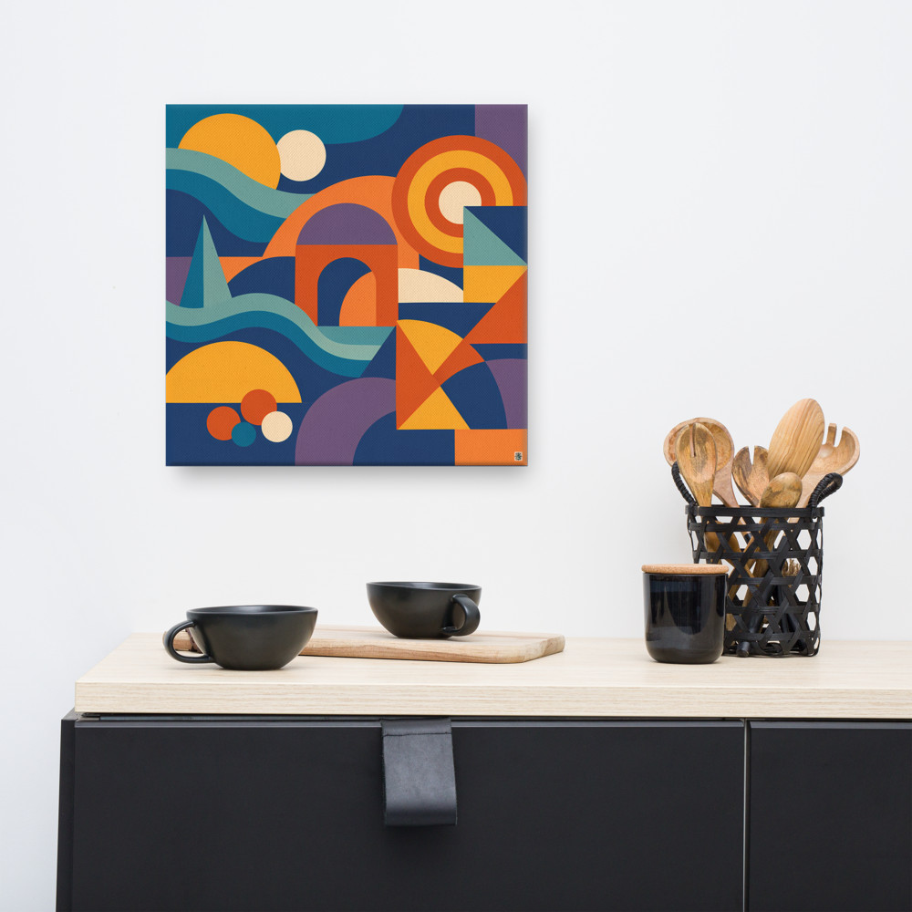
Mid-century design (roughly 1945-65) is its own thing, and it's often lumped in with retro even though it predates most of what people mean. The shapes there are architectural — atomic starbursts, boomerangs, tapered legs, that clean Scandinavian silhouette. A piece like Twin Horizon sits closer to that mid-century geometric tradition, where a sun and moon become simple, confident shapes rather than illustrated cartoons.
Colours are the other tell
Eras had palettes. Not vibes, palettes. Actual specific colours that were everywhere because of what pigments and printing processes were cheap, what the culture was reacting against, and what looked good on the tellies of the time.
The 70s were warm and earthy — mustard yellow, burnt orange, avocado green, harvest gold, chocolate brown. These weren't accent colours. They were the whole room. Curtains, carpet, kettle, all of it. If you're putting up a print that's supposed to feel 70s and it's got cool blues and greys in it, something's off.
The 80s went cold and loud. Hot pink, electric blue, black, chrome, that specific teal you saw on every gym leotard. Or, at the other end, pastel: peach, mint, dusty pink, powder blue — the Miami Vice palette. Either way, high contrast and confident.
90s palettes fractured. Grunge browns and forest greens on one hand, neon rave colours on the other, and then the beige-and-chrome minimalism creeping in by the late 90s. Mid-century tends toward mustard, teal, olive, cream, walnut — warmer than the 80s but more restrained than the 70s.
Once you know the palettes, you can spot a fake retro piece in about two seconds. A "70s" design in millennial pink and sage green isn't 70s. It's just current design with a nostalgic shape or two thrown in. Which is fine — plenty of great work does exactly that — but it's not the same thing.
Why generic "vintage filter" fails
Slapping a warm filter on a modern photograph and calling it vintage skips all of this. There are no era-specific shapes, no committed palette, no design language being borrowed. It just looks slightly yellow. And that's why so much of it feels forgettable — it's not referencing anything, it's just softening everything.
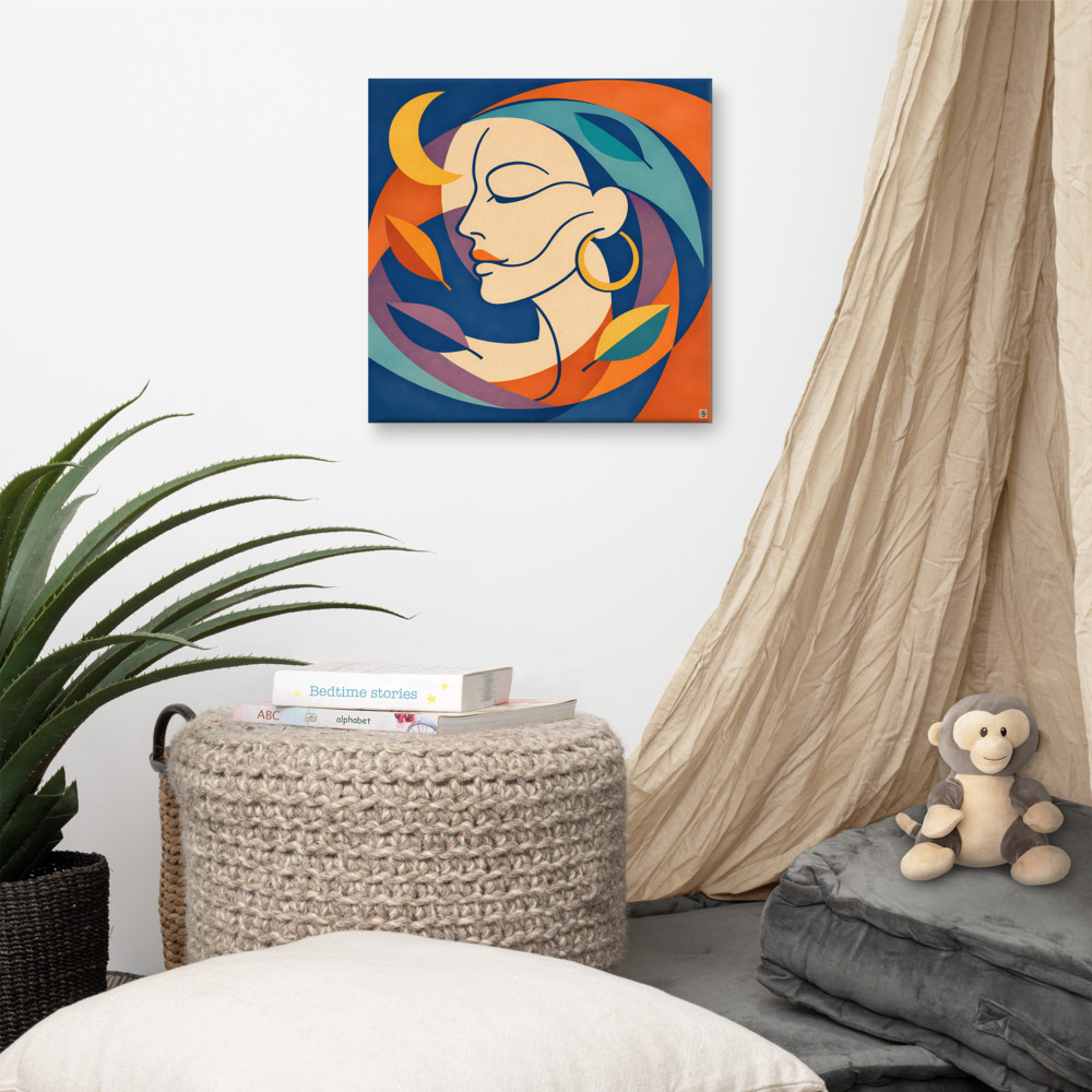
Genuine retro design commits. It picks an era, borrows its rules, and uses them properly. Even something more understated like Moonlit Grove works because it's making a specific choice — that stylised face-and-foliage motif has roots in a particular strand of mid-century illustration, and it either leans in or it doesn't. There's no filter doing the work.
So if you're trying to build a room that actually feels retro rather than just old-fashioned, the question to ask isn't "does this look vintage". It's "which decade is this piece speaking". If you can answer that in one word — 70s, 80s, mid-century, whatever — you're probably looking at real retro design. If your best answer is "dunno, oldish", you've got a vintage filter and not much else.
Which era you pick is a whole other conversation, and honestly comes down to what your room already does. But at least now you're picking one.
Related articles
Mentioned in this article