Why Asymmetric Compositions Tend to Feel More Alive
There's a moment that happens when you hang something perfectly centred over the sofa and step back, and it just sits there. Politely. Doing nothing. The wall is balanced, the maths checks out, and yet the whole arrangement has the energy of a hotel corridor.
This isn't your fault. It's not bad taste. It's that strict symmetry, while comforting, often kills the thing that makes art interesting in the first place — the sense that something is happening, or about to happen, or just stopped happening a second ago.
Asymmetry, done thoughtfully, brings that back.
The rule of thirds, and why it's actually about tension
Most people have heard of the rule of thirds from photography. Imagine a noughts-and-crosses grid laid over an image: two lines across, two lines down, four points where they meet. The idea is that putting your subject on one of those lines, or better yet on one of those intersections, tends to feel more interesting than dead-centring it.
The usual explanation is that it's more pleasing to the eye, which is true but a bit hand-wavy. The deeper reason is that an off-centre subject creates tension with the empty space around it. Your eye has somewhere to travel. The composition becomes a small relationship between the subject and the room it's standing in, rather than a self-contained announcement.
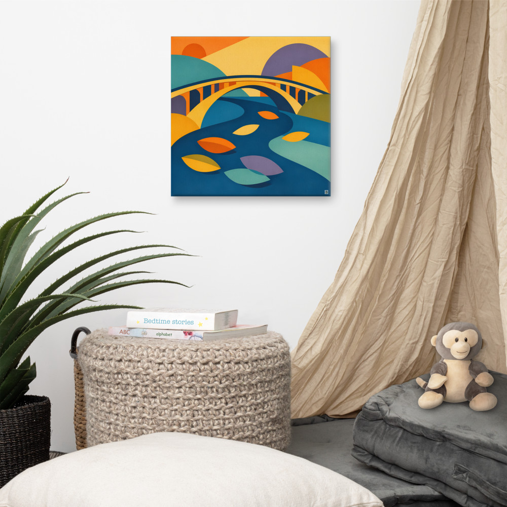
Look at almost any landscape painting you've genuinely liked. The horizon probably isn't halfway up. The interesting thing — a tree, a figure, a boat — probably isn't in the middle. Something like Riverbend Rise works because the curve of the river pulls your eye on a diagonal across the frame; if you flipped everything to be symmetrical around a central axis, the whole thing would go inert.
Visual weight isn't the same as physical size
The other concept worth understanding is visual weight. This is the idea that different elements in an image "pull" on your attention with different strengths, and they don't pull in proportion to how big they are.
A small, dark, high-contrast shape can hold its own against a large pale wash. A single human figure will dominate a frame full of trees. A warm colour generally outweighs a cool one of the same size. Anything with a face, even an abstract suggestion of one, wins almost every time.
This matters when you're arranging art on a wall, or choosing a print for a particular spot, because it explains why two pieces that are technically the same size can feel completely unequal. If you've got a gallery wall that looks lopsided despite careful measuring, it's almost always visual weight rather than geometry. The fix is rarely to move things — it's to swap one piece for something with a different weight.
Asymmetric compositions use this on purpose. A small, heavy element on one side can balance a large, airy element on the other, and the result feels considered without feeling rigid. That's the trick. Balance without symmetry.
Why asymmetry implies movement
Here's the bit I find most interesting. Symmetry tells your brain: this thing is at rest, it is finished, nothing more is going to happen. It's the visual language of monuments, official portraits, wedding cakes. All things that are meant to feel permanent and ceremonial.
Asymmetry tells your brain the opposite. Something is leaning. Something is about to fall, or fly, or arrive. The composition is caught mid-something. Even in a completely static print on a wall, that suggestion of unfinished movement is what makes you keep looking at it rather than registering it once and moving on.
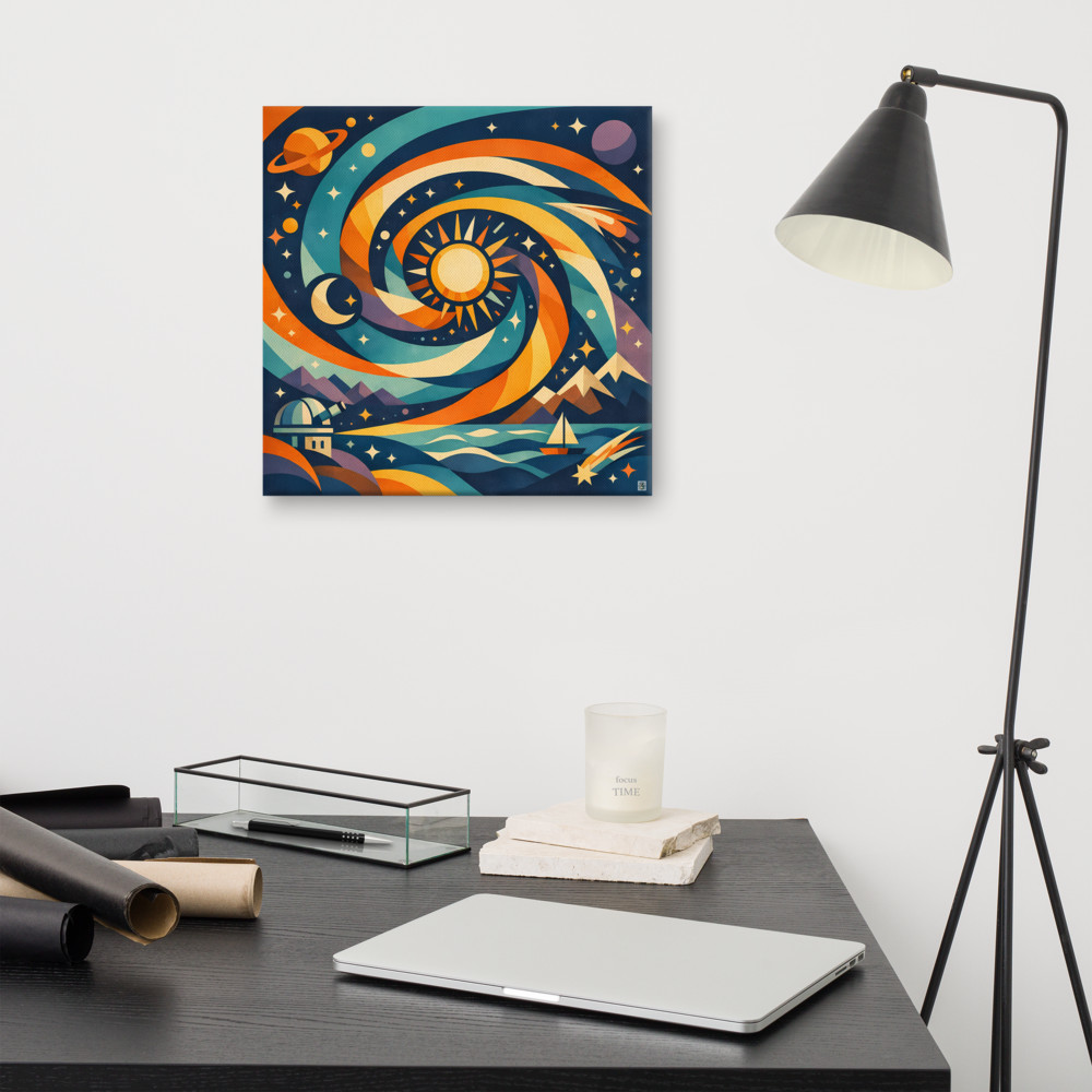
This is the asymmetric design rule that nobody quite states outright: the eye stays where there's somewhere left to go. A print like Night Passage, with its sun and moon offset against each other rather than mirrored, has that quality — your eye traces between them rather than parking in the middle and giving up.
Where this leaves you with actual walls
None of this means symmetry is wrong. A symmetrical arrangement above a bed or a fireplace can feel grounded and calm, which is sometimes exactly what a room needs. The mistake is reaching for it automatically because it feels "safe".
A few things worth trying instead, if your walls feel a bit lifeless:
- Hang a single piece off-centre above a piece of furniture rather than dead centre. Aim for roughly two-thirds of the way along, not halfway.
- If you've got two prints of different sizes, don't try to make them "work" by centring the pair. Let the larger one sit further from the visual centre and the smaller one closer in — counterintuitive, but it balances better.
- Mix orientations. A landscape print next to a portrait one nearly always feels more alive than two of the same shape.
- Leave more empty wall on one side than the other. Negative space is part of the composition, not failure to fill it.
The other thing worth saying: trust your eye over the tape measure. If something looks right but the measurements say it shouldn't be, the measurements are wrong. Visual weight isn't something you can calculate, and the people who designed the print weren't thinking in centimetres either.
Once you start noticing this, it becomes hard to stop. You'll see it in book covers, in shop windows, in the way a good photographer frames a face slightly to one side. Symmetry announces itself; asymmetry invites you in. Both have their place, but most rooms — and most walls — are crying out for a bit more of the second one.
Related articles
Mentioned in this article