Where to Hang Art in a Home Office Without Wrecking Your Video Calls
There's a particular kind of awkward that only happens on video calls: a colleague squinting at your background, then asking what the print behind your head is. Not because they're interested, but because their brain can't stop trying to read it. You spend the rest of the meeting wondering if you've been sitting in front of something distracting for six months.
Art in a home office is genuinely worth having — staring at a blank magnolia wall for eight hours is its own slow misery — but where you hang it changes everything about how it reads on camera. A piece that looks brilliant in person can become a visual jumble at 720p, and a piece you barely notice in the room can suddenly dominate the frame. So it's worth thinking about placement before you start putting holes in the plaster.
The wall directly behind you
This is the danger zone, and it's where most people instinctively want to hang their favourite print. Makes sense — it's the wall you look at when you're not at your desk, and it's the most obvious empty space.
The problem is that whatever's on that wall becomes your video call background, full stop. And cameras do strange things to art. Detailed pieces turn into noise. High-contrast geometric shapes can create that horrible moiré shimmer when they interact with compression. Anything with text becomes a magnet for eyeballs that aren't supposed to be reading it.
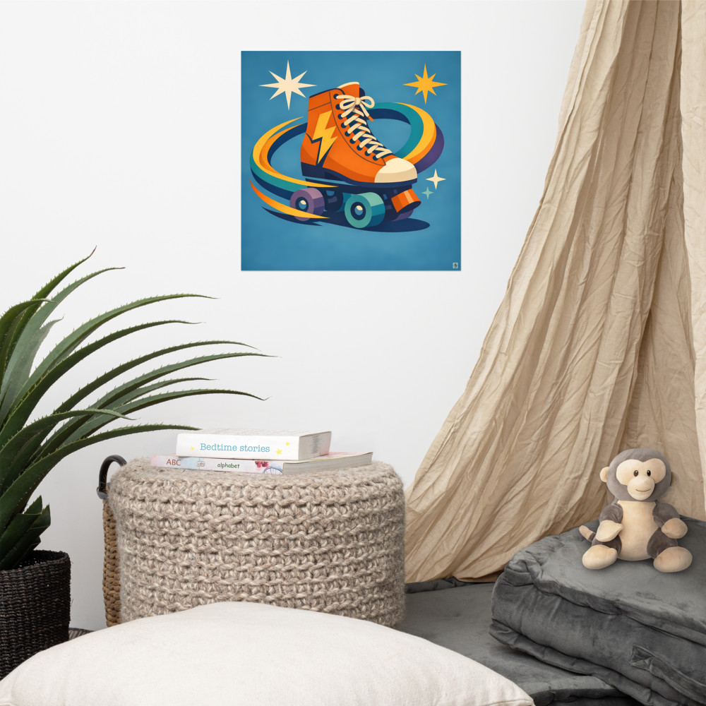
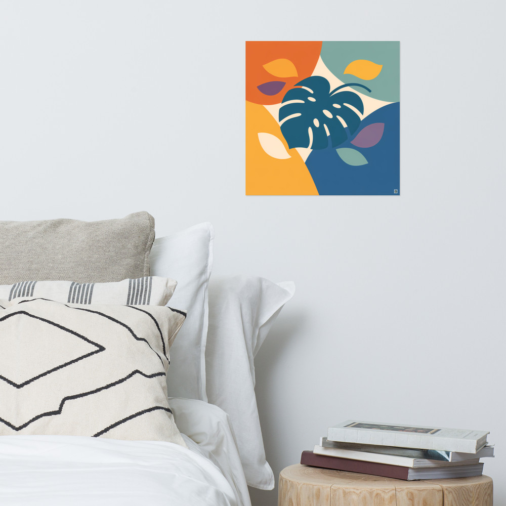
If you do want art behind you, the rule I'd stick to is: one piece, medium-sized, hung lower than you think. A print that sits roughly level with your shoulders when you're seated will appear to float just above your head on camera, which is the most flattering position. Something calmer works better here than something busy — a piece with a clear single subject and some breathing room around it, like Solstice Grove, reads as background rather than competing for attention. You want people to register "oh, nice print" in their peripheral vision and then forget about it.
Avoid: a gallery wall directly behind your chair (it looks like you've taped Pinterest to the wall), anything with a face or eyes in it (deeply unsettling on camera), and tall vertical pieces that end up looking like they're growing out of your head.
The wall beside you
This is, in my experience, the best wall in the whole room for the piece you actually love. It's where you can hang something bolder, brighter, more personal — because the camera barely sees it, but you do, every time you look up from your screen.
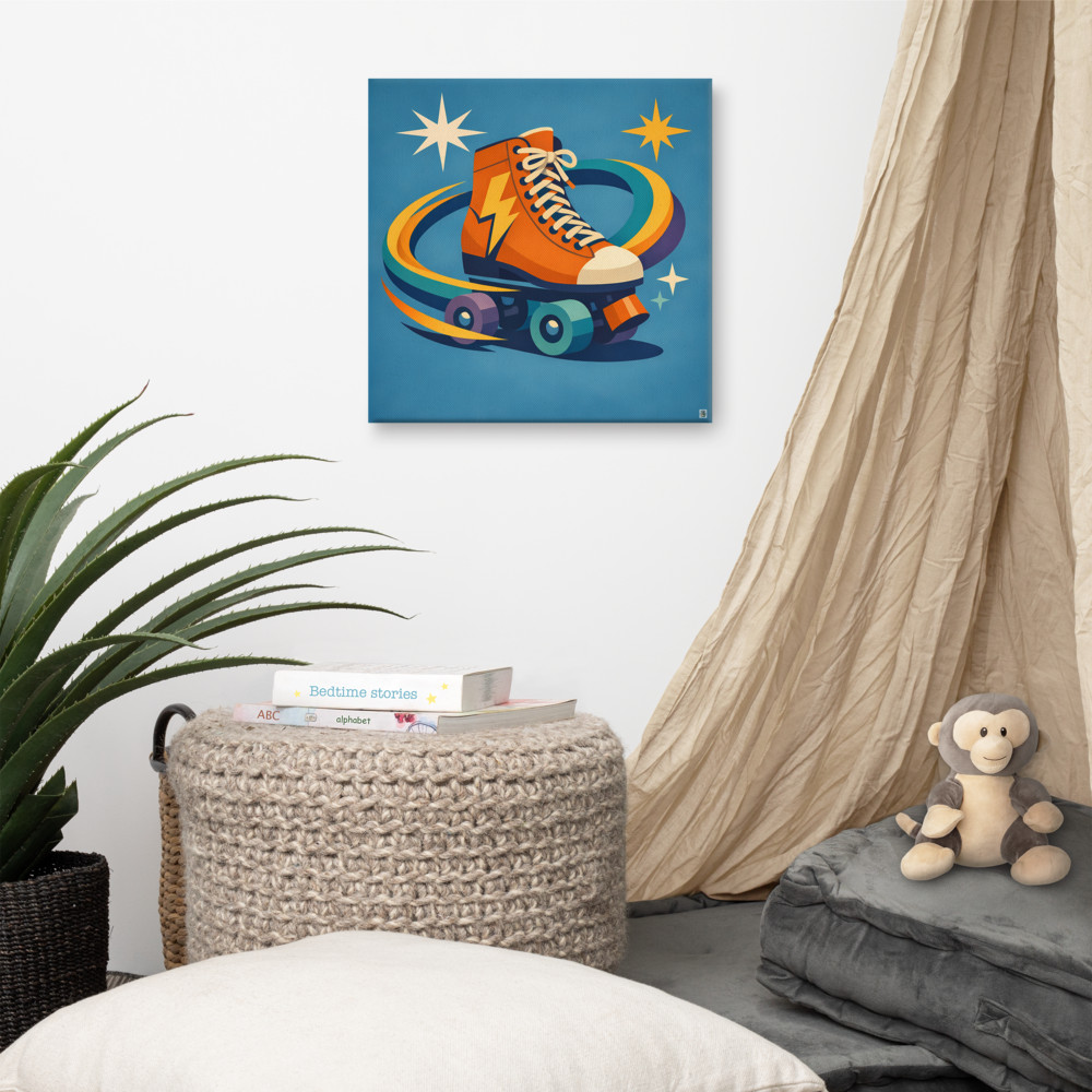
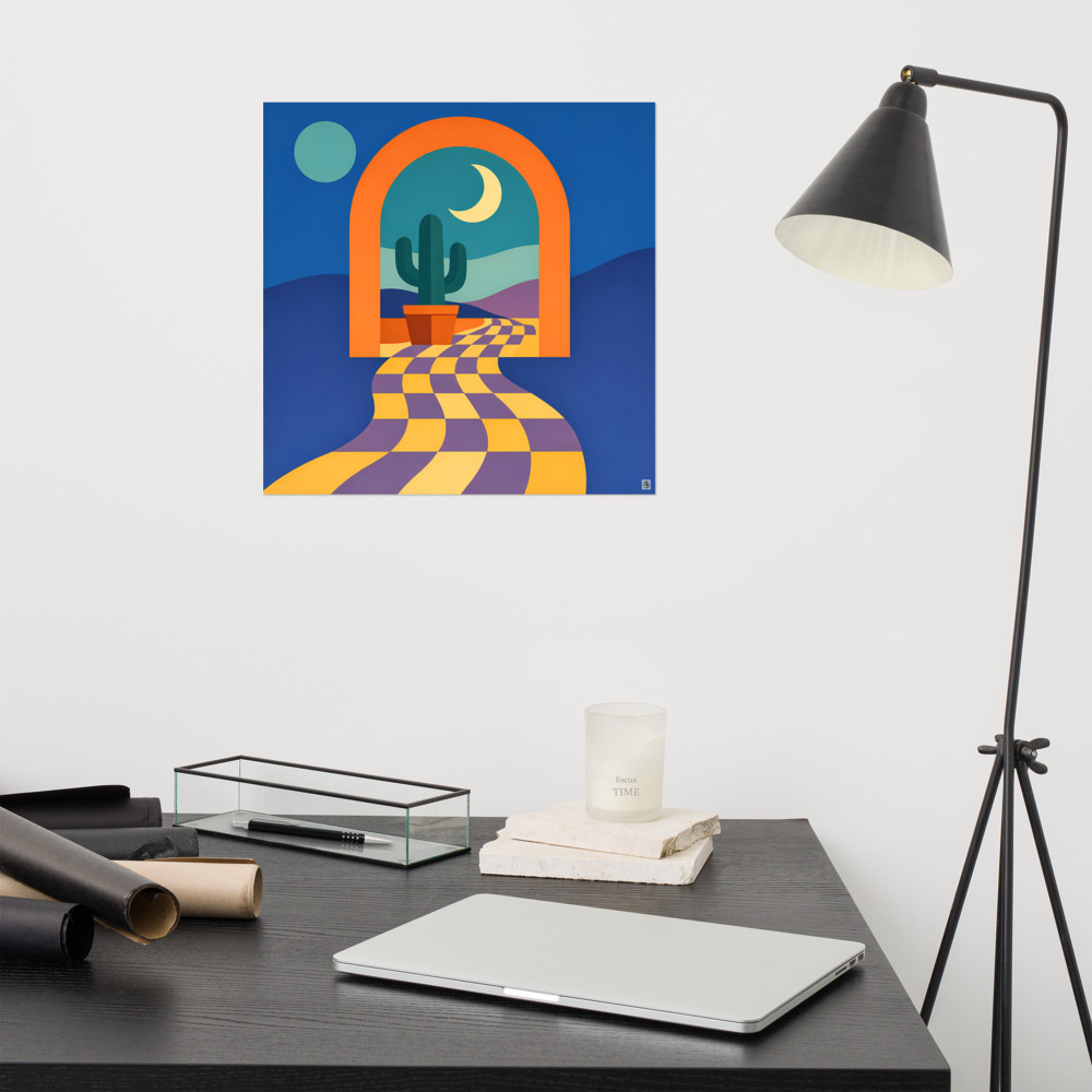
If you've got something with real personality, something like Rink Signal that you'd genuinely enjoy looking at on a Tuesday afternoon, this is where it goes. You get the daily benefit of having it in your eyeline, and on calls it either doesn't appear at all or shows up as a soft sliver of colour at the edge of the frame, which actually looks rather considered.
The practical bit: hang it at standing eye level if you stand sometimes, or seated eye level if you don't. Most people hang art too high in offices because they're used to hanging it in living rooms where everyone's standing. In an office you're sitting 90% of the time, so drop everything down by about 15-20cm from where you'd instinctively put it.
The perpendicular wall (the one you face)
The wall your desk faces is underrated. If you don't have a window in front of you, this wall is what you stare at all day, and it deserves more thought than it usually gets.
The catch is that this wall doesn't appear on calls at all — which is either freeing or pointless depending on how you look at it. I'd say freeing. It means you can put anything here. A piece you find motivating, a print with sentimental value, something you bought on holiday that doesn't match anything else. The camera never sees it, so it doesn't need to coordinate with your professional persona.
One thing to watch: if there's a light source behind you (a window, a lamp), a glossy framed print on the wall opposite can throw glare straight back at your camera. Matte finishes, canvas, or unframed prints sidestep this entirely. Worth checking before you commit to a frame with glass.
A few practical things people forget
Do a test call before you commit to a placement. Hang the piece with removable strips first, get on a Zoom call with yourself, and actually look at how it sits in the frame. You'll spot problems in 30 seconds that you'd otherwise live with for years.
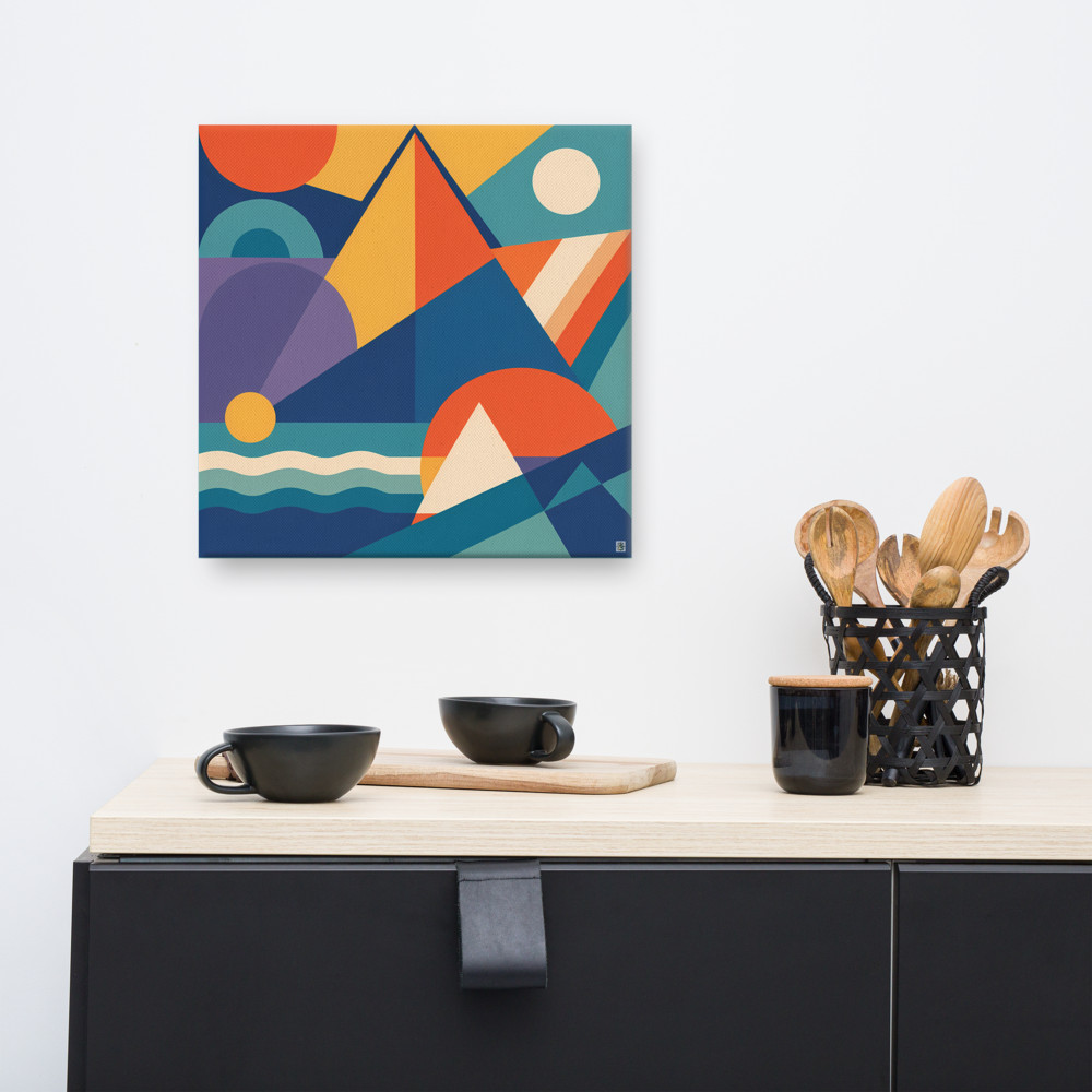
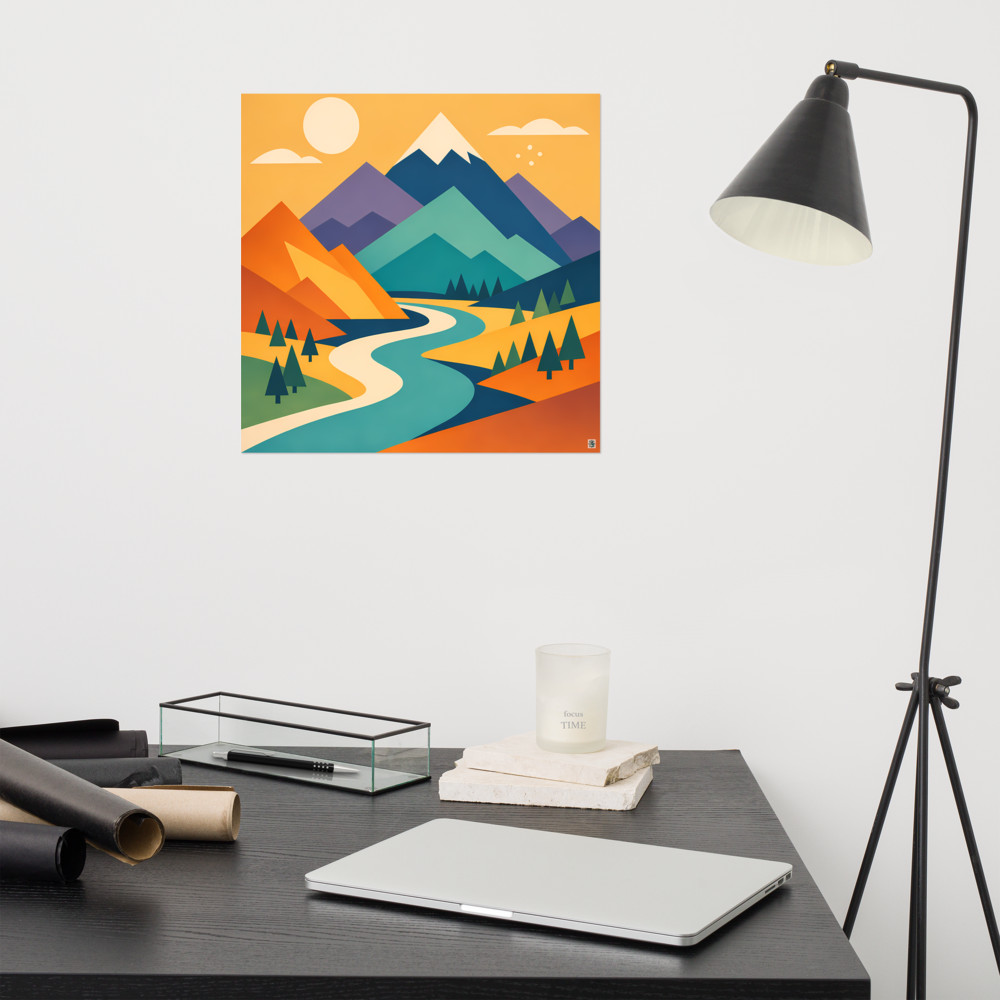
Watch the colour relationship between the art and your skin tone on camera. A piece with a lot of orange directly behind you can make you look slightly jaundiced under certain lighting. A piece with strong cool tones can do the opposite. Something balanced and more architectural — say a graphic composition like Harbour Rise — tends to play more nicely with camera white balance than anything that leans hard into one colour family.
Mind the parallax. If the wall behind you is more than about a metre away, the art will look further off than it actually is, and small pieces will read as tiny. Either move closer to the wall, or go bigger than feels right. A 30cm print three metres behind you will look like a postcard.
And finally — your office is yours. If you genuinely love a piece and want it directly behind your head on every call, do it. The point of working from home is that you get to surround yourself with things you like. The video call etiquette is just a layer to consider, not a rule to be ruled by.
Related articles
Mentioned in this article