InkSmithery
Gallery Wall Mistakes That Are Easier to Fix Than You Think
Gallery walls look effortless in photos and are a bit of a nightmare in real life. You buy the prints, you lay them out on the floor, you feel confident. Then they go up, and something is off — but you can't quite name what. Usually it's one of three things, and once you've seen them, you can't unsee them.
I've hung a lot of these, for myself and for friends who inevitably send a photo asking why theirs looks flat. The mistakes are almost always the same. So here's what tends to go wrong, and what actually helps.
The three mistakes that quietly wreck the whole thing
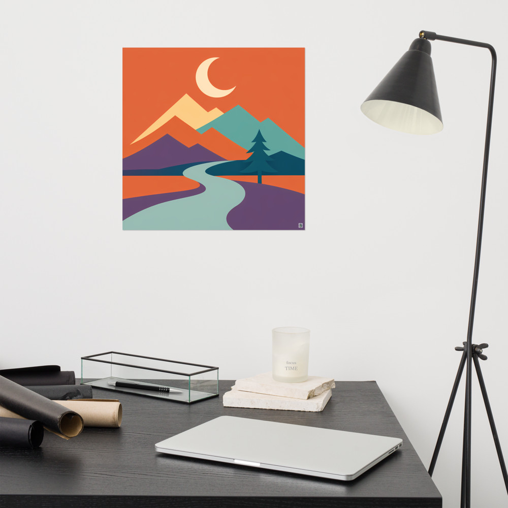
The first one is going too similar. This is the most common by a mile. Someone picks four prints they love, all in the same palette, all roughly the same size, all the same style — and hangs them in a neat grid. It reads as one big beige blob from across the room. There's no rhythm to it, nothing for your eye to catch on. A gallery wall works because of contrast between the pieces, not sameness. You want at least one that's a different scale, one that breaks the palette slightly, maybe one that's a different medium entirely — a photograph among illustrations, a line drawing among something bolder like Canopy Rise. The variety is what makes it feel collected rather than bought as a set.
The second is the eye-line problem. Most people hang things too high. Gallery convention is that the centre of the arrangement — not the centre of any single piece, but the midpoint of the whole cluster — sits around 145 to 150cm from the floor. That's roughly average eye level for someone standing. In a room where you're mostly sitting (a lounge, say), you can go a touch lower. Above a sofa or a console table, the bottom edge of the lowest print should sit about 15 to 25cm above the furniture, not floating awkwardly halfway to the ceiling. If your prints look like they're trying to escape upward, this is why.
The third one nobody talks about: ignoring the wall colour underneath. A gallery wall isn't just the prints — it's the prints plus the wall, treated as one composition. A crisp black-framed print that sings against warm white will look muddy against a mid-grey. A pale, airy piece will vanish on a dark navy wall unless the frame does the heavy lifting. This is where people get frustrated and blame the artwork, when actually the wall is fighting them. Before you commit to anything, hold a print flat against the wall in the actual light of the room. Morning, evening, lamp-on. If the contrast between print and wall isn't there, either the frame needs to change or the wall does.
What to do instead, in the order I'd actually do it
Start with the wall, honestly. Look at the colour, look at where the light falls, look at what's underneath (sofa, sideboard, bed). The wall dictates what the prints have to do. On a warm neutral wall you've got range — almost anything works. On a saturated colour, you need prints that either lean into that palette or intentionally clash with confidence. Half-measures look like mistakes.
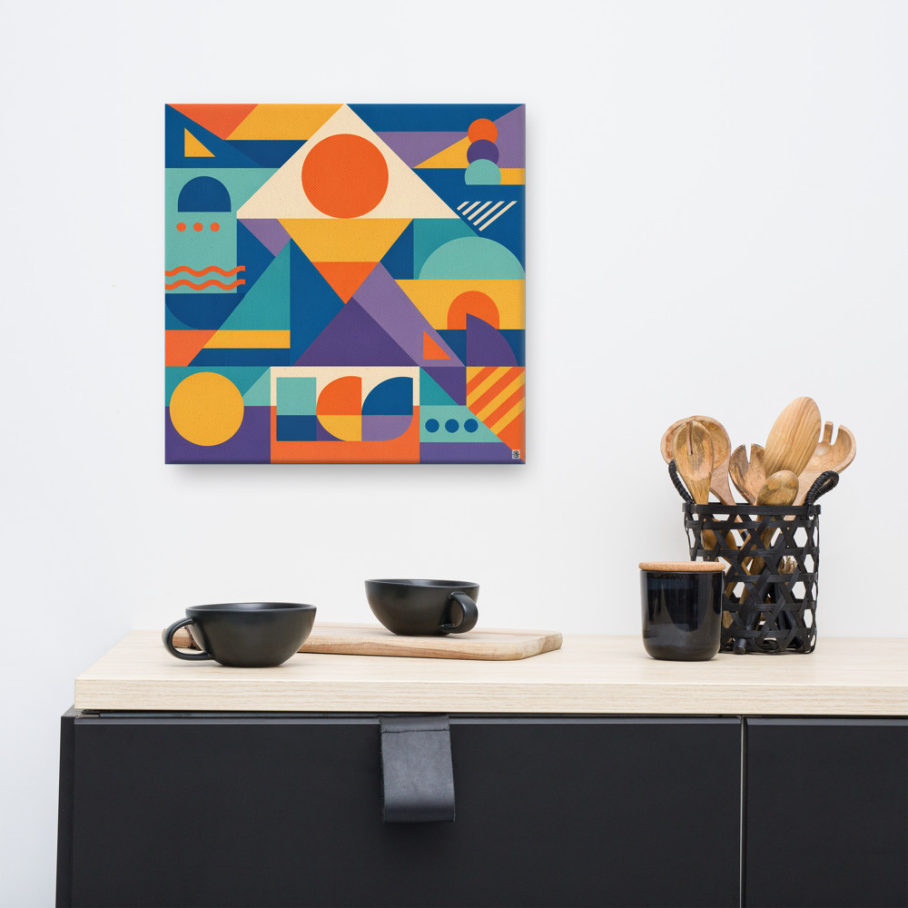
Then pick an anchor piece. One print that's clearly the largest or clearly the most visually loud. Something like Arcade Terrace works well as an anchor because it's got enough going on to hold the wall on its own — everything else you add is in conversation with it. Without an anchor, gallery walls tend to feel like a committee decision where nobody won.
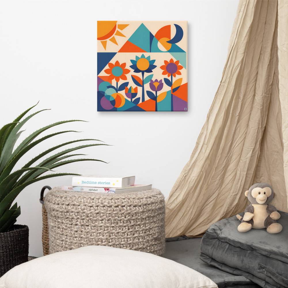
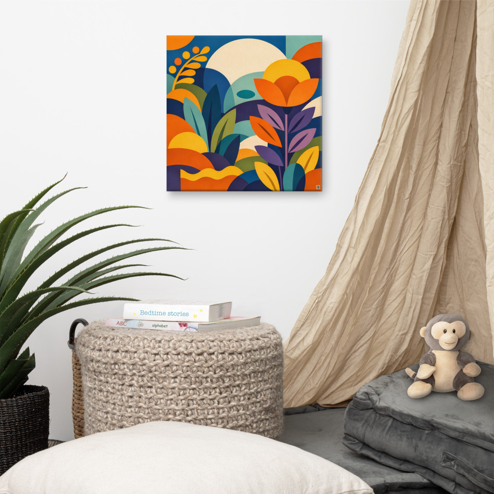
Build outward from the anchor with pieces that vary in at least one of: size, orientation, colour weight, or subject. Not all four — that's chaos. One or two at a time. If your anchor is a bold geometric, a softer botanical like Dawn Meadow beside it gives the eye somewhere to rest. That push and pull between busy and calm is doing more work than most people realise.
Before anything touches the wall, lay it out on the floor. Move things around for longer than feels reasonable. Then cut newspaper or scrap paper to the exact size of each frame, stick those to the wall with a bit of masking tape, and live with the arrangement for a day or two. It sounds fussy. It saves you filling holes.
Spacing matters more than people think. Roughly 5 to 8cm between frames tends to feel intentional without being sparse. Wider than about 10cm and the pieces stop reading as a group. Narrower than about 3cm and they feel cramped. Keep the spacing consistent across the whole arrangement, even if the frames themselves vary in size — that consistency is what holds the composition together when everything else is different.
One last thing. A gallery wall doesn't have to be finished on day one. Some of the best ones I've seen grew over a year or two, with pieces added as the owner found them. If you're not sure about a fourth or fifth print, leave the space. An arrangement of three good pieces beats five where two are filler. You can always add. Taking down is the fiddly bit.
Related articles
Mentioned in this article