InkSmithery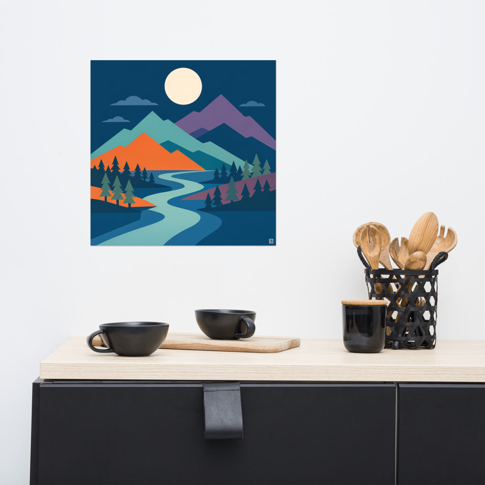
The Case for Two Prints: Why Pairs Often Beat a Single Piece
There's a middle ground in wall art that doesn't get talked about enough. On one side you've got the single statement print — one big frame, done, move on. On the other you've got the gallery wall, which looks brilliant on Pinterest and takes about three weekends and a lot of masking tape to actually pull off. And then there's the pair. Two prints, hung side by side, doing something together that neither could do alone.
I've come round to pairs as the answer for more walls than I used to think. Above a sofa where one print looks lonely but a gallery would feel cluttered. In a hallway where you want rhythm without chaos. Above a bed, where symmetry actually helps you sleep in a room that feels resolved. A pair of prints gives you compositional weight without the commitment of curating six or eight pieces that all need to get along.
What makes two prints actually work as a pair
The mistake I see most often is people buying two prints they both like and hoping proximity will do the rest. It won't. Two strong prints that have nothing to say to each other just look like two prints someone forgot to finish hanging things around.
Diptych logic — and I'm using the word loosely, because a true diptych is one image split across two panels — is really about conversation. The two pieces need to share something and differ in something. Share the palette, differ in the subject. Share the subject, differ in the mood. Share the geometry, differ in the season. If they share everything, you've basically bought the same print twice. If they share nothing, they're just neighbours who don't speak.
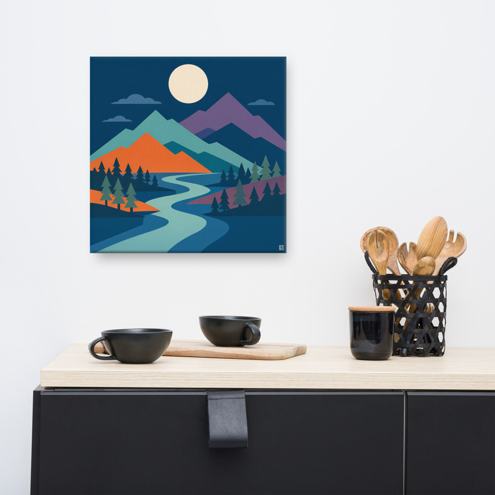
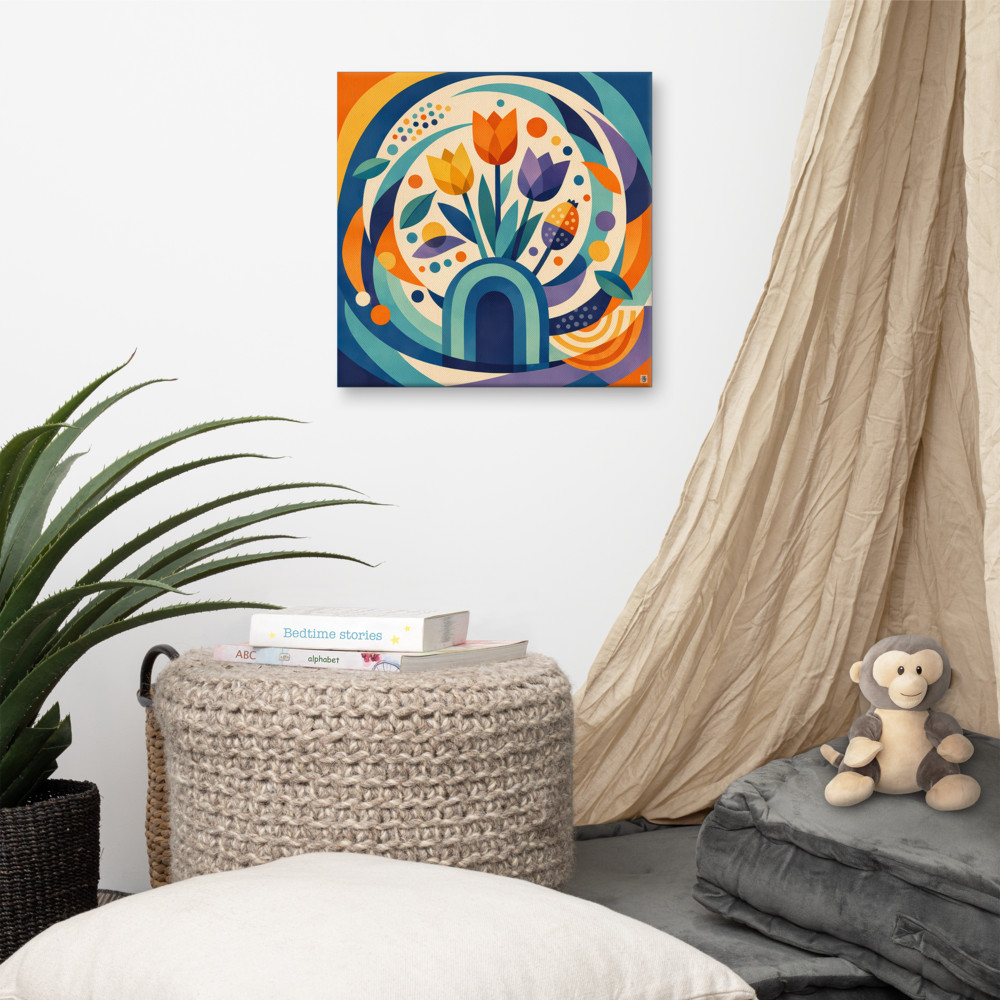
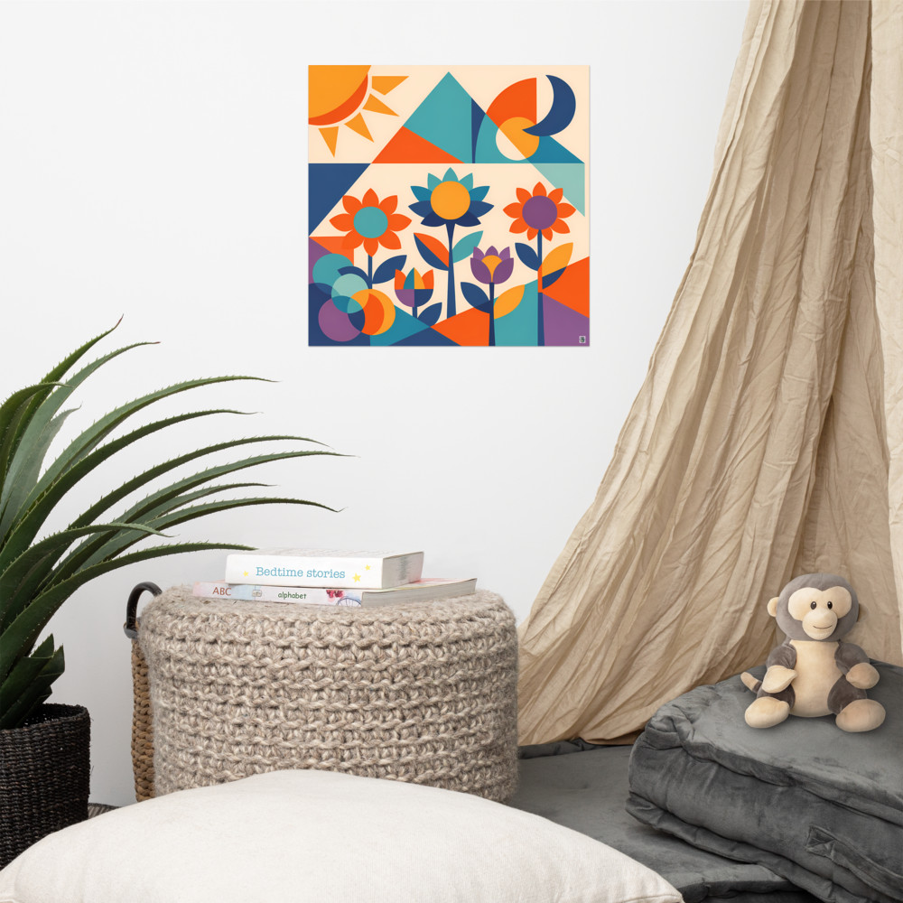
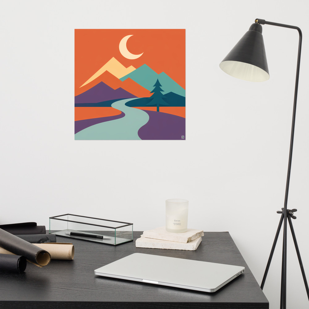
The easiest shared element to get right is colour. If both prints pull from the same restricted palette — say, terracotta, cream and a muted teal — your eye reads them as a unit even if the imagery is quite different. A geometric mountain scene next to a botanical study will hang together happily if the ochres and slate blues echo across both. Something like Quiet Pass paired with Meadow Orbit is doing exactly this — different subjects entirely, but the geometric vocabulary and the muted, slightly dusty palette pull them into the same room.
The second easiest is style. If both prints are drawn in the same visual language — same line weight, same approach to shape, same era of reference — they'll read as a pair even across wildly different subjects. Mid-century geometry is particularly forgiving here. A desert landscape and a coastal one, if they're both rendered in the same reduced, shape-first way, will look like they came from the same sketchbook.
Contrast is the interesting bit
Sharing is the safety net. Contrast is what makes the pair feel intentional rather than matchy.
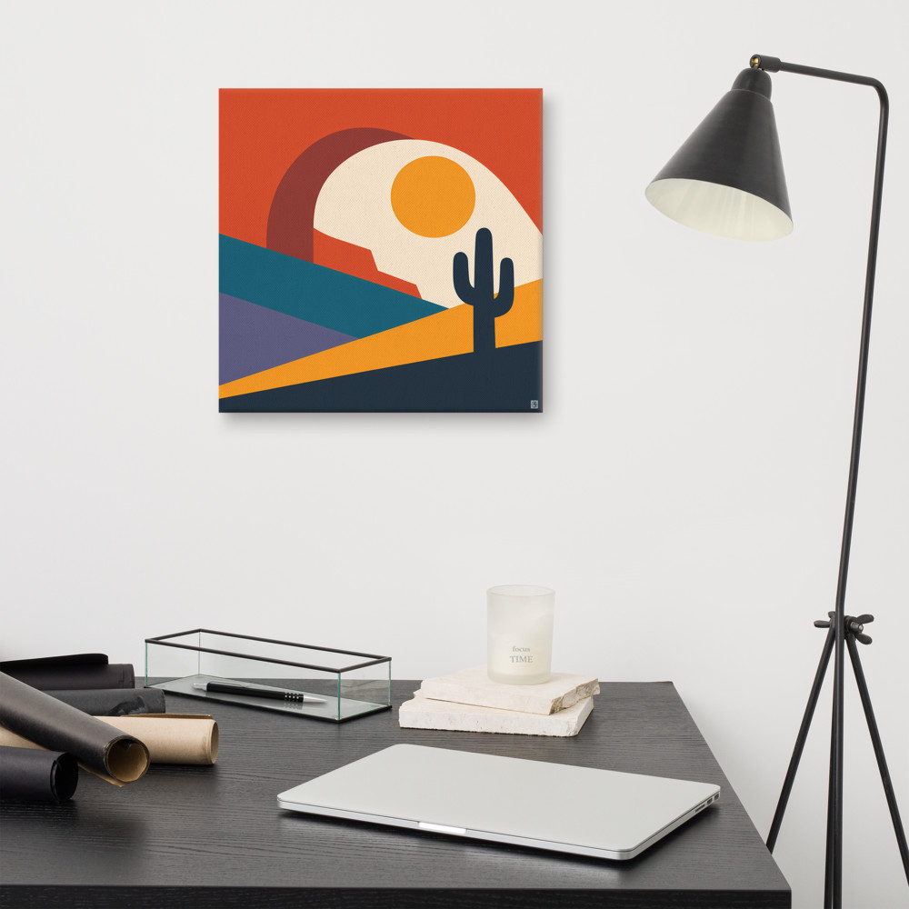
Think about pairing warm with cool. A sun-baked scene next to a moonlit one. Mesa Quiet hung beside something like Quiet Pass gives you that day-and-night tension — same geometric language, same restrained palette approach, but one is dry heat and the other is cold water. Your eye moves between them and finds something to think about. That's the difference between decoration and a wall that holds attention.
Other contrasts that work: horizontal composition next to vertical (as long as the frames are the same size), busy next to quiet, close-up next to landscape, one figure next to many. The point is that the two prints together tell a slightly bigger story than either does alone.
The practical bit — hanging two piece wall art
For a pair of prints wall art arrangement, spacing matters more than most people realise. Too close and they read as one awkward wide piece. Too far apart and the conversation breaks. My rule of thumb is a gap between 5 and 10cm for prints up to A3, and 10 to 15cm for anything larger. Trust your eye — hold them up with tape first, live with it for a day, adjust.
Centre the pair on whatever they're hanging above. Not each print centred on its own bit of wall — the pair, as a unit, centred on the sofa or the bed or the console. The visual middle is the gap between them.
Match the frames. I know, I know — mismatched frames can look brilliant in a gallery wall, but in a two-piece arrangement, mismatched frames just look like you couldn't find another one. Same frame, same mount, same glass. Let the prints do the differing.
Height is the usual eye-level rule: centre of the pair at around 145-150cm from the floor, or roughly 20cm above the back of a sofa if it's sitting above one. If the ceilings are tall, go slightly higher. If you're short, hang for your eye, not some hypothetical taller person.
When a pair is the wrong answer
I should be honest: pairs aren't always right. Above a fireplace, one large piece almost always wins — the mantel already gives you a horizontal line, and a pair on top of that can feel fussy. In a small alcove, one print sized correctly beats two squeezed in. And if your wall is genuinely enormous — think a double-height stairwell — a pair will just look marooned.
But for the mid-sized walls that most of us actually have, above the sofa, along the hallway, in the bedroom, over the sideboard, a well-chosen pair does something a single print can't. It creates rhythm. It gives the eye somewhere to go. It suggests a bit of thought without demanding you become a curator.
Start with the palette. Add a contrast. Match the frames. Mind the gap.
Related articles
Mentioned in this article