InkSmithery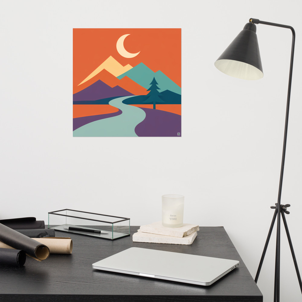
How Much Space to Leave Between Frames on a Gallery Wall
There's a number that gets thrown around a lot for gallery wall spacing: 5 to 7cm between frames. It's a decent starting point, and I'll happily recommend it as one. But if you hang everything to that measurement and step back expecting it to look right, you might find yourself squinting at the wall thinking something's a bit off. That's because visual balance and mathematical equal spacing aren't the same thing, and once you know why, the whole exercise gets easier.
Let me walk through how I actually approach this, including the bits where the tape measure has to be quietly put down.
Why 5–7cm works as a default
The rough logic behind the 5–7cm gap is that it's close enough for the frames to read as a single composition — a group, rather than a scatter of separate pictures — but far enough apart that each piece still has room to breathe. Get too tight (say, 2cm) and it starts to feel cramped and busy, especially with chunky frames. Go much beyond 10cm and the eye stops grouping them together; they become individual prints that happen to share a wall.
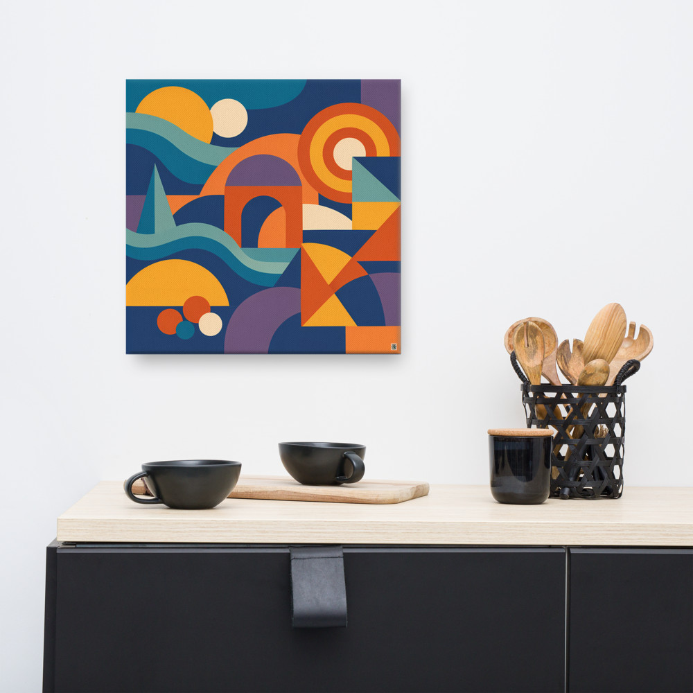
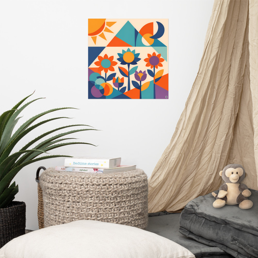
A few things nudge me within that range. Smaller prints (A4-ish and below) tend to look better with tighter gaps, around 4–5cm. Larger prints, or anything with a wide mount and a thick frame, can carry 6–8cm comfortably. Busy artwork wants a bit more air; quieter, minimal designs can sit closer together without feeling suffocated. If you've got something graphic and bold like Harbour Mirage, it holds its own with a generous gap. A softer, more muted piece might get lost if you leave too much wall showing between it and its neighbours.
That's the starting point. Now for the awkward bit.
Why equal spacing often looks wrong
Here's the thing nobody warns you about: if you measure exactly 6cm between every frame, dead-on, some of those gaps will still look bigger than others. This isn't a trick of the light. It's how our brains process shapes.
The eye reads negative space in relation to what's around it. A 6cm gap between two small square frames looks different to a 6cm gap between a tall portrait and a wide landscape. When frames are different sizes or orientations, the visual weight shifts, and mathematically equal gaps can start to feel lopsided. Two frames of very different heights sitting 6cm apart can look like one is drifting away from the other, even though the tape measure disagrees.
The fix is to trust your eyes over the ruler, at least for the final adjustment. In practice, that might mean tightening a gap to 5cm here, or opening one up to 7cm there, so the whole arrangement feels evenly balanced rather than technically evenly spaced. It's the same principle typographers use with kerning — the space between letters isn't identical, it's adjusted so it *looks* identical.
Laying it out before you commit
I'd strongly recommend not skipping the paper-template stage, even if it feels a bit tedious. Cut out newspaper or brown paper to the exact size of each frame, stick them to the wall with masking tape, and live with the arrangement for a day or two. This is where you catch the awkward gaps before you're staring at a wall full of holes.
When you're arranging the templates, start by lining up either the top edges, the bottom edges, or a horizontal midline running through the group. Pick one and stick with it — that shared line is what holds a mixed-size gallery wall together. Then set your gaps by eye first, measure second. Stand back after every couple of adjustments. Photograph it on your phone; the camera flattens things and often reveals imbalances your eye has stopped noticing.
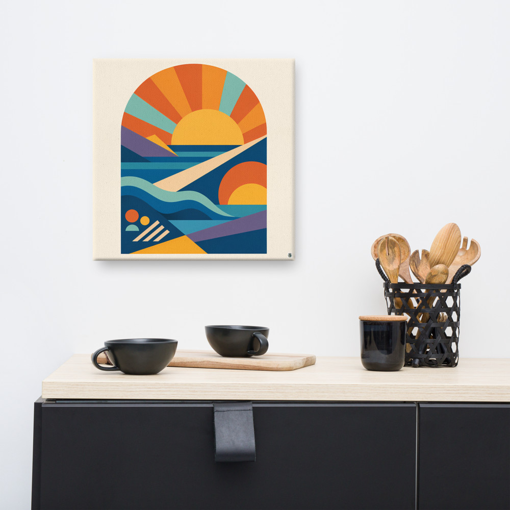
If you're building around one anchor piece — say a larger print like Solway Rise as the centre of gravity — hang that one first (or at least mark its position first) and work outwards. Everything else negotiates its position relative to the anchor.
When to measure and when to eyeball
Measuring is genuinely useful in two situations. The first is when you're doing a strict grid — four or six identical frames in a rectangle, all the same size. Here, mathematical equal spacing does look right, because the frames are matched and the eye isn't being asked to compensate for different shapes. Get the tape out and be precise.
The second is when you're aligning to a piece of furniture or a horizontal feature — the top of a sofa, a picture rail, a mantelpiece. That relationship needs to be deliberate, not vibes-based.
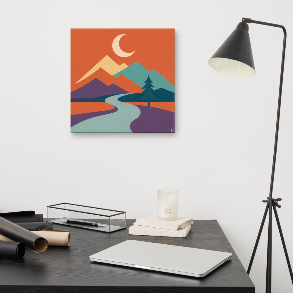
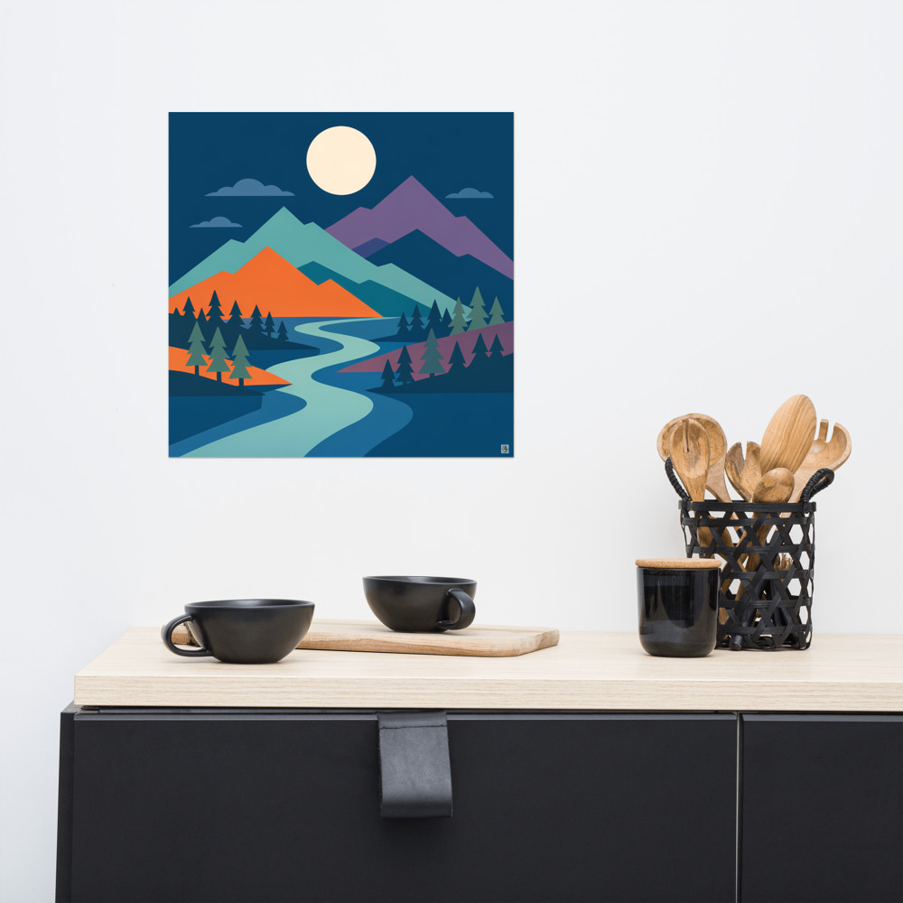
For pretty much everything else — mixed sizes, mixed orientations, an organic salon-style cluster — I'd measure to get a sensible starting gap and then eyeball the corrections. If a print like Moonlit Pass is sitting next to something wider and shorter, the gap between them might want to be a touch tighter than the gaps elsewhere, just so the composition holds together.
One last practical note: your gallery wall spacing should also relate to the space around the whole group. If the cluster sits close to a doorway, a light switch, or the edge of a wall, the breathing room around the outside of the arrangement matters at least as much as the gaps between the frames. Too close to an edge and even a well-balanced gallery wall starts to feel like it's falling off the wall. A good rule of thumb is to leave at least twice the internal gap around the outside — so if your frames are sitting 6cm apart, aim for 12cm or more of clear wall between the outermost frame and anything else.
Get the internal spacing feeling right, then check what's happening around the edges. That's usually where a gallery wall either settles into the room or looks like it's been squeezed in.
Related articles
Mentioned in this article