How to Start a Gallery Wall Without Ending Up in a Mess
Most gallery walls go wrong at the beginning, not the end. People collect a stack of frames, hold them up against the wall in various nervous configurations, hammer in a nail that feels roughly right, and then spend the next six months slowly hating the arrangement without quite knowing why. The fix isn't more prints or better frames. It's picking the right piece to build around, and doing the layout on paper before anything touches plaster.
So let's talk about how to actually start one.
The anchor piece does most of the work
Every good gallery wall has an anchor — the piece your eye lands on first, the one everything else is arranged around. It's usually (but not always) the largest print, and it sits at or near the visual centre of the arrangement. Not the geometric centre necessarily. The visual one, which is a slightly different thing depending on the shape of the wall and where you're standing when you look at it.
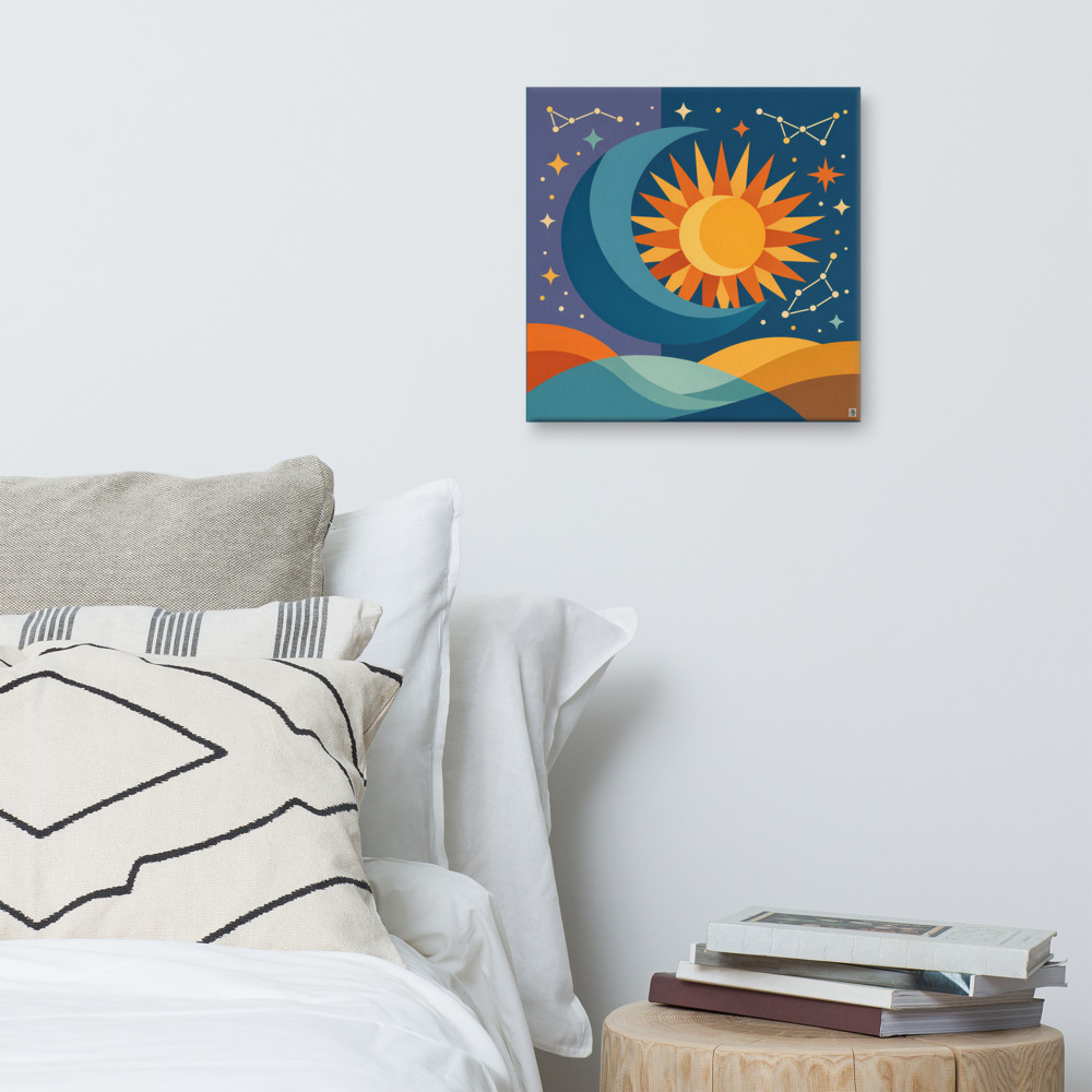
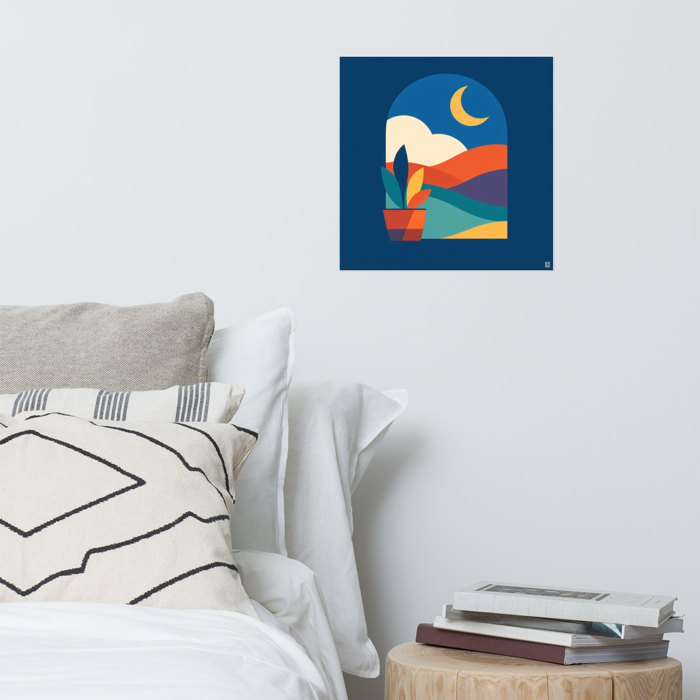
The anchor sets the tone. If it's a bold, high-contrast print, the surrounding pieces need to either echo that energy or deliberately calm it down. If it's something quieter and more atmospheric — say a soft celestial piece like Dusk Passage — then the wall around it can breathe, and smaller supporting prints don't need to shout to hold their own.
Here's the thing people underestimate: the edges of a gallery wall don't matter nearly as much as the centre. Nobody's standing three inches from the corner print judging its placement. They're taking the whole wall in as a shape, and that shape is anchored by whatever sits in the middle. Get the centre right and the edges have quite a lot of forgiveness built in. Get the centre wrong and no amount of clever edge arrangement will rescue it.
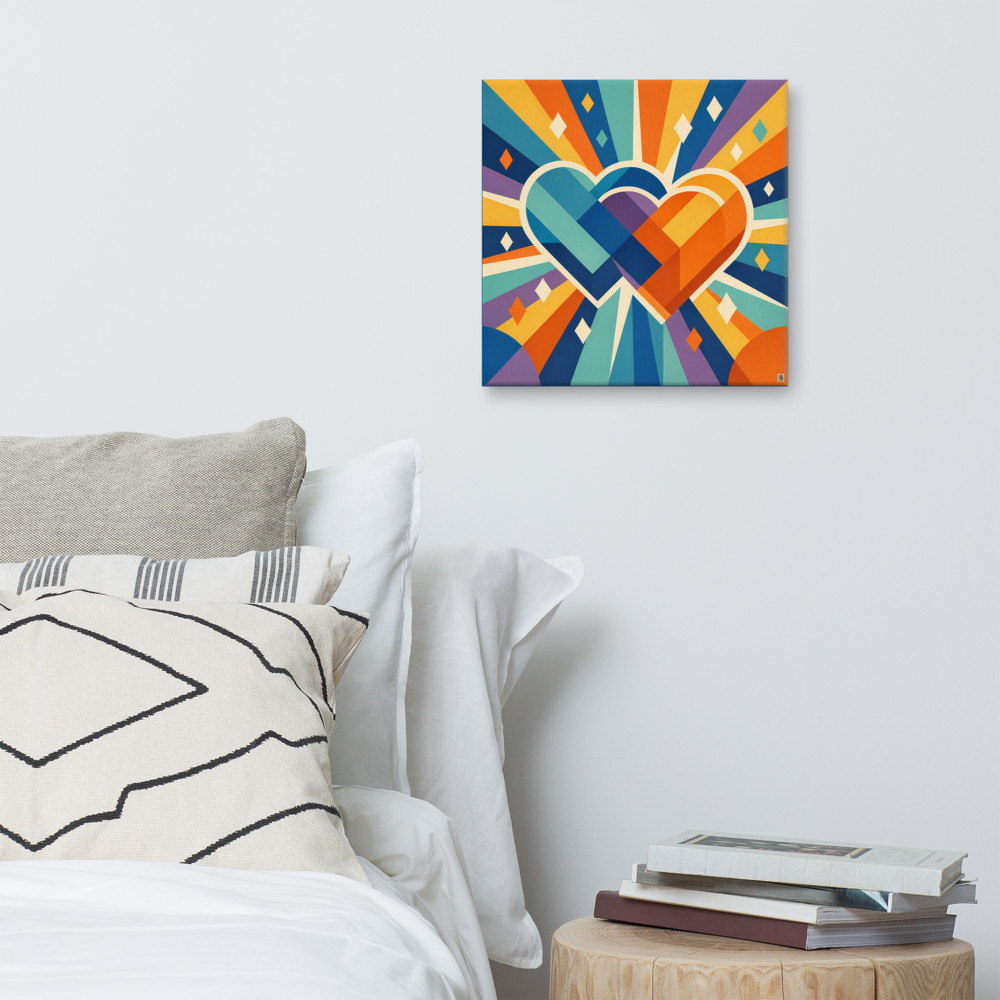
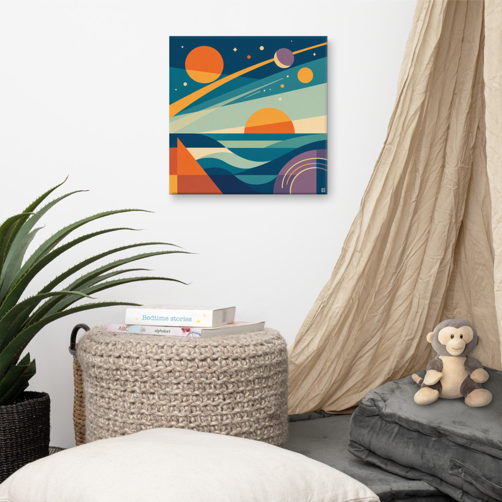
This is why I'd always pick the anchor first, before buying anything else. Even if you already own a stack of prints, lay them out and ask which one deserves to be the one everything else defers to. If nothing quite earns it, that's a sign you need to bring in a piece specifically to do that job. Something with a bit of weight to it — visually, not literally. A geometric piece with strong structure like Distant Meridian can hold a wall together because there's enough going on inside the frame that the eye has somewhere to rest.
Working outwards, not inwards
Once you've got your anchor, everything else is a conversation with it. Place your next largest pieces close to the anchor, then work outwards with smaller frames toward the edges. This creates a natural weight distribution — heavier in the middle, lighter at the perimeter — which reads as intentional even when the arrangement is fairly loose.
A few things I'd think about as you work outwards:
- Colour echoes. Pick one or two colours from the anchor and make sure they reappear at least once elsewhere on the wall. Not everywhere. Just enough that the eye connects the pieces. If your anchor has warm oranges in it, one small print with a similar warmth on the opposite side of the wall does a lot of quiet work.
- Frame consistency, mostly. All-matching frames look intentional and calm. All-mismatched frames look eclectic and busy. Both can work. What tends not to work is two matching frames and one lone rebel — that just looks like you ran out of the right one.
- Breathing room. 5–8cm between frames is a good default. Tighter than that starts to feel cramped. Wider than about 10cm and the arrangement stops reading as a single unit and becomes a collection of separate prints that happen to be near each other.
Don't feel obliged to make it symmetrical. A slightly off-balance arrangement, where one side has a bit more visual weight than the other, almost always looks better than a rigidly mirrored one. Symmetry is difficult to pull off unless the wall is architecturally symmetrical too — flanked by matching alcoves, that sort of thing.
The paper template method
This is the bit that saves you from a wall full of unnecessary holes.
Before hanging anything, trace each frame onto brown parcel paper or newsprint. Cut them out. Mark on each one where the hanging point sits on the back — this matters more than you'd think, because the nail goes where the hanger is, not where the middle of the frame is. Label each cut-out so you know which is which.
Then tape them to the wall with masking tape. Low-tack, so it doesn't lift paint. Stand back. Live with it for a day or two if you can. Walk past it at different times, in different light. Move things around. The whole point is that shuffling paper is free, but shuffling nail holes is not.
A couple of things this method reveals that you can't see just by holding frames up:
The arrangement almost always wants to sit lower than you instinctively think. People hang gallery walls too high because they're standing up when they plan them. If most of the viewing happens from a sofa, the centre of the arrangement should be at roughly seated eye level, not standing eye level. That's often 10–15cm lower than your instinct says.
And the shape of the overall arrangement matters. Squint at your paper templates from across the room. Is the outline a rough rectangle? A loose diamond? A cascading shape that follows a staircase? Whatever it is, it should feel deliberate. If the outer edge looks accidental, keep moving pieces until it doesn't.
Once it feels right on paper, mark the hanging point through the paper with a pencil, take the paper down, and hammer straight into your mark. Something like Kindred Rise with its strong geometric shape is a good test for this — if the paper template looks balanced on the wall, the real print will too.
The temptation once you've got a plan is to rush the final hanging. Don't. Get a spirit level. Check every frame after you hang the one next to it, because knocking a nail in shifts the plasterboard slightly and neighbouring frames can drift out of true. It's fiddly. It's worth it.
Related articles
Mentioned in this article