Geometric Art in a Victorian Home: When It Works, When It Doesn't
There's a particular kind of nervousness that comes with owning a Victorian or Edwardian property. You've got ceiling roses, picture rails, maybe some original cornicing if you're lucky, and the temptation is to keep everything within the era — heavy gilt frames, botanical prints, a bit of William Morris and call it done. Which is fine. But it can also feel like you're living in a museum of someone else's taste.
Geometric art, done with a bit of thought, is one of the better ways out of that. I've hung clean-lined modern prints in three period homes now (one mine, two friends'), and the contrast almost always reads as deliberate rather than jarring. The trick is knowing where it works and where it absolutely doesn't.
Why the contrast actually works
Victorian rooms were designed around layering. Patterned wallpaper, patterned rugs, patterned upholstery, all jostling for attention in a way that looks busy to a modern eye but made perfect sense at the time. The architectural details — the mouldings, the skirting, the fireplace surrounds — are themselves quite ornamental.
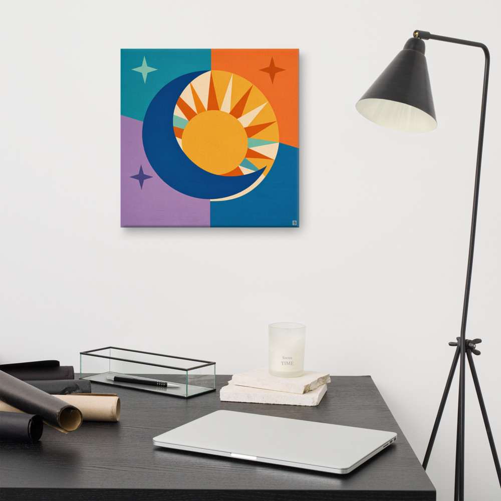
When you put a piece of geometric art into that environment, you're giving the eye somewhere flat to land. A bold sun-and-moon motif like Dawn Crossing above a tiled Victorian fireplace doesn't fight the room. It punctuates it. The clean shapes feel almost startling next to all that ornament, and that little shock is what makes the room feel curated rather than themed.
This is the same logic behind why a mid-century sideboard works in a period drawing room, or why a single Eames chair earns its keep in a house full of antiques. Contrast tells the eye that someone lives here and has chosen things. Matching everything to the era of the building can read as a slightly desperate impersonation of the past.
The other thing worth mentioning: the geometry of Victorian rooms is generally quite vertical. Tall ceilings, tall windows, tall doors. A horizontal-leaning print, or a piece with strong diagonals, can break that verticality up nicely. It gives the room a second rhythm to follow.
When it stops working
This is where I see people go wrong. Geometric art and traditional homes get along beautifully — until the art starts competing with the architecture, at which point both lose.
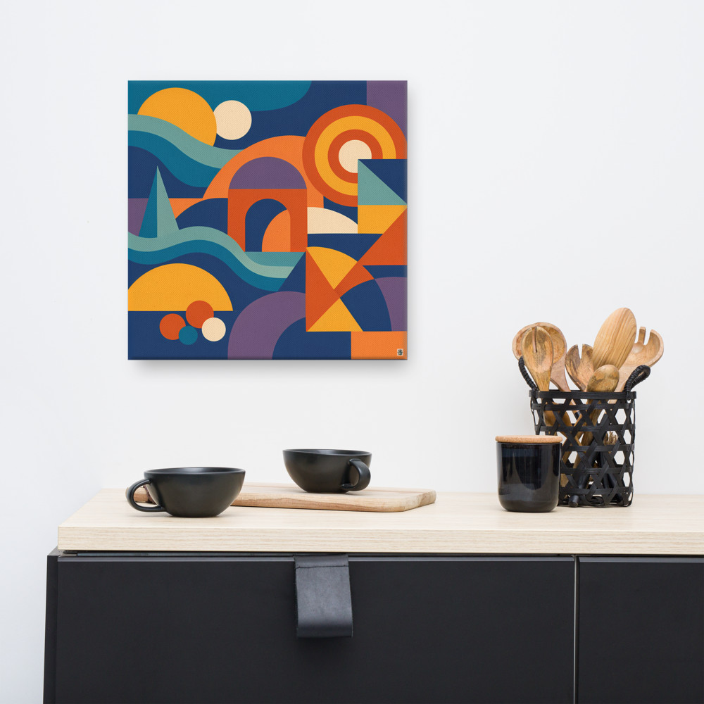
The worst offender is hanging detailed, busy geometric work directly next to detailed plasterwork. If you've got a wall with elaborate cornicing, a deep dado rail, and an ornate picture rail all visible at once, that wall is already doing a lot. Adding a print with twenty intersecting shapes and a complicated palette turns the whole thing into visual noise. Your eye doesn't know where to settle and the room starts to feel exhausting to be in.
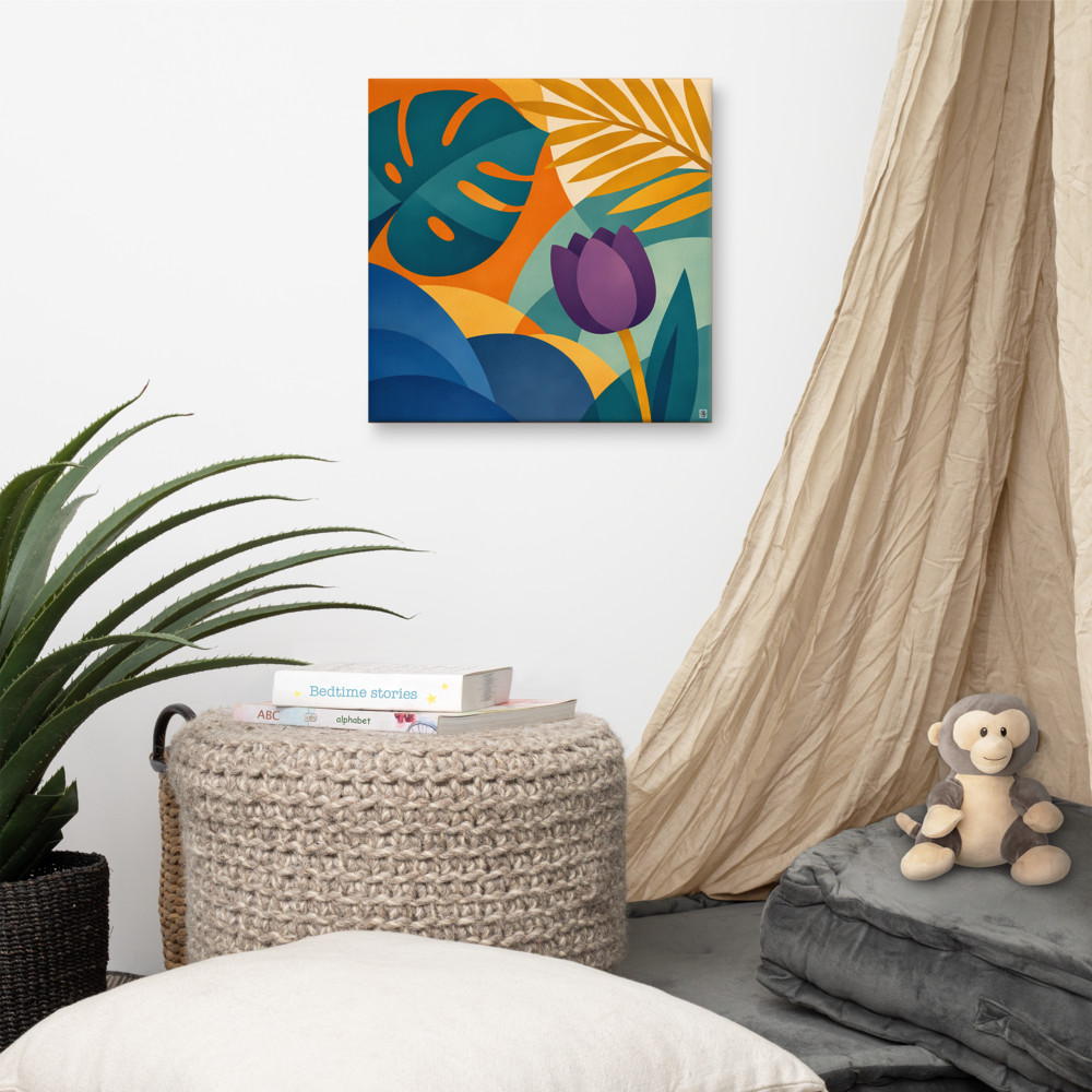
The fix isn't to give up on modern art in a period property — it's to read the wall first. If the architecture is busy, the art needs to be quieter. A piece with two or three clear shapes and a restrained palette will sit on a heavily moulded wall far better than something maximalist. Save the busier prints for the simpler walls — the ones in the hallway, the landing, the bits of the house that the Victorians treated as functional rather than decorative.
Scale is the other thing people get wrong. Victorian rooms are tall, and a small print floating in the middle of a tall wall looks lost — like a postage stamp on a parcel. If you're committing to modern art in a period room, commit to size. A 50cm or 70cm piece will hold its own against the architecture. A 30cm one usually won't, unless it's part of a grouping.
A few practical things I'd think about
Frame choice matters more here than it would in a new-build. A thin black frame on a geometric print, hung against a wall with detailed mouldings, can look quite stark in a way I personally like — but if you want to soften the contrast, a warm wood frame (oak, walnut) bridges the two languages better. It picks up on the timber of the floors and the doors, which makes the modern piece feel like it belongs to the house rather than visiting it.
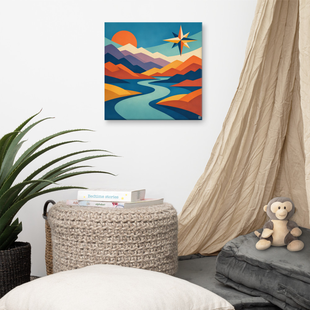
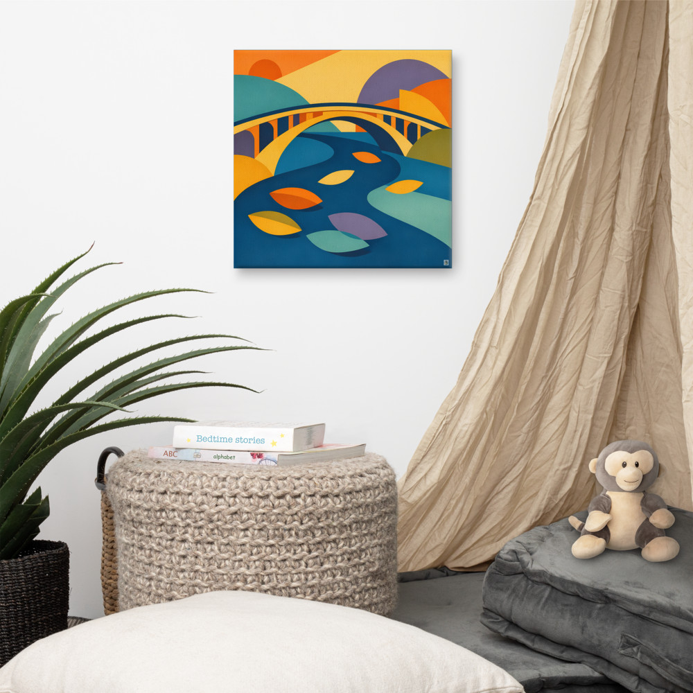
Think about where the eye enters the room. In a Victorian front room, that's usually through the doorway, with the fireplace as the focal point. If you put a piece like Northward Bend above the mantel, it becomes the thing the room is organised around. That's a strong move, and it works, but you then need the rest of the walls to back off a bit. One bold modern statement plus quieter supporting pieces is a much better strategy than trying to make every wall sing.
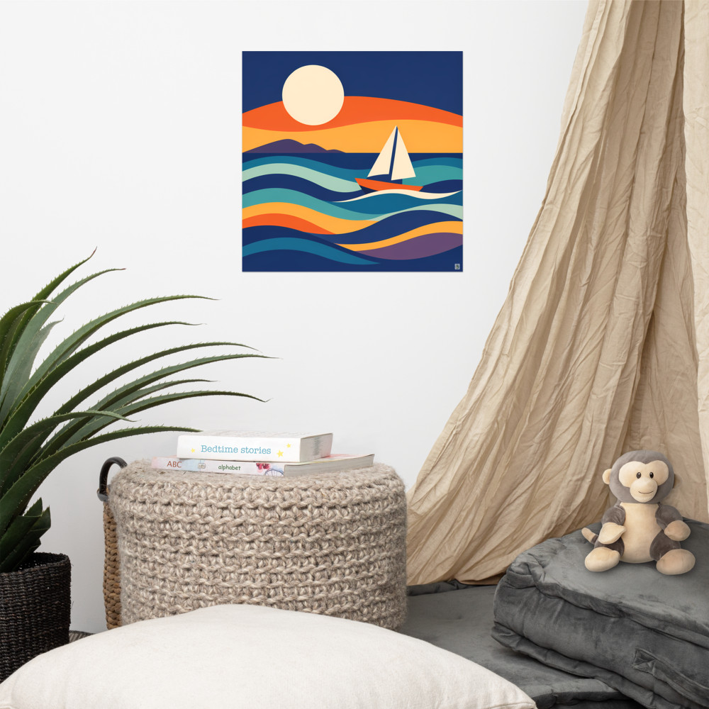
Colour is the bit people overthink. Victorian palettes were richer and moodier than we tend to remember — deep greens, oxblood, mustard, dusty pinks. A geometric print that picks up even one of those colours will tie itself into the room without you having to do anything else. Something with warm botanical tones, like Sunlit Court, can feel surprisingly at home against a dark green wall, because the colour conversation is doing the heavy lifting.
And finally — and this is the bit nobody talks about — hang it lower than you think. Victorian picture rails were positioned for ceilings that are often 9 or 10 feet high, and people instinctively hang art near them, which leaves the work floating above sightline. Centre of the piece at roughly 145-150cm from the floor is still the right answer, even in a tall room. Trust that. The architecture above can breathe on its own.
Related articles
Mentioned in this article