Mixing Frame Finishes on a Gallery Wall Without the Chaos
There's a moment, usually about halfway through hanging a gallery wall, when you step back and realise something's off. The prints are fine. The spacing's fine. But the wall looks busy in a way you can't quite name. Nine times out of ten, it's the frames.
Mixing frame finishes is one of those things that looks effortless on Pinterest and feels impossible in your hallway. Black, white, oak, brass — they all individually work with almost anything. Together, on the same wall, they can either feel curated or like you grabbed whatever was in the cupboard. The difference isn't taste, really. It's a few small rules, and knowing when to ignore them.
The two-finish maximum (and why it usually works)
The rule I keep coming back to, and the one I'd give anyone starting out, is this: pick two finishes and stop. Black and oak. White and brass. Oak and brass. Two is enough variety to feel intentional and not enough to feel scattered.
The reason it works is about visual weight. Each finish carries a different feeling — black is heavy and graphic, white disappears into the wall, oak softens everything, brass adds warmth and a bit of shine. When you've got two of those on a wall, your eye reads it as a deliberate pairing. Add a third and suddenly your brain is trying to work out what the system is, and there isn't one, so it just registers as noise.
If you're going two-finish, the easiest combination to live with is probably oak and black. The oak warms up the contrast, the black gives the wall some backbone, and almost any print style sits comfortably between them. I've got a small wall at home that's a mix of black-framed line drawings and oak-framed botanicals and it's been there for three years without me wanting to change anything, which is about the highest praise I can give an interior decision.
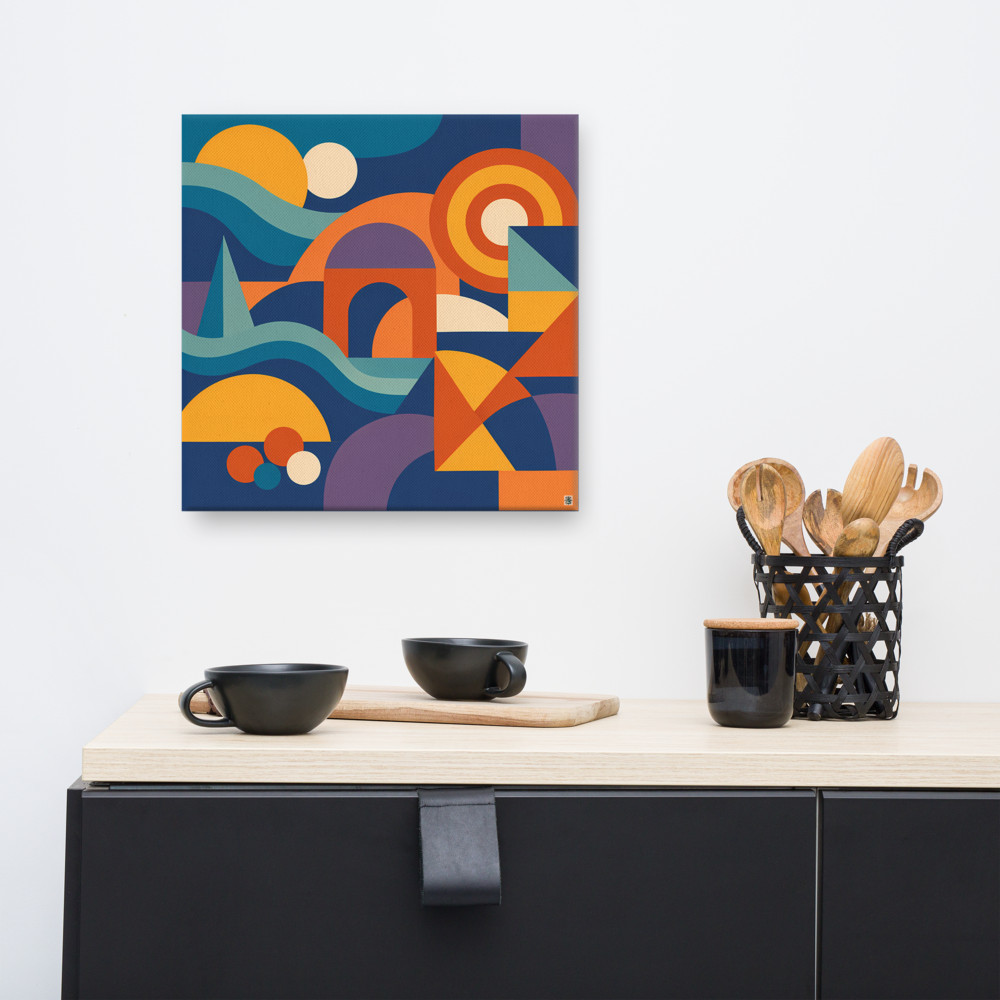
White and brass is the other reliable pairing, especially in rooms that already lean light — pale walls, linen sofas, that sort of thing. Brass on its own can feel a bit much, but tempered with white frames it reads as a soft accent rather than a statement. If you've got something with warm tones in the artwork itself, like Marigold Cove, the brass picks up on the colours in the print and the whole thing feels connected rather than coincidental.
Distribution matters more than you'd think
Here's where people often go wrong even when they're following the two-finish rule: they cluster. Three oak frames on the left, three black frames on the right, and the wall splits in half visually. You want the finishes scattered through the arrangement so your eye moves across the whole thing rather than parking on one side.
A rough guide — and I do mean rough — is to aim for something like a 60/40 or 70/30 split between your two finishes, with the minority finish dotted around rather than grouped. If you've got six frames, four oak and two black, put the black ones at opposing corners or roughly diagonal to each other. The arrangement should feel balanced even if you squinted and just saw blobs of finish.
Size plays into this too. A big frame in your accent finish will pull more attention than two small ones in the same finish, so factor that in. One large black frame can balance four smaller oak ones quite happily.
When to break the rule
Three or four finishes can absolutely work, but only under specific conditions, and it's worth being honest about them.
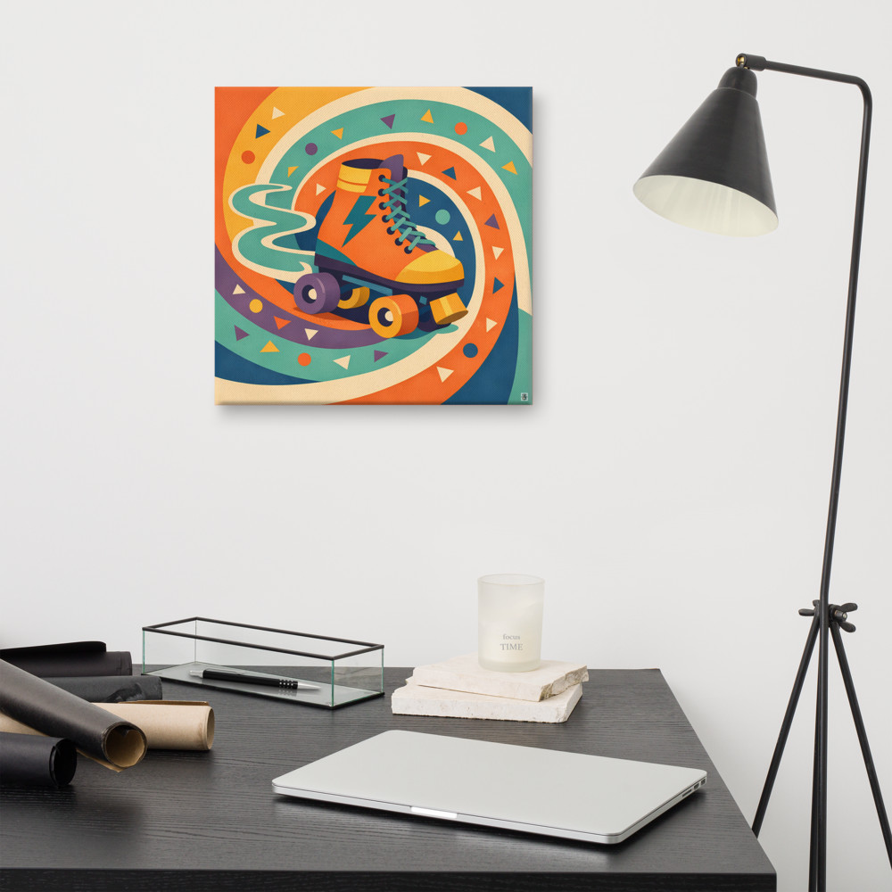
The first is when the artwork itself is doing the unifying work. If every print on your wall shares a strong colour palette or visual style, you've got more permission to vary the frames, because the eye latches onto the shared thread in the art rather than getting distracted by the frames. A wall of bold, graphic prints with a consistent retro feel — say, something like Tangerine Rink alongside other Memphis-style pieces — can handle a mix of black, white and oak frames because the prints are loud enough to lead.
The second is when one finish is genuinely an accent, meaning it appears on one frame, maybe two, and that's it. A single brass frame among a wall of black and oak isn't really a third finish — it's a punctuation mark. That's different from a wall with three or four of each, which starts to feel like indecision.
The third condition, and this one's more about the room than the wall, is when the rest of the space already mixes metals and woods confidently. If your living room has brass lamps, a black coffee table, oak floors and a white sideboard, a gallery wall with all four finishes will read as part of the same conversation. In a more pared-back room, that same wall will feel chaotic because there's nothing else in the space backing it up.
A few practical things worth mentioning
Matching frame finishes to the room hardware is a quiet detail that does a lot of work. If your door handles and light switches are brass, even a single brass frame on the wall will feel anchored rather than random. Same goes for black metalwork, oak furniture, anything visible nearby.
Mount thickness matters as much as frame colour. A thin black frame and a chunky oak one read as different objects even if you've followed every rule about distribution. Try to keep frame profiles broadly similar across the wall, or at least don't have wildly varied widths sitting next to each other.
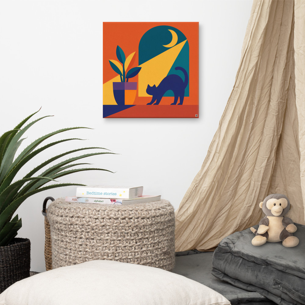
And give yourself permission to swap things out. Frames are the easiest thing to change in a room — much easier than the art itself. If you've hung something like Ember Sill in a black frame and it's not quite working, an oak frame might be all the wall needs. The print isn't the problem. The setting is.
Most gallery walls that look properly considered have been adjusted at least once. Mine certainly have.
Related articles

Mentioned in this article