Grid vs Cluster Gallery Walls: Which Layout Suits Your Room
There's a moment, usually after you've bought three or four prints you genuinely love, when you have to decide what kind of person you are. Not really, but a bit. Are you going to hang them in a neat grid where everything lines up to the millimetre, or are you going to scatter them across the wall in a loose cluster that looks like it grew there over time?
It sounds like a small decision. It isn't. The layout you pick changes how the whole room reads — more than the frames, sometimes more than the art itself.
What a grid actually says
A symmetrical gallery wall — same frame sizes, even spacing, usually a 2×2, 3×3 or 2×3 arrangement — is a calming thing to look at. Your eye doesn't have to work. It lands, takes it all in, moves on. That's why grids tend to suit rooms that are already doing a lot: open-plan kitchens with busy worktops, hallways with coats and shoes and post piling up, home offices where you're staring at a screen all day and don't need your peripheral vision pulling you sideways every five minutes.
Grids also flatter modern interiors. If your sofa is low and linear, your coffee table is a clean rectangle, and your lighting is intentional rather than inherited, a grid will look like it belongs. It reinforces the geometry that's already there.
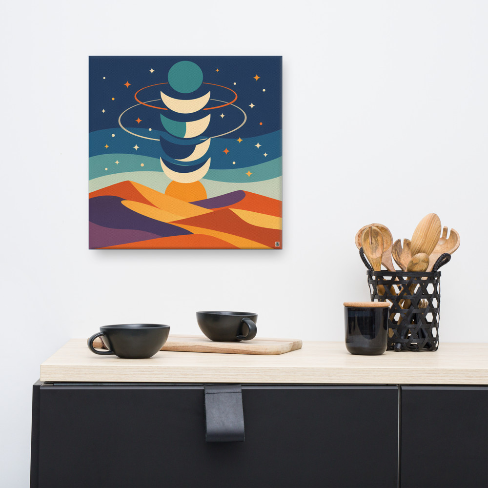
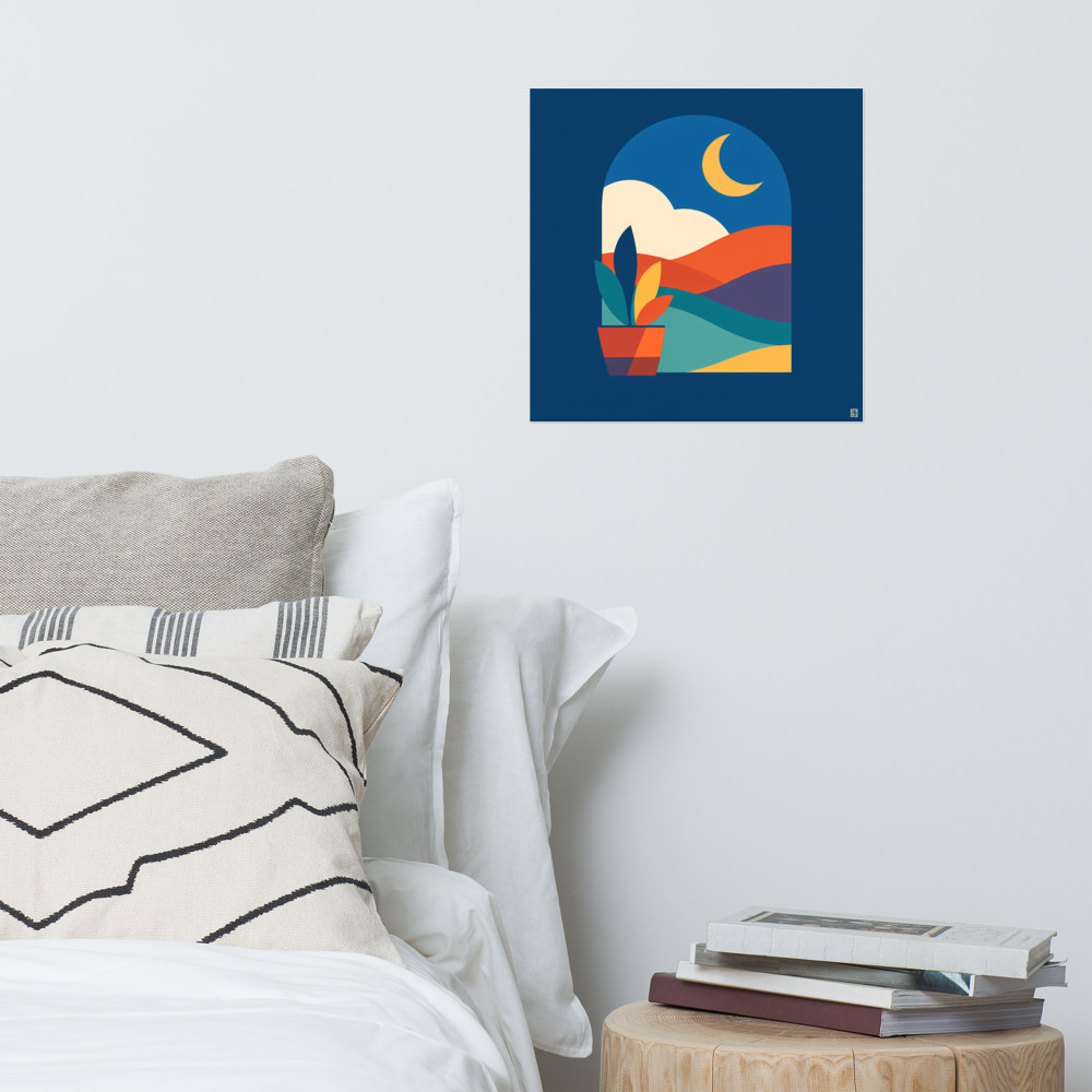
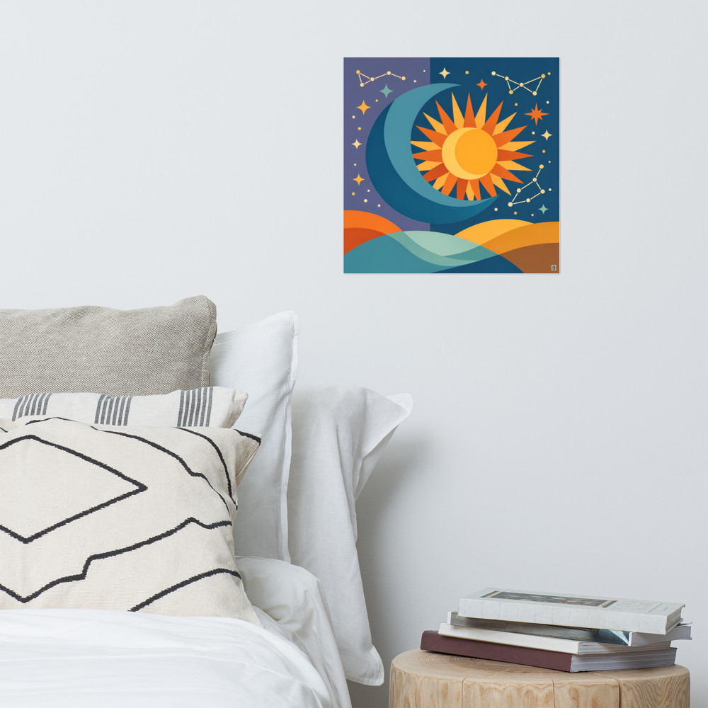
The trade-off is honesty: a grid is unforgiving. If one frame is 4mm off, you'll see it. If the prints don't share a colour palette or a tonal weight, the grid amplifies the mismatch rather than absorbing it. You need pieces that genuinely talk to each other. Something like Mirage Rise paired with Distant Vale works in a grid because they share a moon, a palette, a mood — there's a visual logic holding them together. Throw in something wildly different and the grid stops feeling considered and starts feeling like a mistake.
A grid also commits you. Once it's up, you can't really swap one print out for something seasonal or new without disrupting the balance. It's a more permanent statement than people realise when they start drilling.
What a cluster says
A scattered, organic gallery wall — sometimes called a salon hang, sometimes just a cluster — is the opposite proposition. Different frame sizes, different orientations, prints at varying heights, with the spacing roughly even but never measured. The effect is informal, lived-in, a bit bohemian even if nothing else in the room is.
Clusters suit rooms with history or texture: a sitting room with a slightly worn rug, a bedroom with mismatched bedside tables, a stairwell where the wall already has a bit of character. They also forgive you. You can add a new print next year and just tuck it into a gap. You can mix a small landscape print with a larger abstract and a tiny framed postcard from a holiday and it still reads as intentional, because the whole point is that it isn't uniform.
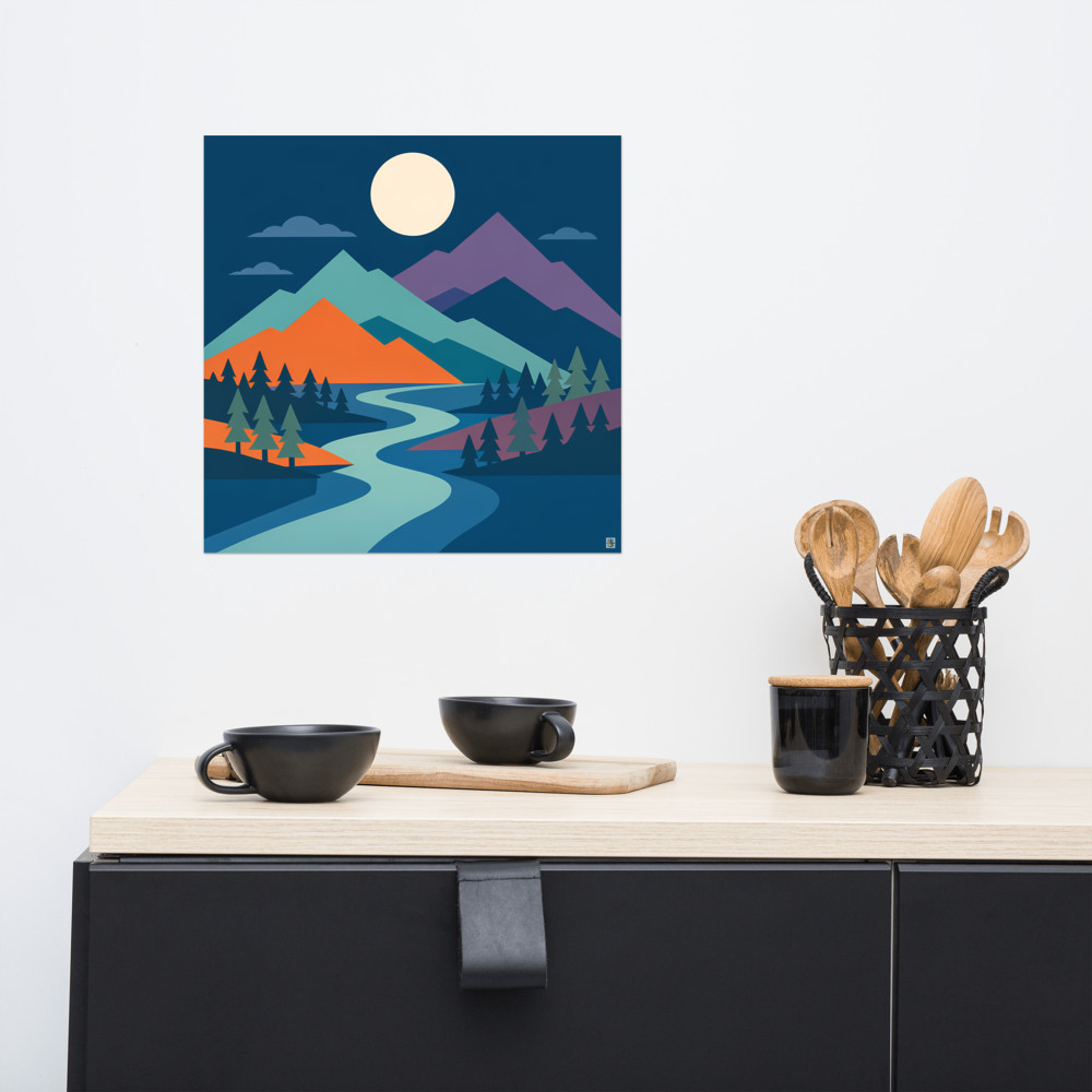
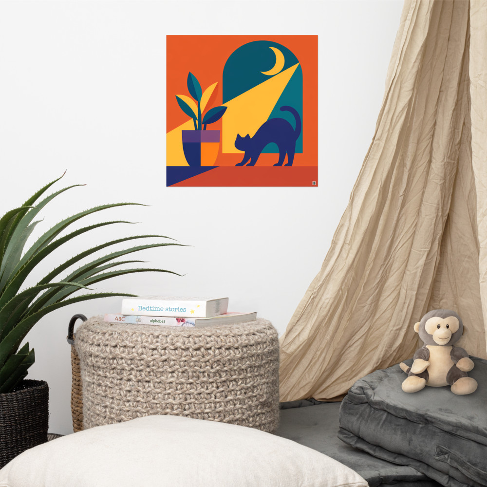
The risk with a cluster is that it tips into chaos. The fix isn't to add more rules — it's to find one or two threads that quietly connect everything. A shared colour running through three of the five prints. A frame material that repeats. A consistent mat board. Something like Distant Cove anchoring a cluster gives the eye somewhere to land first, and the smaller pieces around it become supporting players rather than competitors.
I'd also say: clusters look better when there's one piece that's clearly the biggest. A cluster of similarly sized prints just looks like a grid that's gone wrong. You want hierarchy.
Matching the layout to the room, not the trend
The honest answer to symmetrical gallery wall vs cluster is that neither is better. They do different jobs. The mistake I see most often is picking the layout based on what's on Pinterest that month rather than what the room actually needs.
A few rough rules of thumb that I'd stand by, with caveats:
- If the wall is above a piece of furniture (sofa, sideboard, bed), a grid usually sits more comfortably because it echoes the rectangle below it. A cluster above a sofa can work, but it needs to be contained within the width of the furniture or it starts to feel like it's spilling.
- If the wall is freestanding — a stairwell, a hallway, a chimney breast — a cluster has more room to breathe and feels less like it's fighting the architecture.
- If your interior style is mid-century, Scandi, or anything with strong horizontal lines, lean grid. If it's more layered, vintage, or eclectic, lean cluster.
- If you genuinely can't decide, a grid is the safer bet for a first gallery wall. Clusters look easy and aren't.
One thing worth saying about gallery wall layout types in general: paper templates are your friend. Cut newspaper or brown paper to the size of each frame, tape them to the wall with masking tape, and live with the arrangement for a few days before you put a single hole in the plaster. You'll move things three or four times. That's normal, and it's much cheaper than filling holes later.
The other thing — and this is the bit nobody mentions — is that the layout you choose will dictate how often you actually look at the wall. Grids become part of the architecture; you stop seeing them after a month, in the nicest possible way. Clusters keep catching your eye because there's always a slightly different path through them. Neither is wrong. It just depends on whether you want art that sits quietly in the background, or art that keeps reintroducing itself.
Related articles
Mentioned in this article