Hanging Art Up a Staircase Without Making It Look Wonky
Stairwells are the room nobody designs. You walk through them dozens of times a day and barely register the walls, until one day you notice they're completely bare and you think, right, I should do something about that. Then you try, and immediately discover that hanging art on a sloping wall is fiddly in a way no Pinterest grid prepared you for.
The main mistake I see — and I've made it myself — is trying to hang everything at the same height, the way you would in a hallway or above a sofa. On a staircase, that fights the architecture. You end up with frames that feel like they're sliding off the wall, or sitting at heights that only make sense if you're standing on a specific step. It looks restless. Your eye doesn't know where to land.
The fix is to follow the stairs, not the floor.
The staircase line
Imagine a line running parallel to your handrail, roughly 145–155cm above each tread (so, eye level for an average adult standing on that step). That diagonal is your anchor. Every frame's centre should sit on or near that line. Not the tops aligned, not the bottoms — the centres. This is the bit people get wrong with the tape-measure-from-the-floor approach.
When the centres follow the slope, the arrangement reads as deliberate. Your eye travels up the wall the same way your feet travel up the stairs. It feels calm even when the individual pieces are quite different from each other.
A practical way to plan this: cut paper rectangles the size of your frames, stick them up with masking tape, and walk up and down the stairs a few times. Look at them from the bottom, from the top, from the landing. Move things around. Live with the paper for a day or two before you put a single nail in. You'll save yourself a lot of filler.
Spacing-wise, I'd leave about 5–8cm between frames if you're doing a tight cluster, and 15–20cm if you want them to read as separate moments rather than a gallery wall. Tighter spacing forgives slight misalignments; wider spacing punishes them. Worth knowing before you commit.
What actually survives a stairwell
Here's the unglamorous reality of stairwell decor: things get knocked. Hoovers thump into the bottom row. Suitcases swing into the middle row on the way to the loft. Children, dogs, and your own elbow when you're carrying laundry will all, at some point, make contact with a frame. Plan for it.
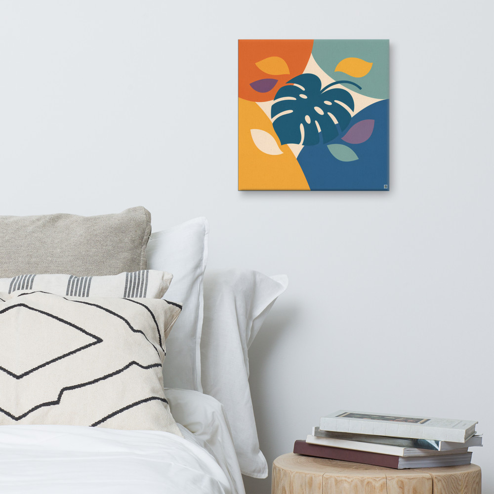
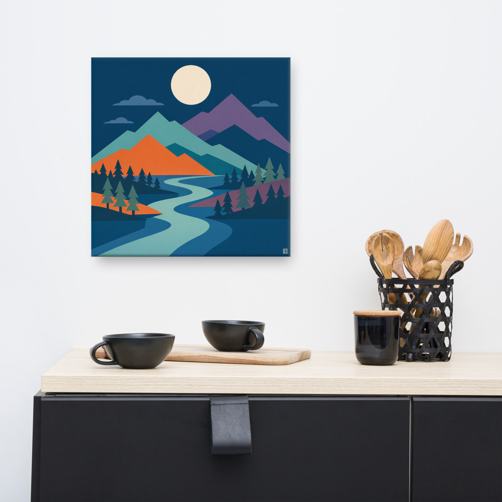
Glass is the obvious vulnerability. A single sharp knock and you've got shards on the stairs, which is genuinely dangerous if anyone's barefoot. For anything below shoulder height on a staircase, I'd skip glazed frames entirely. Canvas prints are the sensible choice here — they take a knock, they don't shatter, and a small scuff on the edge of a canvas usually doesn't show. Something like Canopy Cove on canvas at the lower stretch of the wall is going to outlast a glazed equivalent by years.
For the higher pieces — head height and above, where the only thing likely to touch them is the occasional duster — framed prints are fine. That's where I'd put anything with detail you want to look at properly, or anything sentimental you'd be gutted to replace.
Size matters more on stairs than people realise. Tiny frames get visually swallowed by the verticality of the wall. You're often looking at them from quite far away (the bottom of the stairs to the top of the wall can be three or four metres of sightline), so anything smaller than about 30cm on its longest edge tends to disappear. I'd lean towards one or two larger pieces — say 50–70cm — with maybe a couple of mid-sized supporting ones, rather than scattering eight little frames up the slope. The wall is big. Let the art be big too.
Choosing what goes up there
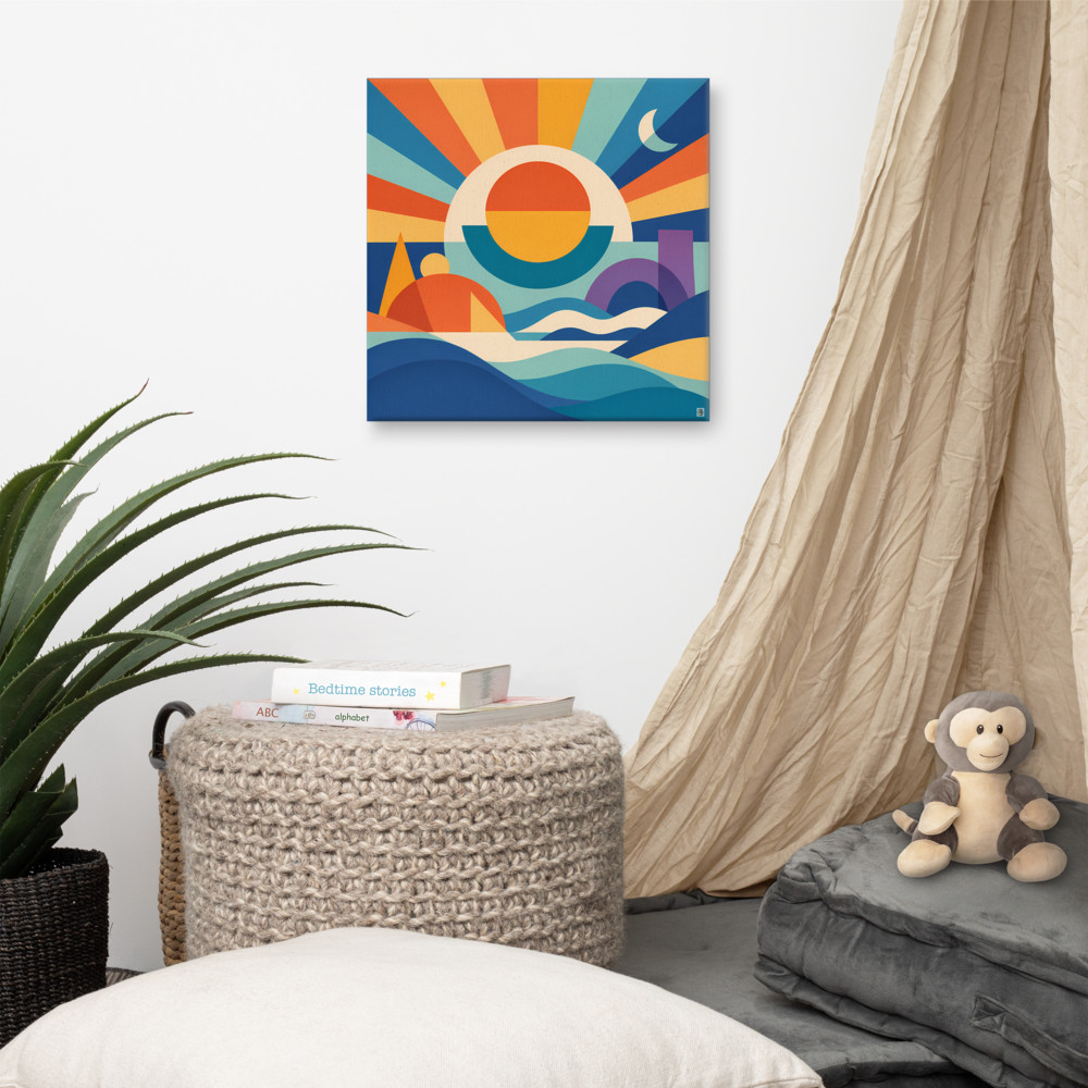
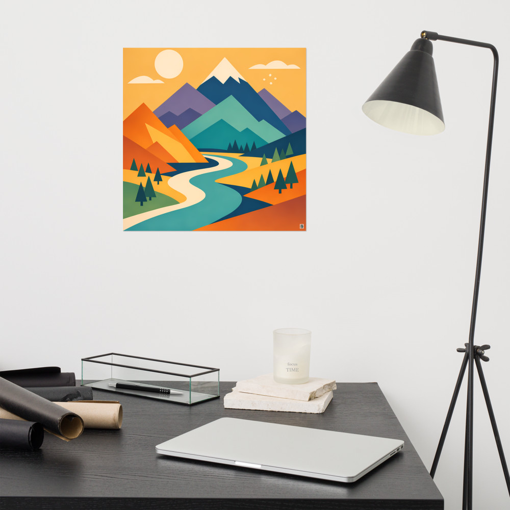
Stairwells are funny spaces tonally. They're transitional — you're never standing still in them — so they can take art that might feel too much in a room where you sit and stare at it for hours. Bolder colours, more graphic shapes, something with a bit of movement. A piece like Sunward Tide, with its strong horizon and layered colour, suits the diagonal sweep of a staircase because the eye already wants to travel across it. Pieces with implied direction — sun rays, waves, spirals — tend to work harder on a stairwell than perfectly symmetrical compositions, which can feel static against the slope.
A quiet trick: pick a loose colour story across three or four pieces rather than matching them precisely. Two warm-toned, one cooler, one nearly neutral, all sharing one accent colour. The eye reads them as belonging together without you having to buy a coordinated set. June Current pairs nicely with warmer-toned prints for exactly this reason — the botanical greens read as a calm pause between busier pieces.
Lighting is the bit most people forget. Stairwells are often lit from above by a single pendant or from below by whatever leaks in from the hall. That means the top of your arrangement is usually well-lit and the bottom is in shadow. Put your boldest, highest-contrast piece lower down where it can hold its own in dimmer light. Save subtler work for the top, where it'll actually be seen.
One last thing on fixings. Stairwell walls in older UK houses are sometimes lath and plaster, sometimes plasterboard over old brick, sometimes a confusing mix on the same wall. Test a small hole before you commit to a layout. The wall that took a regular picture hook beautifully at the bottom of the stairs might crumble disappointingly halfway up. Adhesive strips can work for lighter canvases but I wouldn't trust them above head height — if one fails, you don't want a frame coming down onto a tread.
Related articles
Mentioned in this article