InkSmithery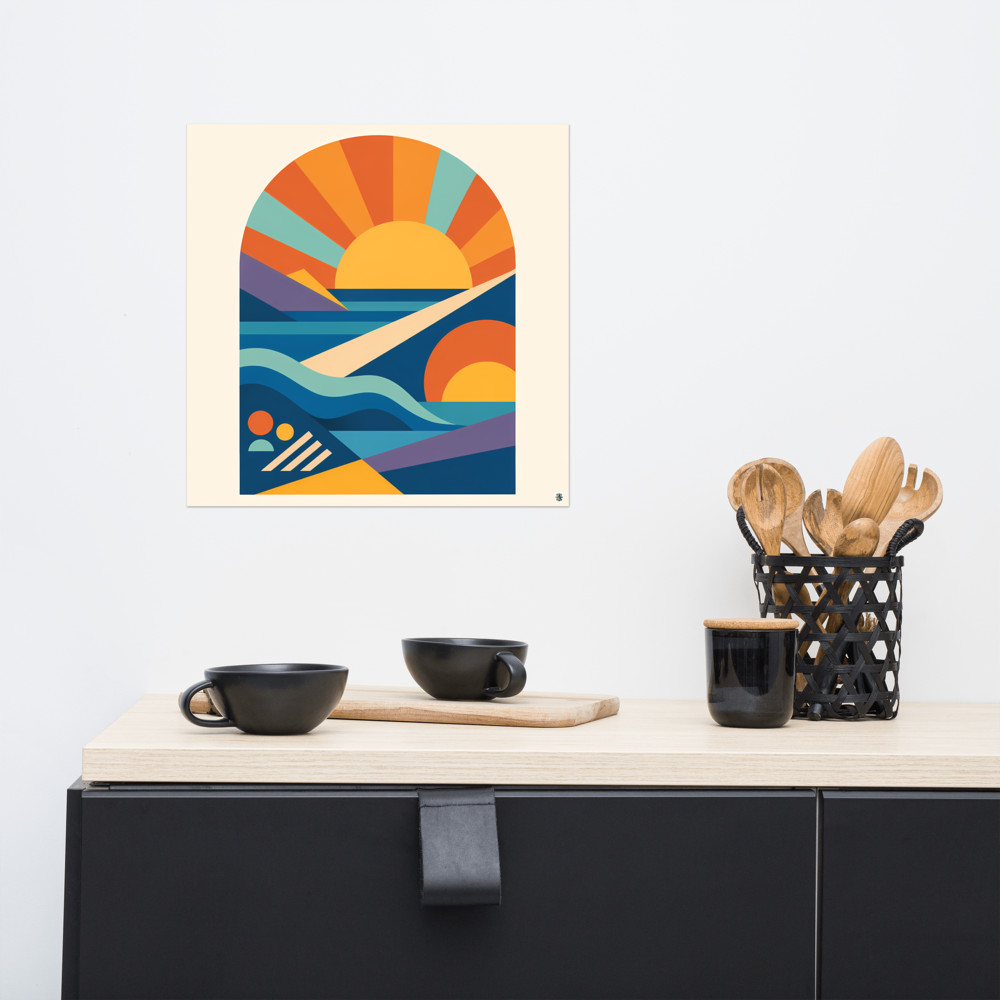
How to Mix Photography, Abstracts and Line Art on One Wall
The gallery walls that make you stop and actually look at them almost never contain one type of art. It's the mix that pulls you in — a black and white photograph next to a loose ink drawing next to something bold and abstract. But it's also the mix that people find hardest to pull off at home. You buy three prints you love, hang them together, and somehow the wall looks like a jumble sale rather than a considered arrangement.
The reason is almost always the same. There's nothing tying it together.
A mixed media gallery wall needs one thread running through it — just one — and once you've got that thread, everything else is allowed to vary wildly. Different subjects, different styles, different scales. The unifying element does the heavy lifting so the individual pieces don't have to match each other. That's the trick, really. Match one thing, vary the rest.
Pick your thread before you pick your prints
There are three threads that tend to work, and I'd pick one and commit to it rather than trying to do all three at once.
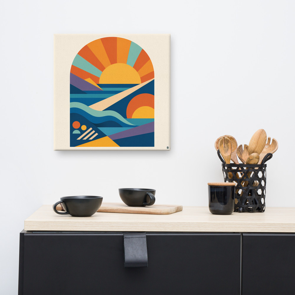
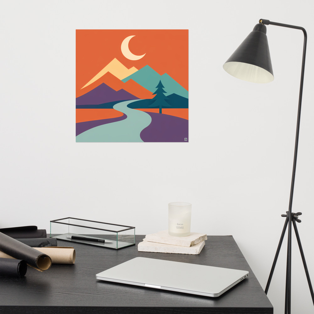
The first is palette. If every piece shares two or three colours — say, a warm terracotta, a muted teal, and cream — you can hang a black and white portrait next to a geometric abstract next to a botanical line drawing and it'll feel intentional. The eye reads the colour repetition first and the style differences second. This is why prints like Solway Rise, with its warm retro palette, can sit comfortably next to something completely different in subject matter, as long as those rusts and ochres show up somewhere else on the wall.
The second is frame. If everything is in the same frame — same colour, same width, same finish — you can hang almost anything inside those frames and it'll cohere. This is the classic art gallery move. Walk into any decent gallery and you'll see wildly different work presented in identical frames, and it works. At home, matching oak frames or matching thin black frames will let you get away with an enormous amount of stylistic variety.
The third is era or mood. Everything mid-century. Everything vaguely botanical. Everything with a slight melancholy to it. This one is more subjective and takes a better eye, but when it lands it lands hard. A wall of things that all feel like they belong to the same imagined world, even if the media and subjects are wildly different.
Pick one thread. If you try to unify by palette *and* frame *and* era, you've essentially made a matching set, which is the opposite of what makes an eclectic art wall interesting in the first place.
What you're actually allowed to vary
Once your thread is chosen, this is where the fun starts. You can mix:
- A grainy landscape photograph with a clean vector illustration
- A dense, detailed abstract with an almost-empty line drawing
- Something figurative with something completely non-representational
- Small pieces with a much larger anchor piece
- Portrait orientation with landscape with square
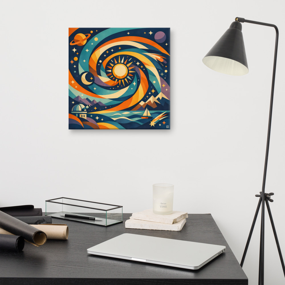
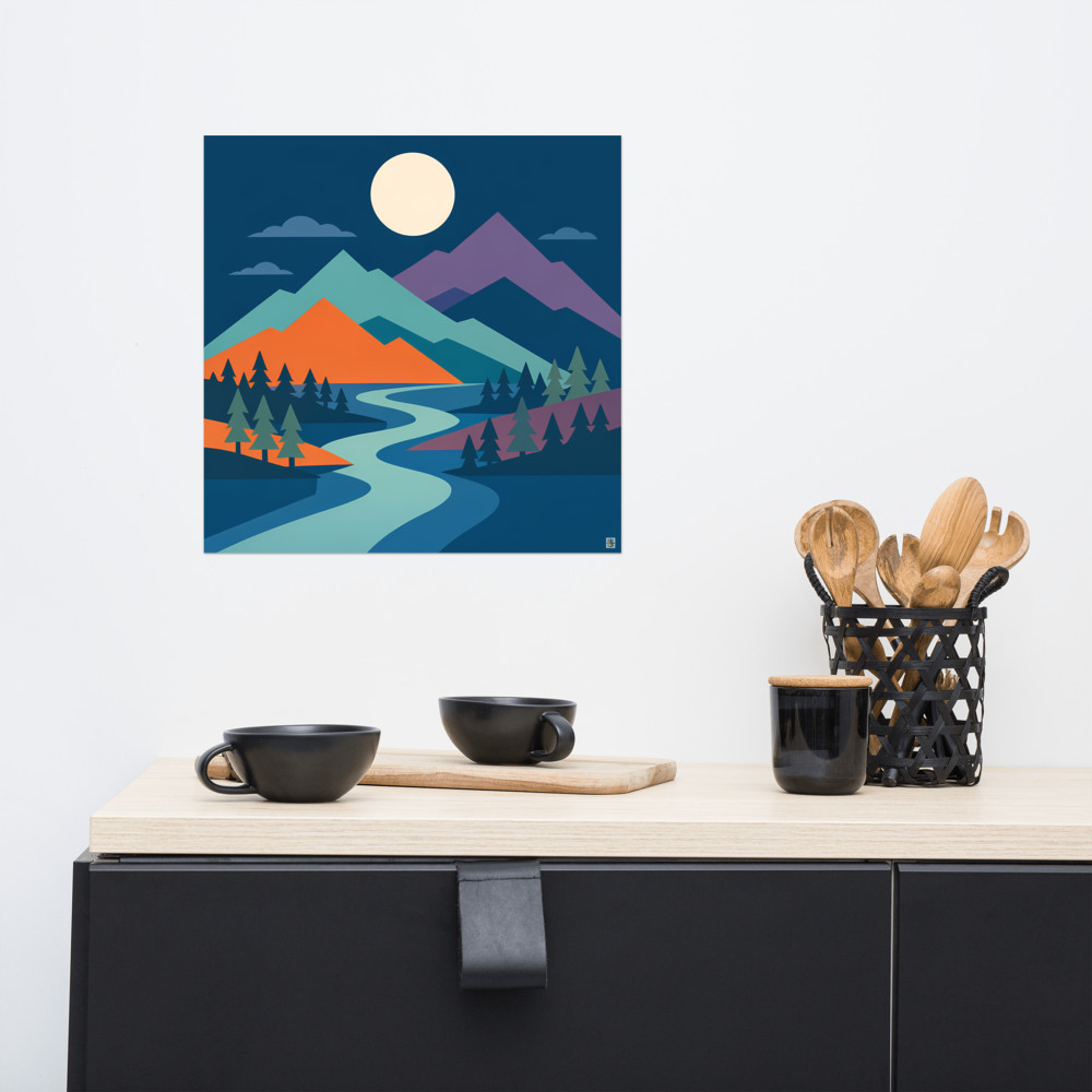
The contrast is the point. If you've committed to a palette, then a busy abstract next to a spare single-line drawing creates rhythm — the eye rests on the quiet piece and gets pulled back to the loud one. A piece with a lot of movement, like Night Passage, works best when there's something calmer nearby to balance it. Two swirling, busy prints next to each other tend to fight.
Scale variation is underrated. A common mistake is hanging everything at roughly the same size, which creates a grid feeling even when you didn't want one. One larger piece — maybe 50cm or 60cm on its longest edge — surrounded by smaller ones gives you an anchor and a hierarchy. Your eye knows where to start.
The layout bit, briefly
I'm not going to give you a rigid formula because gallery walls really don't need one, but two things worth knowing.
Keep the gaps between frames consistent. Somewhere around 5-8cm works for most rooms. Tighter looks more like a salon hang, wider looks more like a modern gallery, but pick one and stick with it across the whole arrangement. Inconsistent gaps read as accidental even when the art itself is beautiful.
And lay it out on the floor first. Every time. Move things around for as long as you need to before a single nail goes in the wall. If you want to be really careful, cut paper templates the size of each frame and tape them to the wall to check the overall shape. It feels fussy but it saves you from a wall full of extra holes.
When it's not quite working
If you've hung everything and it still feels off, the culprit is usually one of three things. Either one piece is breaking the thread — its palette is a shade too cold, or its frame is subtly different — and it needs to move somewhere else. Or the scale is too uniform and you need one piece to be visibly bigger than the rest. Or, most commonly, there's a piece that just doesn't belong on this particular wall and you're trying to force it because you like it.
That last one is hard. A print you love genuinely might not fit with the others you love. That doesn't mean it's a bad print — it means it wants to live somewhere else in your home. A Harbour Afterglow print with warm gradient tones will sing on a wall built around dusky pinks and oranges, and sulk on a wall built around cool blues and greys. Same print, different context.
Good mixed walls are usually built slowly. Start with three or four pieces you're confident about, live with them for a while, then add. The walls that look effortlessly collected almost always were, in fact, collected — just with one quiet rule holding the whole thing together.
Related articles
Mentioned in this article