InkSmithery
Matte vs glossy prints: how finish behaves in daylight and lamp light
There's a moment most people don't think about until they've already hung something on the wall: the print looks completely different at 3pm than it does at 9pm. Sometimes better. Sometimes noticeably worse. And a huge chunk of that difference isn't the artwork itself — it's the finish sitting on top of it.
I've had prints that I genuinely loved in the shop lighting turn into a mirror-slick mess above my sofa the second the afternoon sun hit the wall. And I've had matte prints that looked a bit flat at first glance suddenly earn their keep once the lamps came on. So it's worth talking about this properly, because most advice online is basically "matte is modern, glossy is vibrant" and then it just stops there.
What actually happens when light hits a print
Glossy finishes have a smooth, sealed surface. Light hits them and bounces back in more or less the same direction it came from — that's why you see reflections, glare, and sometimes a full-on window-shaped hotspot right across the middle of the piece. Matte finishes are microscopically rough, so light scatters in all directions when it lands. You lose a bit of the punchy contrast, but you also lose the mirror effect.
That's the whole physics of it, and it explains almost every complaint people have about their prints.
In bright daylight — especially direct sun, but even strong indirect light through a big window — glossy prints often look worse than they did when you unboxed them. The glare flattens the image. You tilt your head to see past the reflection. Colours that should be deep look washed out because you're seeing the light source bounced back at you, not the ink underneath. On a piece with a lot of dark areas, like Moonlit Quay, a glossy finish under a south-facing window can turn the whole moody navy sky into a bright rectangle of reflected daylight. Which is the opposite of what you wanted.
Matte prints in the same spot behave. The colours read as the colours. You might lose a touch of the deepest black — matte can't quite hit that wet-ink density that gloss can — but in exchange, the picture is actually visible from every angle in the room, at every time of day.
Why glossy comes into its own after dark
Here's the flip side, and the reason I don't want to just say "always pick matte." Under warm, directional lamp light — a table lamp, a picture light, a soft overhead pendant — glossy finishes genuinely glow. That same reflective surface that ruined things at midday now gives you a subtle sheen, deeper blacks, and colours that look more saturated than the matte version of the same image. The reflections are controlled because the light source is controlled. You know where the lamp is. You've placed the print so the glare doesn't land in your eyeline.
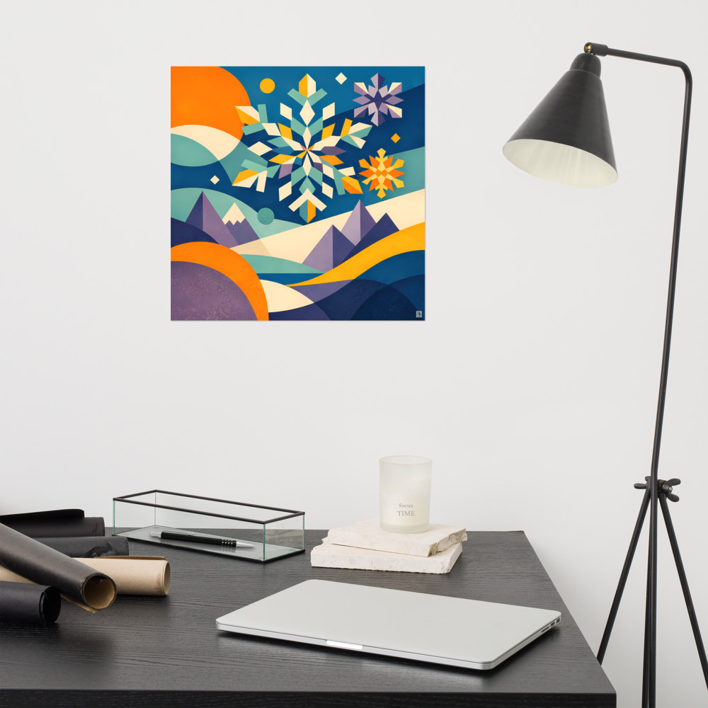
A piece with rich blues and warm accents, something like Quiet Crossing, can look almost lit-from-within under a decent floor lamp if it's on a glossy stock. The matte version of the same print looks lovely too — just quieter. More like a painting, less like a photograph.
So if your room is mostly used in the evenings, and you already know your lighting setup, glossy is not the villain the internet sometimes makes it out to be.
The honest case for matte as the default
That said, if I had to pick a finish for someone who hasn't hung the print yet, hasn't finalised their lighting, or isn't sure how the sun moves across that wall — I'd pick matte nearly every time. Here's why.
Most rooms are used across the whole day. A print in a living room gets morning light through the curtains, midday sun bouncing off the floor, afternoon shadow, then lamp light in the evening. Matte handles all of that consistently. It might not peak as high as glossy under ideal conditions, but it never fails badly either. It's the finish that works in more situations, which for a piece you're going to look at every day for years matters more than a specific best-case moment.
Matte is also more forgiving of hanging mistakes. Hung it slightly off-centre from the window? Put a lamp on the wrong side? Have a shiny wall paint you didn't think about? Matte absorbs those decisions. Glossy amplifies them.
And — this is the bit nobody mentions — matte hides fingerprints and dust far better. If the print is in a hallway, kitchen, or anywhere near a doorway that gets touched, the smudges on a glossy surface are relentless.
When I'd actually reach for glossy
A few situations where I think glossy earns its place, honestly:
- The print lives in a room you mostly use in the evening, with lamps rather than overhead lighting.
- The image itself is high-contrast with rich, saturated colour — botanicals, tropical palettes, deep night scenes. Something like Canopy Cove has the kind of colour depth that glossy genuinely flatters.
- The wall gets no direct sun, ever. North-facing rooms in the UK, interior walls, snug spaces.
- You're framing behind non-reflective glass anyway, in which case the finish underneath matters less than you'd think.
Outside of those, matte's the safer bet. Not the more exciting one, necessarily. But the one that's going to look right on a random Tuesday afternoon when the sun does that thing it does around 4pm, and you glance up from the sofa and just enjoy the picture instead of squinting at it.
Worth walking around your room at a few different times of day before you order, if you can be bothered. Sun at breakfast, sun at lunch, lamps at dinner. You'll know which finish suits that wall within about thirty seconds of paying attention.
Related articles


Mentioned in this article