InkSmithery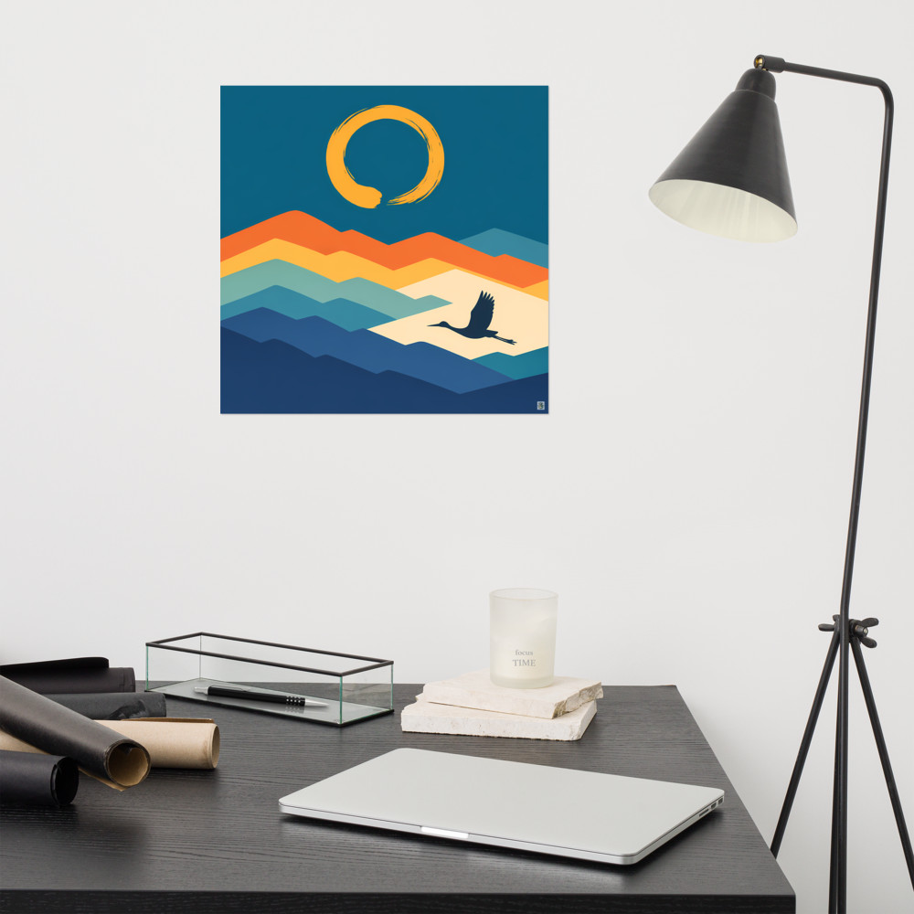
Using Art to Define Zones in an Open-Plan Space
Open-plan living was sold to us as freedom. And it is, mostly. But anyone who's actually lived with a knocked-through kitchen-diner-lounge knows the flip side: without walls, the whole space can feel like one big undifferentiated room where the sofa is always vaguely staring at the hob. You sit down to watch something and you're aware of the dirty pans. You eat dinner and you're aware of the telly. Nothing has edges.
The usual advice is rugs and lighting, and both work. But art is the one people underuse, and honestly it's often the fastest fix. A well-placed piece behind the sofa or above the dining table draws a line in the air — a visual boundary that tells your brain *this bit is for sitting, that bit is for eating*. No building work required.
The catch is that art in an open-plan room behaves completely differently from art in a normal-sized room. Scale is the thing that trips people up, and it's what I want to talk about most, because getting it wrong is the single most common mistake I see.
Why your usual instinct about size is wrong
In a standard living room — say four by five metres, ceilings around 2.4m — a 40x50cm print above the sofa looks about right. It reads as a proper piece. Hang that same print on a wall in an open-plan space where the ceiling's been vaulted or the room stretches nine metres end to end, and it looks like a postage stamp. Your eye doesn't know what to do with it. It just skates past.
The rule I use, roughly: in an open-plan space, whatever you'd normally hang, go one or two sizes up. If you were going to buy a 50x70, look at 70x100. If you were thinking A2, think A1 or bigger. The piece has to hold its own against the volume of air around it, not just the wall it's on.
This matters even more when the art is doing zoning work. A tiny frame above the sofa doesn't create a zone — it's just decoration on a wall. A large piece, or a considered pairing, actually establishes territory. It says: this is the sitting area. The eye lands there and understands.
Where to actually place things
Think of the natural sightlines through the space. When you walk in the front door, what do you see? When you're at the kitchen island, what's straight ahead? Those are your anchor walls, and they're where the biggest, most confident pieces should go.
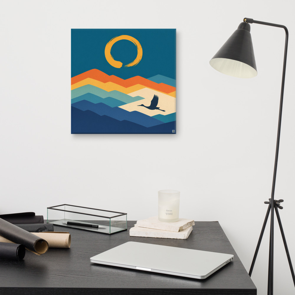
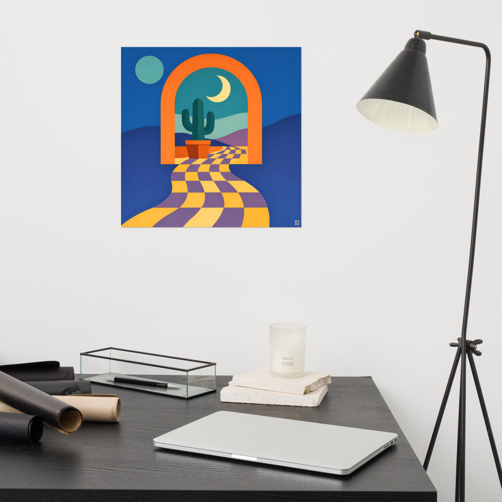
For the lounge zone, the wall behind the sofa is the obvious one, but don't overlook the wall the sofa *faces*. If your telly is mounted there, art either side of it can bracket the whole seating area and make it feel contained. Something soft and horizonal-feeling works well here — I've got something like Distant Crossing in mind, where the layered mountains give the eye somewhere to settle without being loud. In a zone meant for winding down, you don't want a piece that shouts.
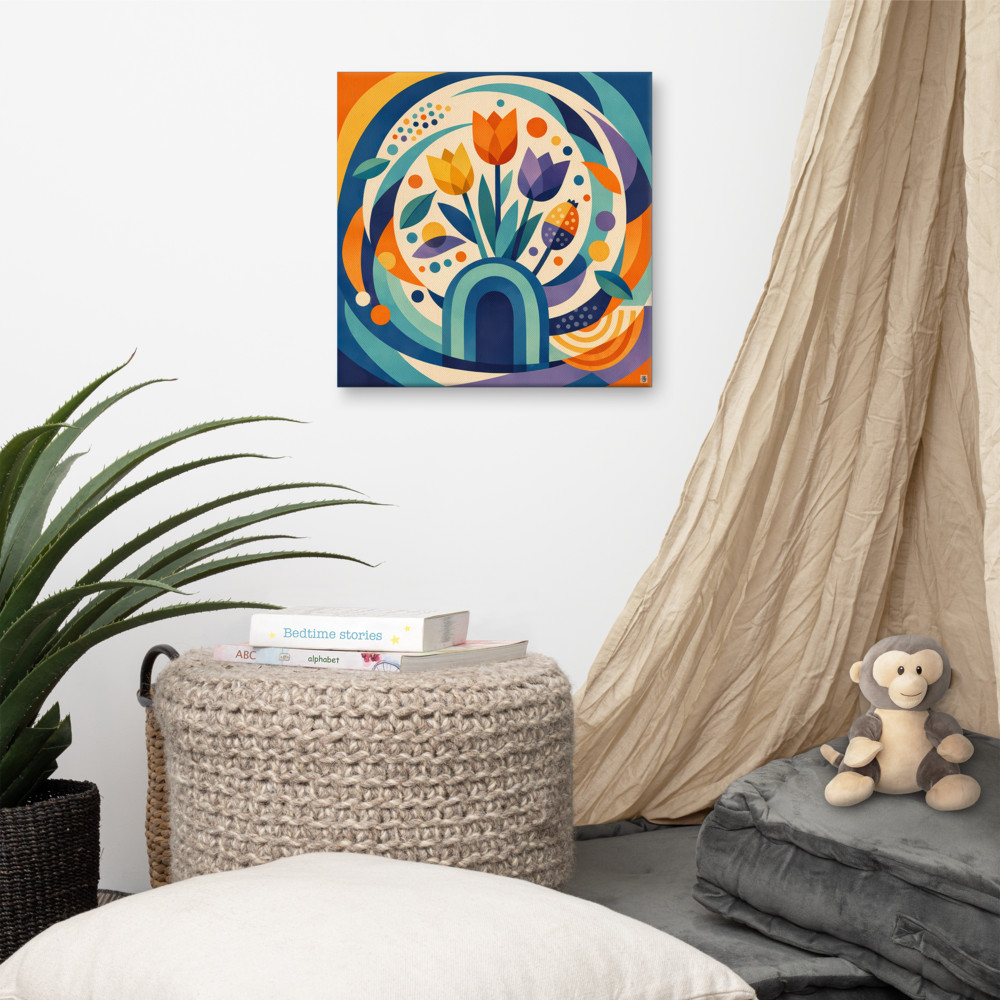
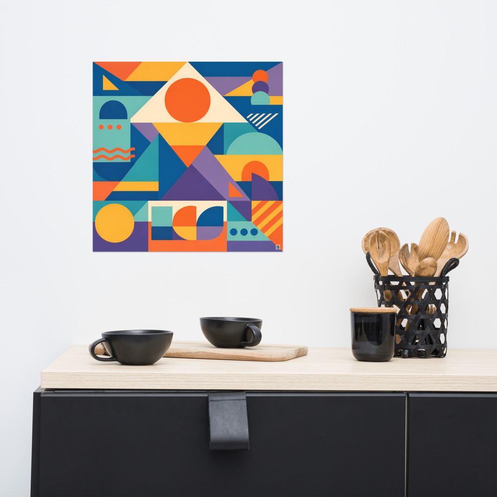
For the dining zone, go bolder. Dining areas can take more visual energy because you're only there for an hour or two at a time, and conversation benefits from a bit of backdrop. A single large piece on the main dining wall does more work than three medium ones scattered about. Something structured and graphic like Meadow Orbit can anchor a table properly — the circular forms give it a centre of gravity that pulls the eye and, by extension, defines where the dining zone starts and ends.
The kitchen zone is trickier because of splashbacks, extractors and the general reality that walls are already busy with tiles or shelving. I'd usually leave the kitchen itself alone and let the surrounding art define its edges by contrast. If the lounge and dining walls are clearly art-led, the kitchen reads as the working zone without you having to try.
Colour as a second layer
Scale gets the zones set up. Colour keeps them cohesive so the room doesn't feel like three different flats stitched together.
The trick is to let each zone have its own dominant piece, but pick works that share a palette or a sensibility. If your lounge piece has warm ochres and a cream ground, your dining piece can be bolder in shape but should nod to those same tones somewhere. That's how you get zones that feel distinct but related — separate rooms in feeling, one home in fact.
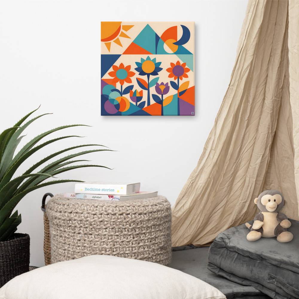
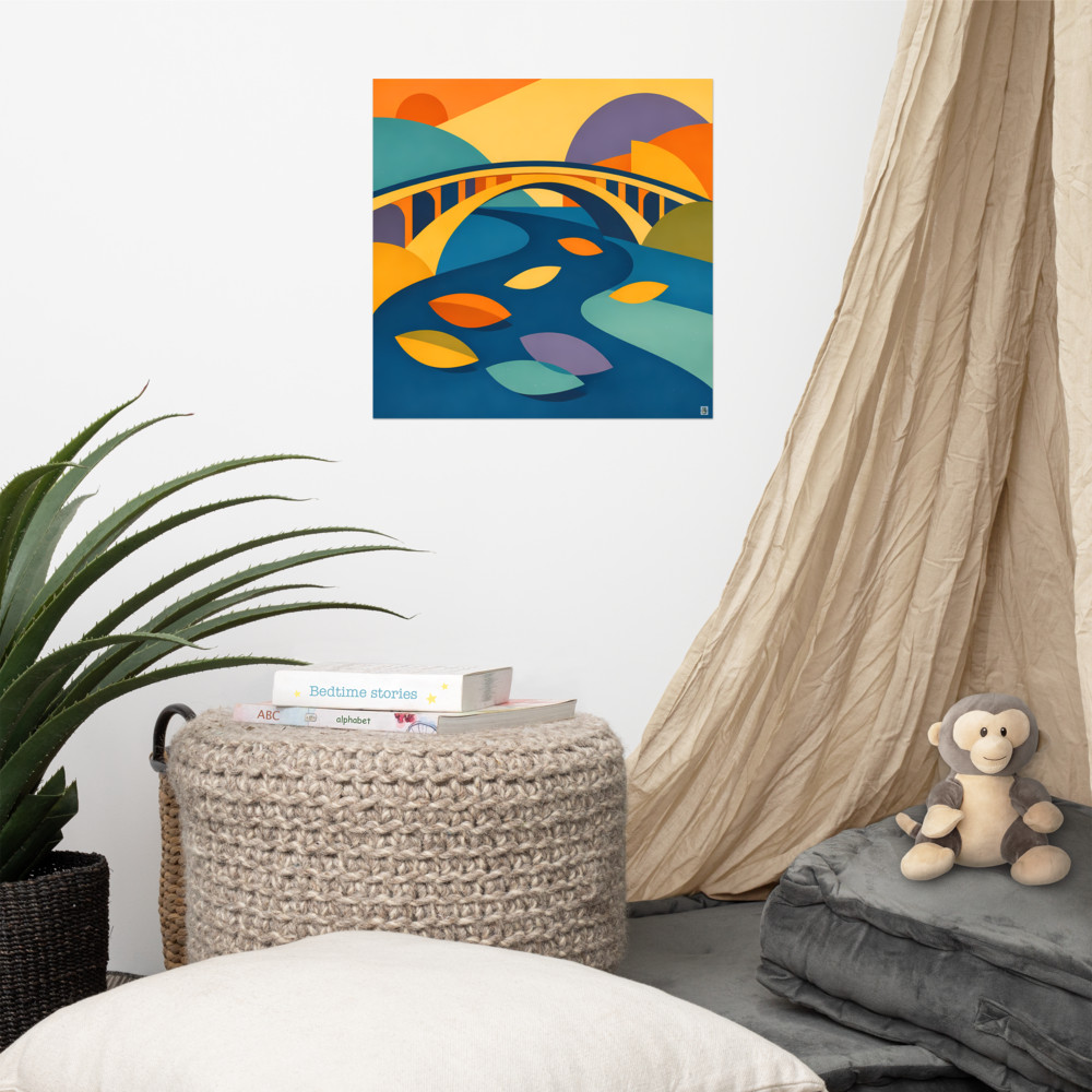
A piece like Dawn Meadow is useful for this kind of bridging work because it carries several colours at once, so it can act as the connective tissue between a warmer zone and a cooler one. Hang it somewhere you can see it from both areas — a hallway wall, or the wall between lounge and dining — and it does quiet mediation between the two.
The bit nobody mentions
Here's the honest caveat. Big art in an open-plan space is a commitment. It's more expensive, it's harder to hang on your own, and if you get the piece wrong it's a much more visible mistake than a small print in a corner. I'd genuinely recommend living with masking-tape rectangles on the wall for a week before you buy anything at the larger sizes. Cut newspaper to size, blu-tack it up, and see how it feels when you walk in on a Tuesday evening with the lights on. You'll know within a few days whether the scale is right.
And don't feel you have to solve the whole room at once. Get the main lounge wall right first. Live with it for a month. Then look at what the dining area needs — you'll have a much better instinct for it once one zone is properly settled. Open-plan spaces reward patience more than they reward a single big shopping trip.
Related articles
Mentioned in this article