InkSmithery
Warm or Cool Art: Matching vs Contrasting Your Room
There's a question that comes up a lot when someone's picking prints for a room they've already decorated: should the art carry the same temperature as everything else, or should it push back against it? Warm walls, warm art. Cool room, cool art. Or the opposite — a burst of orange in an otherwise icy grey lounge.
The honest answer is that both work, but they do very different jobs. And getting them mixed up is probably why some walls feel a bit flat even when the individual pieces are lovely.
When matching the temperature actually works
Matching is the safer play, and I don't mean that as an insult. If your room is already doing something confident — deep terracotta walls, warm oak floors, brass fittings — then leaning into that with warm-toned art pulls the whole space together into something intentional. It reads as a considered scheme rather than a collection of stuff.
The same is true in reverse. A cool, calm bedroom with pale blue walls, white linen and a bit of chrome tends to want art in the same family. Soft blues, greys, muted greens, maybe a moonlit night scene. Something like Moonlit Tor sitting above a bed in a cool room reinforces the mood — it's restful because everything's speaking the same language.
Matching works best when:
- The room already has a strong, deliberate temperature and you want to strengthen it.
- The space is for winding down (bedrooms, reading nooks, bathrooms).
- You've got a lot of pattern or texture going on and you don't want the art to compete.
The risk with matching is that if you go too far, the room starts to feel a bit one-note. Everything blurs together. You walk in and there's nothing for your eye to land on because it's all one temperature at one volume.
When contrast is the smarter choice
Contrast wakes a room up. This is the trick I mentioned in the intro — using art as a warm injection in an otherwise cool space. If you've got a north-facing living room with grey walls, a grey sofa, and daylight that never quite feels friendly, a warm-toned print above the sofa can genuinely change how the room feels at 4pm in November. It's not magic, it's just that your eye reads the warmth and the whole room borrows a bit of it.
The reverse works too, though it's used less often. A very warm room — think heavy curtains, dark wood, gold lamps — can start to feel airless. A single piece of cool-toned art can act like a window, giving your eye somewhere to breathe.
A few situations where contrast tends to earn its keep:
- North-facing or basement rooms that need warming without repainting.
- Minimalist spaces where the art is deliberately the focal point.
- Rooms with lots of natural cool light (big windows, pale floors) that feel a bit clinical.
- Kitchens and hallways where you want a small jolt of personality.
One thing worth flagging: contrast pieces need to be the right size to hold their own. A tiny warm print on a big cool wall just looks lost, like it wandered in from another house. If you're using art as a temperature counterweight, go bigger than feels comfortable. The whole point is that it should shift the balance.
The trick of the single warm injection
This is the move I use most often, and it works in almost any cool-leaning room. You keep the walls, furniture and soft furnishings in your cool palette — greys, off-whites, muted blues, sage — and then you introduce one piece of art that runs warm. Sunset oranges, terracotta, dusty pink, ochre.
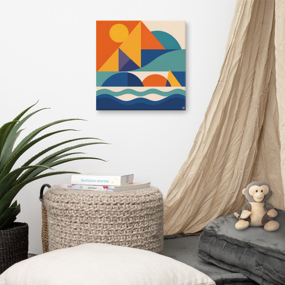
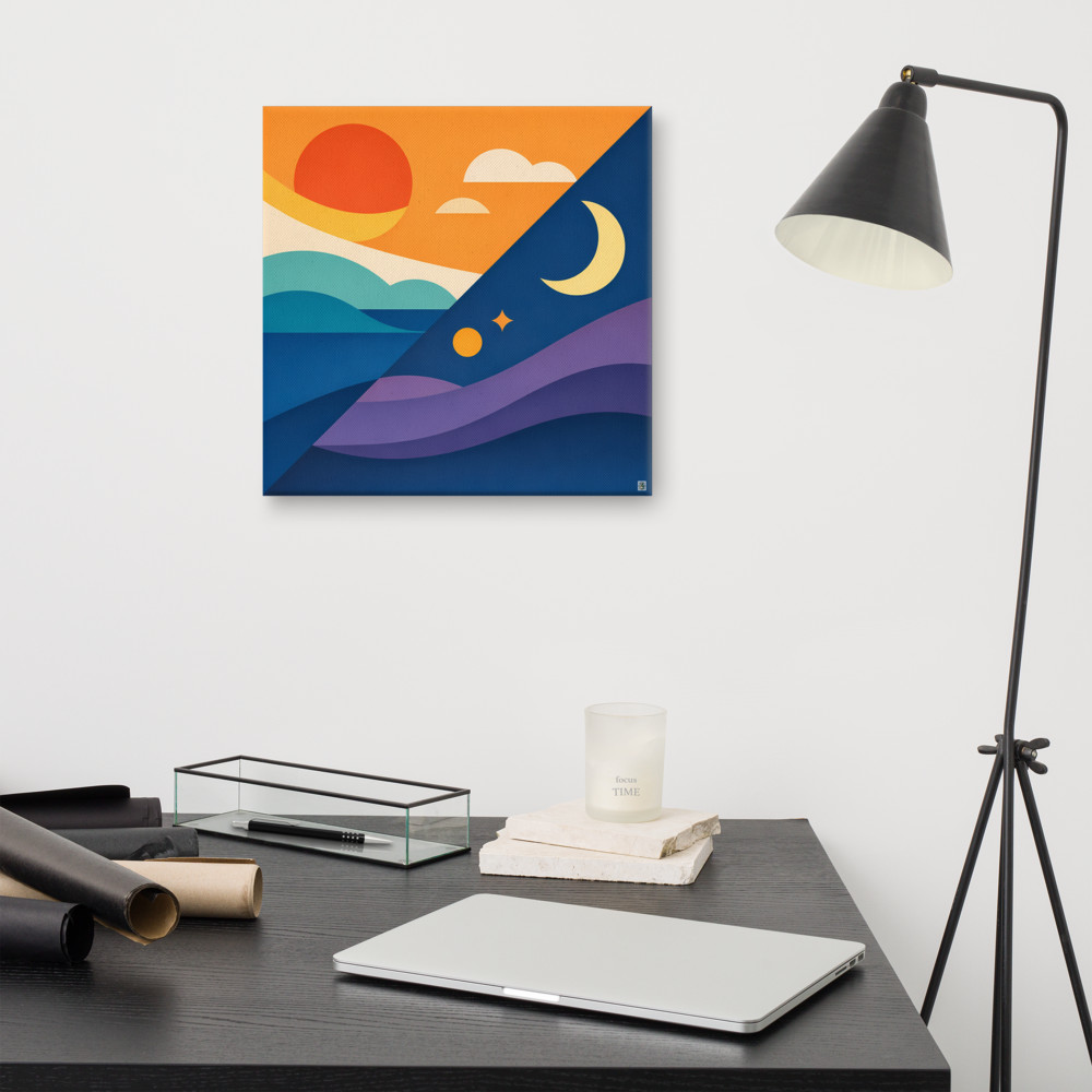
Something like Harbour Light does this job well because it's not aggressively warm — there's structure and calm in the geometry, but the sun and the horizon bring in a golden note that lifts the whole wall. You get the warmth without the room suddenly feeling like it's shouting.
The reason this works better than sprinkling warm accents around the room (a cushion here, a candle there) is that concentrated warmth in one spot creates a proper focal point. Scattered warmth just muddles the temperature reading and you end up with a room that can't decide what it is.
If you're going to try this, hang the warm piece where the eye naturally lands when you enter the room — usually above the sofa, or on the wall opposite the door. Not tucked away in a corner.
When to break your own rules
Mostly this stuff is about intent rather than correctness. A cool print in a warm room can look brilliant if you commit to it — bring in one or two cool accents elsewhere so it doesn't look accidental, and give it enough visual weight to be a statement rather than an oversight.
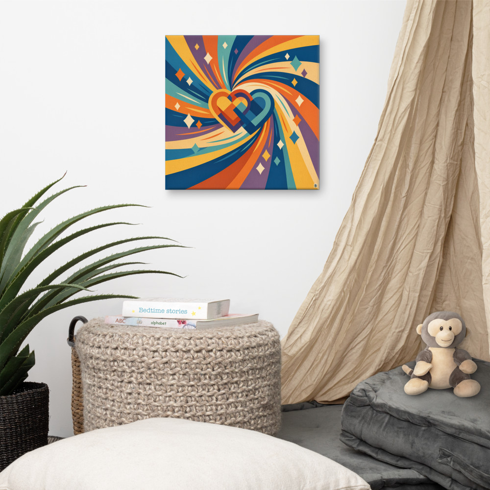
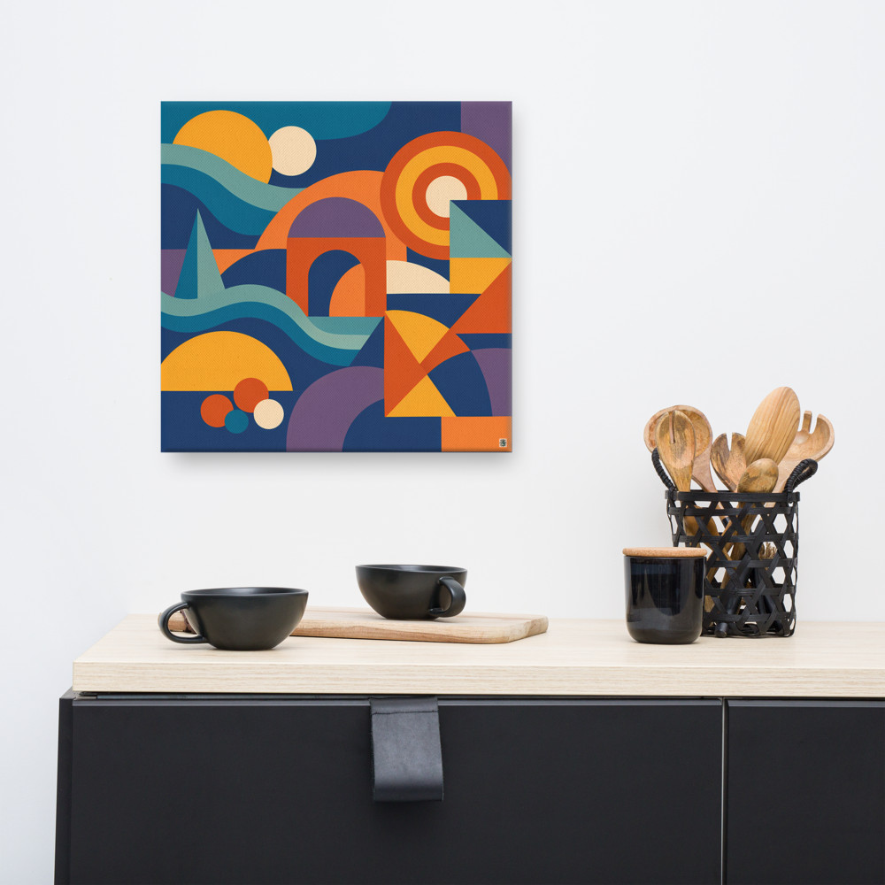
And sometimes temperature isn't really the point at all. A piece like Promise Current works because of the pattern and the movement more than any warm-cool reading, so it slots into a lot of different rooms without you having to think too hard about the palette question.
If you're stuck, here's the rough rule I fall back on. Cool rooms almost always benefit from one warm piece. Warm rooms usually want to be reinforced rather than fought. And any room that already feels balanced and finished probably doesn't need the art doing heavy lifting on temperature at all — you can pick based on what you actually like looking at.
Which, honestly, is what you should have been doing anyway.
Related articles
Mentioned in this article